
Google has since released an Android version called Honeycomb, that was designed from the ground up with a larger screen in mind. While still icon-based, the UI was completely overhauled, now sporting a layout more similar to that of a desktop OS. With the Xoom, Motorola was the first manufacturer to launch a tablet based on the OS. But can they catch up with Apple, who has also made improvements with their second version of the iPad? Do read the FoneArena Motorola Xoom review.
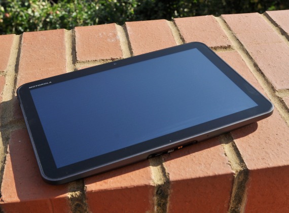
As far as hardware goes, the Xoom is a well made tablet, albeit a bit heavy at 730g. Much like their Milestone smartphone series, there is no denying that the built quality is good. While it is considerably heavier and thicker than the iPad 2, it isn’t a major concern once I got used to using it daily. Inside the Xoom resides a powerful 1GHz nVidia Tegra 2 ARM Cortex A9 dual core processor and 1GB RAM, which should aid in multi-tasking sessions. It comes with 32GB of built-in storage which can be expanded to 64GB via the microSDHC card slot.
The 10.1″ touchscreen display is coated with Corning Gorilla Glass, and while I have my doubts on the durability of Gorilla Glass, the screen remained scratch-free despite heavily using the tablet for two weeks. At 1280 x 800, the screen is a widescreen variety and while offering more pixels than the iPad 2, I found it too narrow to use comfortably in portrait mode. A screen with 4:3 aspect ratio like on the iPad 2 would have been more suited for tablets as would be optimised to use in either portrait or landscape orientation.
The bezel is an inch in thickness and while some might moan the wasted screen estate, it is useful not gripping the device without touching the touchscreen. A front-facing 2 Megapixel camera is available for picture taking or video calling via Google Talk.
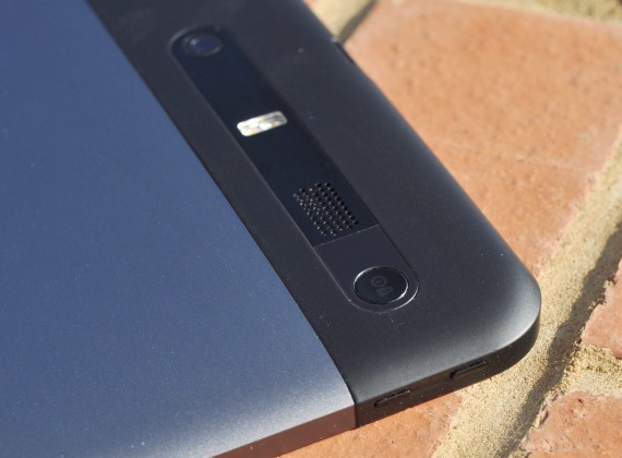
About 3/4th of the back case is aluminium, while the rest is made of plastic – no doubt to aid wireless connectivity. A 5 Megapixel camera with dual LED flash reisdes near power/lock button and speaker grills. While I personally can’t see the need for a camera on a tablet device, it is there. The volume buttons is found on the left side of the tablet. On the base are the microUSB data port, HDMI slot, a proprietary charging slot and two gold contacts for what is presumeably for accessories. The Xoom can not be charged via microUSB as the current USB standard is not able to provide the necessary current to charge the Xoom’s battery. A none-working SIM slot, microSDHC card slot (currently disabled in the EU model, but will be enabled with Android 3.1) and 3.5mm headphone jack can be found on the top of the device.
In comparison to other Android smartphone manufacturers, Motorola has never been particularly gifted at making custom launchers on their smartphones even when they insist that making MOTOBLUR available on the smartphones is for our own good. Not here. The Xoom comes with the vanilla version of Honeycomb, and for that I applaud them. Unfortunately for them, Google hasn’t quite got it right, instead opting for a UI that is messy at best and downright confusing at worst.
As I mentioned earlier, I found that the UI of Honeycomb to be very desktop-like. All corners of the screen are populated with some core functionality. The core system bar is found on the bottom of the screen and provides access for navigation, multi-tasking bar, notifications and system status. Notifications like emails, twitter mentions etc. are in the form of pop-ups which you can dismiss easily and can be accessed via touching the digital clock on the right side of the system bar. The aforementioned multi-tasking bar will bring up a list of the last five programs used with a thumbnail of each. It’s nifty, but why limit to the last five applications when there is a large screen capable of showing more?
On the top left of the screen, you will find a search entry box and an icon to activate voice search. To access the application menu, touch the application icon on the right side of the top screen. Smack in the middle of this are five customisable home screens that can be swiped around. These homescreens can be populated with widgets and shortcuts, much like a typical Android smartphone. Adding widgets and shortcuts is easy, touch the + icon on the top right corner and you will be taken to a customisation screen where you can slow widgets, shortcuts and wallpapers into place. But overall I found the UI to be too busy – there’s just far too many taps needed to accomplish a task. I do hope that the next major Android milestone, Ice Cream Sandwich, will address this issue.
Unlike the general UX of the Honeycomb, Google has done well to optimise some of the built-in apps. Emails for example features a two-column UI. This two-column UI design is also found in other apps like Calendar and Contacts. Like on the smartphone version of Android, you will need a Google account to use the tablet to its full potential. GMail is undoubtedly well supported but you can also add none-Google email accounts with ease. I had no issue linking an old Yahoo! email account and a corporate MS Exchange email account. There is no denying that with optmised apps, the Xoom is useful and I spent most of my time composing email replies on the Xoom compared to my smartphone.
The browser supports multi-touch, has Flash support (downloadable from Android Market) and tabbed browsing. Opening a new tab is as easy as touching the + icon. There is also a private incognito mode for those who wish to visit web pages without recording your browser, search history and tracking cookies. It isn’t a killer feature but I am sure some people will find it useful. 😉 I found the browser to be very capable and rendered most sites accurately. Unfortunately the browser isn’t very stable, often crashing more than once a day.
The Xoom’s camera was a tad disappointing, even in daylight. Details were poor, it lacks sharpness and a good dynamic range. This isn’t a massive issue as a tablet was hardly ever going to take on a smartphone camera. What I do like was the camera UI which far exceeds that of the one found on many other devices. Still beware that the camera here is no replacement to any smartphones with a decent camera, much less your dedicated digital camera. HD video is supported, including the ability to record time-lapse video. A video editing suite is also included.
With a built-in GPS receiver the Xoom is quite capable of replacing your GPS device – though with the size I can hardly imagine why you would want to. In any case Google Maps is now an extremely solid navigation program with voice-guided navigation in some countries. The latest version has support for offline maps, though this is still in beta mode and isn’t quite as useful as Ovi Maps, at least not yet.
The lack of tablet-optimised apps on the Android Market is a huge concern. It is frustrating to find only two Twitter applications that supports multi-column interface. Not even Tweetdeck and Twitter seems willing to optimise their applications for tablets. Even worse, there are no options to search for Honeycomb specific apps. Most Gingerbread apps will scale just fine on the screen, but it’s like holding a giant phone. Given that Honeycomb is Google’s baby, at least Google should lead by example and release a tablet-optimised version of Google+, but as I write this none has yet appeared.
Battery life of the Xoom is excellent. Like all tablets, the battery isn’t removable – at least not easily. Motorola states that the Xoom’s battery was capable of up to 10 hours of video playback. While I did not actually test this, I found I was able to use it for two days of heavy use. And by that I mean WiFi constantly on with background sync, pulling updates from Gmail, Twitter and Facebook, a couple hours of web browsing and the odd two or three episodes of Futurama. It is fair to say that Motorola and Google seems to have solved the issue with power management that plagued previous versions of Android.
Despite the seemingly negative review, I like the Motorola Xoom, I really do. Many of the problems I have had are mainly Google’s, who can’t seem to get around their head to make Honeycomb useful or urge developers to optimise their apps for tablets. It feels like a rushed job, an excuse for Google to throw at us something that isn’t remotely ready for consumers so that their OEMs can get some tablet products out while Google works on the real deal Ice Cream Sandwich. Motorola, to their credit, has done well to create a compelling hardware out of what is essentially an unfinished software.
If you really must have a Honeycomb tablet now, then the Xoom will do you just fine. If not I suggest waiting for Ice Cream Sandwich instead.
+ Great build quality by Motorola
+ Excellent, if buggy, web browser
+ Potentially up to 64GB of storage (with microSDHC slot enabled)
– Honeycomb is half baked
– Lack of Honeycomb apps on Google Market and no way to filter them

