After a few hours with the N9 in my hands, I was even more convinced (as if that was possible) of why Nokia had to make the decision to go with Windows Phone as its main Operating System. Despite the sheer joy of discovering a new OS, using and abusing the swipe gestures, and marveling at the well thought-out package between Meego and the N9’s hardware, I have to say that Meego is simply not up to par with other OSes at this point, and the N9 also comes with some terrible decisions.
I am therefore fairly certain that despite deserving its own spot in heaven, the N9, even on PR1.1, should have a special spot in hell as well.
The wonderful display that isn’t
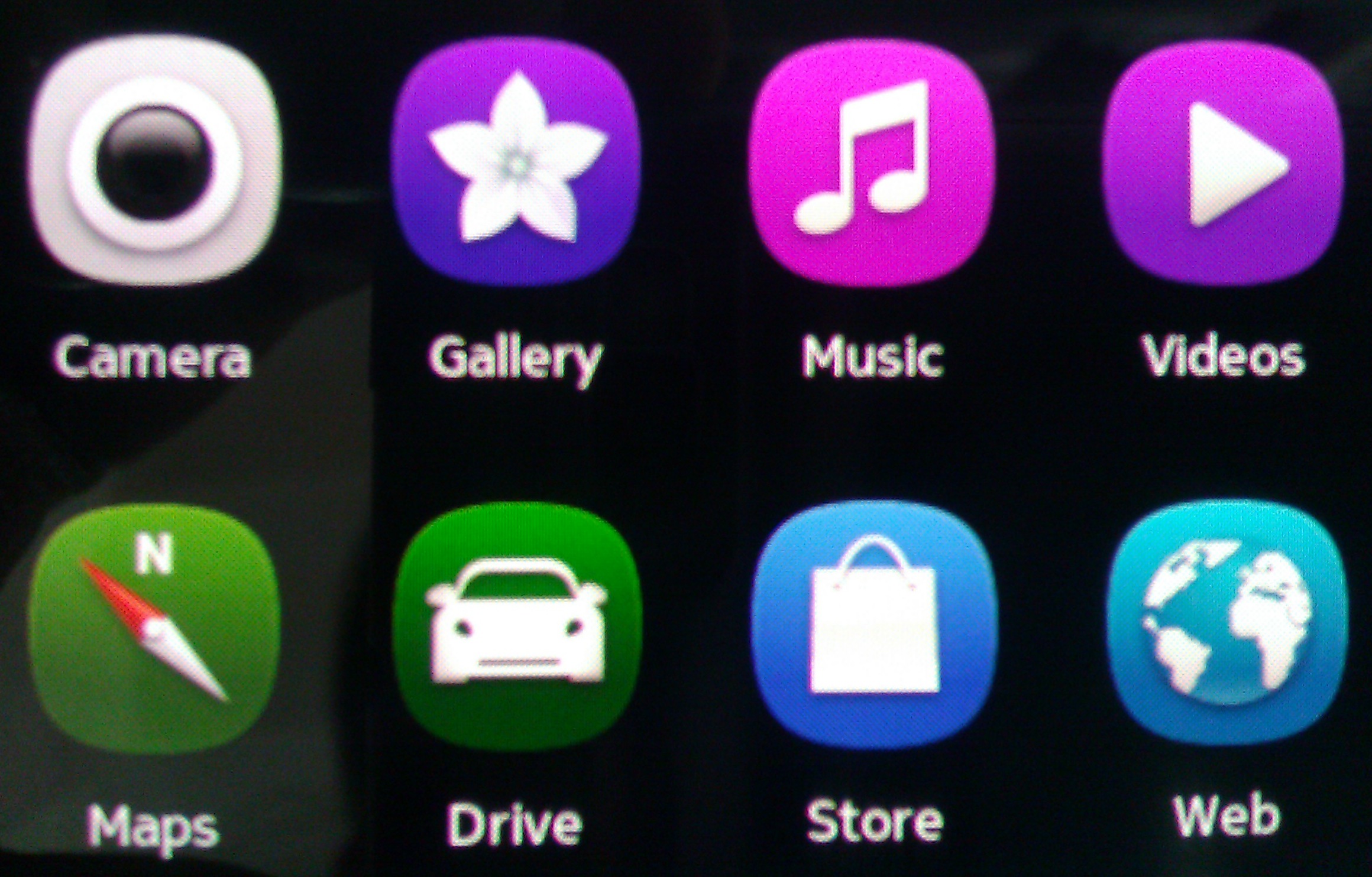
As I mentioned in yesterday’s post, I barely knew anything about the N9 before trialling it, but the one constant I saw in many online comments was that the screen was awesome. Imagine my jaw drop in horrified disappointment when I turned it on for the first time and could see everything slightly blurred and pixelated. I tried to track down the display resolution settings (which do not exist, obviously), then I asked the question on Twitter, only to be told the screen technology is Pentile. I will not bore you with tech details but suffice it to say, if you have slightly poor vision, you won’t see a thing and it’ll be crisp and wonderful for you. But if you have good/great vision, you’re in for the most magnificent disappointment of your geeky life. Everything looks blurred out, you can count every pixel, and anything white on a black background shows with purple edges on the left and green edges on the right.
It’s downright FRUSTRATING. Tragically UGLY. And the problem is that once you see these pixels, you can not go back, they’re all you can see on the screen. You won’t enjoy the curved screen, you won’t enjoy the AMOLED colors, you won’t enjoy anything, because everything is blurred.
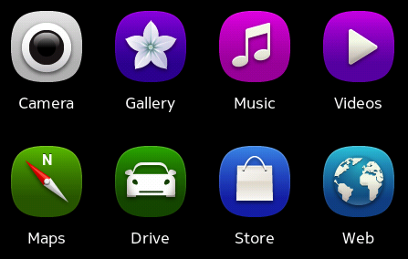
 This is a screenshot of how things should be on the N9
 This is a photo of how the screen really displays them. No, I did not move my hand, it’s a focused macro image, but the display IS actually that blurry. Also look at the Camera icon and notice the purple edge on the left and green edge on the right. That’s what actually creates the blurry effect, every white writing has those two edges, which means that nothing is really sharp. UGLY.
The Google Account that isn’t
When asked to add an Account to import my contacts, I saw a Google account option and was pretty happy that it was finally a simple step to get my contacts onto a Nokia phone. Fast forward 10 minutes, my Gmail is setup perfectly but I only have 45 of my >600 contacts imported. I force another sync but nothing happens. I wait. And that’s when I see it: it only imported my GTalk contacts! I search for a solution online and it turns out I have to use Mail for Exchange to get my Google Contacts. Mail for freaking Exchange! If they thought many people don’t want to have all their email buddies in their contact list, just ASK US. Do not just stupidly assume it. Gah. Mail for Exchange. The tragedy.
The Notifications screen that isn’t
See, when a phone comes with a Twitter and Facebook applications out of the box, that are tightly integrated into Contacts and work really well, and when the said phone has a Notifications screen of sorts, you add 1+1 and you expect to be actually NOTIFIED about replies and messages on Twitter or the aptly named Notifications on Facebook. Apparently, that concept was foreign to whoever worked on the N9. They thought “hey, notifications screen, euh, let’s put the weather, date, missed calls and messages, ta-daaa, useful!”. I’m pretty sure someone came up and asked “and Twitter and Facebook?” so the team looked in puzzlement, and in their all-inspiring wisdom decided to slap the whole Twitter timeline and Facebook Newsfeed on that screen. Not the real notifications. Not the stuff that matter. Useless.
The landscape mode that isn’t
There’s a landscape keyboard on the N9. And the phone actually works in landscape. Yes, we have to state that, because if we don’t, no one will see it. The main phone UI, the settings, the Twitter and Facebook applications… NONE of these work in landscape. So you’re forced to type on a cramped portrait keyboard, oh, and suppose you’re browsing the web or viewing a photo in landscape and want to go back to the menu, hey, you have to turn your phone back as well!
I know that all of iOS, Android and Windows Phone don’t have a proper landscape mode, but it is not justifiable for them, and it is not justifiable for the N9 and Meego. I want to read, browse and use my phone in landscape. And most importantly, I want a landscape QWERTY all throughout the UI. Because I’ve tried portrait QWERTYs, with and without Swype, and they’re uncomfortable. Aside from the iPhone/iPod Touch, all modern phones have awkward proportions that make them much more long than wide, so holding them and typing, you feel cramped and like the phone is going to fall from your hands. I know many of you got used to it, but that’s not an excuse and it’s still not in many people’s genes. I had to find a position worthy of Kamasutra with my fingers and hands to hold the N9 and type, and I am not happy about it. *insert a very angry emoticon face*
The fancy Swipe that isn’t
While the swipe gesture is wonderful and natural and all, there are certain circumstances where it’s downright frustrating.
- First, there is no consistent way to go back specifically to the menu, notifications or multitasking. There’s only a consistent way to go back to any of the three, depending on where you were before opening the current application. Let’s say I was on the notifications screen and I opened a message from there, but now I want to switch back to twitter: I have to go back to the notifications screen and then swipe to get to the multitasking view. Irritating.
- Second, swipe interferes with switching photos in the Gallery. I can’t remember how many times I closed the gallery when all I wanted was switch images.
- Third, swiping the keyboards actually interferes with the Swype keyboard (not a typo, they’re different things), especially with words starting with P. If you’re using Swype and you’re writing “pretty”, the gesture from P to R is most times registered as a “swipe” not a “swype” and the keyboard reverts to the regular one. That’s one of the reasons I deactivated Swype.
- Last, swiping to select words to copy/paste: it took me a google search to figure out how it’s done. Because the gesture is a swipe, not a slide, not a select, it’s awkward, and works 5% of the time for me.
The camera button that isn’t
Look, when I hold a Nokia, I expect a decent camera. And when the Nokia I hold has an 8MP camera with Autofocus, I expect an actual camera button, not an onscreen silly excuse for a button. Tis all.
Everything else that isn’t
So where do I start? The earphones included in the N9’s box are the old, oooooold, regular earphones, not the in-ear type that we saw with most of their high-end smartphones since 2009. I thought the old ones had died a death worthy of their horrifyingly uncomfortable nature, but they’re resuscitated! Miracle! Not.
When importing contacts from several services, the Merge function should work automatically, but most times, you’re left with duplicates or triplicates of the same contact, with the same name. Worse? My Gtalk contacts imported with the Google Account did not merge with the Google contacts imported via the Mail For Exchange Account, even though they have the same name AND the same email address. If you know a logical explanation, please tell me.
Then there’s the fact that you can customize close to nothing in the N9’s UI. You can change the lockscreen wallpaper, the ringtones, and… that’s it. Nothing else. Themes, icons, colors, none of that. The N9 is already set for you, from the box.
So there you have it, the more I use this N9, the more I’m convinced that there’s a special place, somewhere between heaven and hell, for all the joys and frustrations it brings.
