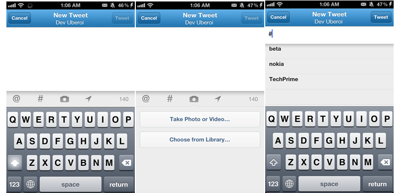
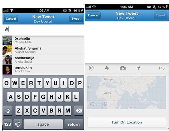
As part of a massive redesign effort , Twitter today unveiled new apps for iOS , Android alongside an improved web interface. The version 4.0 update for the iPhone is a huge change with a slick design, soothing graphics, more features and a whole lot of performance improvements. It has its own pros and cons. We’ll be doing a complete walk through the new app whilst comparing it with the previous (version 3.3.5) release. Unless mentioned , all images on the right are from Twitter for iOS version 4 and those on the left are from the older release.
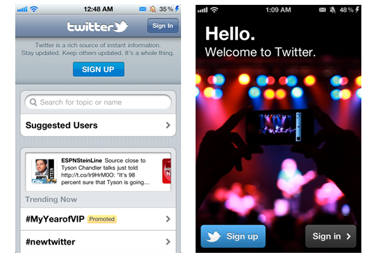
Starting with the Sign Up/Sign In screen, there’s a new look and feel to it. The older one being dull and plain, showed trending topics whereas the new one is more stylish yet simple. Twitter 4.0 for iOS gives the app a very fresh look due to the use of improved graphics on buttons and opting for a simpler launch screen.
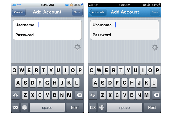
Tapping the sign in button reveals the login screen where you can enter your details. The first thing you will notice is the change in the topbar colour. The old app used the stock colour of the iOS whereas the new one is a nice pleasant blue. There isn’t anything different here in terms of layout besides the topbar colour. If you already have a twitter account saved in your iPhone (iOS 5+), then the new app will ask you to import details and you won’t have to fill it again.
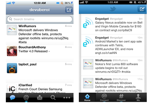
Moving on to the timeline page , this is where the major changes can be seen. As you will notice, everything from the top bar style, to the timeline and the tabs below has been overhauled. On the top bar there’s a refreshed “New Tweet” button, a little bigger in size. The older one shows my name in the middle, which is not there in the new. Instead it displays a nice looking twitter logo embossed into the top bar.
The look of the timeline differs with the old one being wide spread across the screen. In comparison the new timeline is aligned in the centre with a stationary backdrop on side. A much welcome improvement over the previous version is that the application finally shows a person’s name instead of their Twitter handle. This makes it much easier to remember who tweeted what instead of trying to figure out their Twitter handles. The avatar picture display slightly differs. Notice the more rounded edges of the old one to the more squarish look of the new.
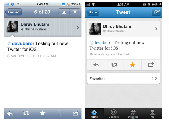
This is how a particular single tweet looks when you tap on it. The refreshed layout is a huge improvement both in terms of visual appeal and usability. Version 4.0 adds options to choose (favourite, retweet, more, reply) below the tweet itself, and the main tabs displayed below (no more going back to timeline to change section). Also a new addition to this is that now you can view who all favorite that tweet you are viewing. The old had options on a bottom bar, the tabs were not present.
Coming to the tabs below on the main section, here there’s a major difference. An interesting omission in the new app is the absence of Favstar support. The tabs now have a new design, icons and better a feel to it, also now the tabs show their names below which is definitely helpful for users new to the app and service. The new app has done away with the 5 tabs at the bottom instead replacing them with 4. The missing one being Direct Message , More on that below !
TABS:
As clearly shows above, the first tab of both is the twitter timeline (active tabs are highlighted blue).
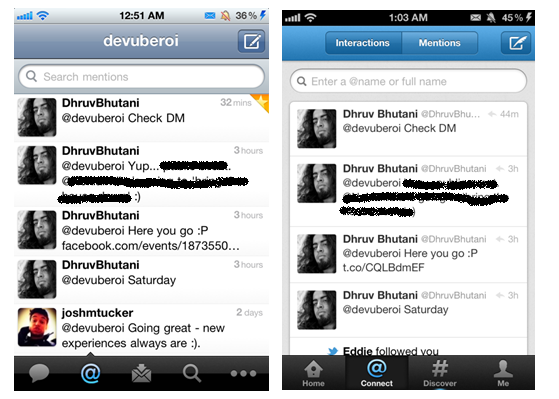
Coming to the second tab, which is the Mentions tab. It displays the section of tweets in which you where tagged or mentioned. The update to this section is that the new one now had two options to choose from for display tweets (notice two button above). One is the “Interactions” display, which displays just tweets which are conversations which other people (replying back and forth to each other) and the “Mentions” display, which shows all the tweets in which you were tagged (also the conversation ones). The older one displays all the tweets together in which you were tagged, and lacked any sort of conversation view.
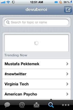
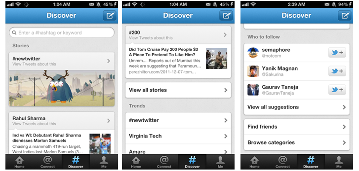
Next up is a comparison of the new “Discover” section with the old “Search” option. The Search Section of the old app allowed users to search for topics , people and showed the Trending topics below. This wasn’t a very efficient way of looking new people nor was it aesthetically pleasing. In comparison , the new Discover section sports a better looking search bar, has a cleaner and nice looking grey constant background, along with a cleaner way of displaying search results and trending topics. The new sections also displays the most search for or liked tweets of the most tending topics. Scroll below and you’ll find suggestions for “who to follow” and find friends feature, along with “browse categories” for topics.
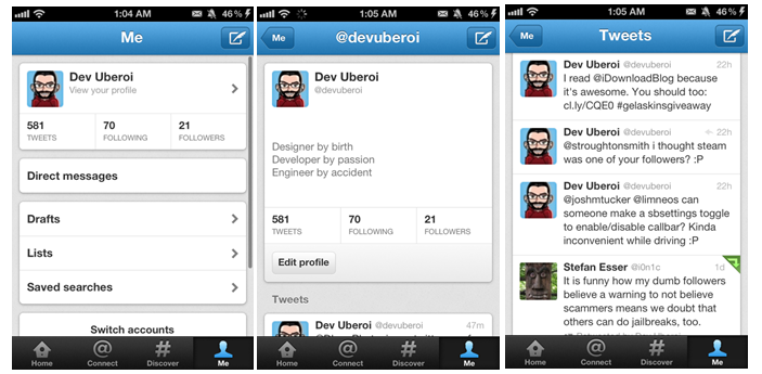
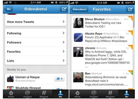
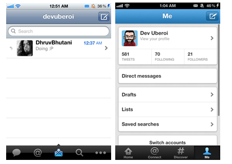
The last tab of version 4.0 as you can see is labelled “Me”, which is exactly what it is. It displays all the options related to you, your profile, your tweets amongst others. The profile display has a new layout and style to it. Here you’ll get the options to view your tweets, your favorites, followers, drafts. Notice the “direct message” button when you are in the “Me” section.
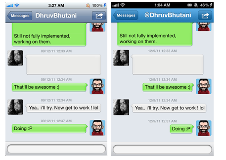
The old version had a direct tab to your DMs in the bottom bar itself. This option is somewhat hidden in the new app. In the new app, you can view the DMs by going into the “Me” section. The change is rather inexplicable as it actually makes it harder to access the Direct Messages panel. Not really in favor of this ‘improvement’. The DMs are displayed in conversation view as expected.
Overall Twitter for iPhone 4.0 is a much needed improvement especially on the visual front. Twitter has indeed done a major overhaul with the clean layout and improved visual aspects. However inexplicable changes like burying the Direct Messages pane are inexcusable. Heavy Twitter users might need some of the more powerful features provided by competing apps but the vast majority of consumers should be able very satisfied with the new Twitter for iPhone.
