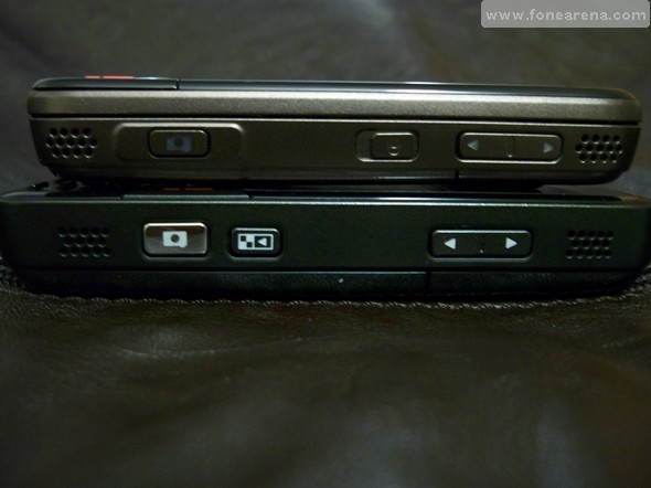
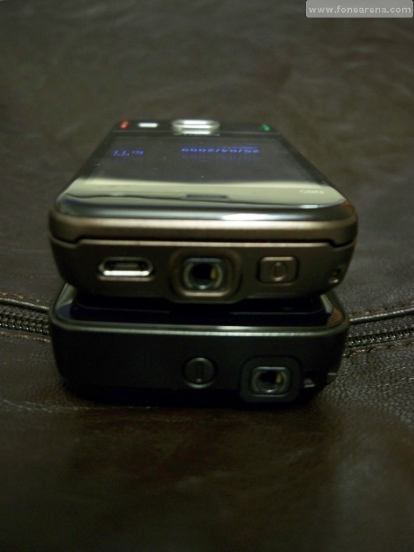
After having brought you the Nokia N85 picture gallery review, we tackle a small comparison with its older brother, the N82. The first part of this comparison is axed on hardware and design.
Both devices bring the black plastic and shiny look in the design category. The N85’s screen is bigger and more vibrant due to its OLED technology.

The N85 is shorter, due to its slider design and also thinner, making it more pocketable and easily carried in a hand. The replacement of the useless Gallery key (N82) with a keylock key (N85) is a welcome addition as it allows to quickly lock and unlock the handset.
The N85’s other feature is its micro-USB port that allows charging the handset form a power outlet or from a computer’s USB port, that way you never run out of juice. It also charges the N85 while you transfer files over USB, making it a double duty port.
Even though the overall volume of the N85 is noticeably smaller, when you slide open the keypad you will see that it becomes much taller than the N82. The keypad designs are very different between both handsets: the N82’s keys are very small but offer a nice “click” when pressed, whereas the N85’s keys are much more flat but cover a bigger volume. Personally, I prefer the N82’s design as the feedback for typing is great, and there is basically no chance of pressing the wrong key by accident as there is a lot of space between each individual key.
The N85 also offers a dual slider design, with the multimedia keys on top (here not lit). The N82 lacks dedicated music, video, gaming keys, which prove to be of a major importance for entertainment junkies.
This wraps up the first part of our N82 vs N85 comparison, but stay tuned for part 2 that’ll bring you a camera comparison between both and part 3 for a screen and display quality comparison.


