Warning: this post is subjective, the most subjective you will ever find. I am writing it for the many readers who understand that and who still want to hear my opinion regardless of whether or not they agree. If you want to bash, build conspiracy theories, point your finger and say that I’m a Nokia hater or a Nokia lover, I’ll save you the trouble and tell you beforehand that you won’t change my mind and that I am both: I love them so much I ended up hating them two years ago. Otherwise, read on.

Let’s start with a quick history glance, shall we? If you’re reading this, you most definitely know what happened on February 2011. Back then, I was one of the few, very very very few non North-American bloggers, who had a positive outlook on that strategy and believed it was the correct move, right from the beginning. On a personal note, I swore off Windows and went for MacOS 4 years ago, I love my Cyanogen Modded HTC Desire Z to bits and would marry it if it was a man, I carry a Nokia N8 for a second SIM but barely use it aside from the camera and maps, and I own and use a 4th generation iPod Touch. I go along with anything that works for *me*, regardless of the platform, manufacturer, whether it’s hip, expensive, cheap or the best thing since sliced bread. That’s now. Back in 2007, and until 2010, I was Dotsisx, as in .sisx, as in I knew everything there was to know about Symbian/Nokia and I could do KungFu with my Nokia 3250 Xpress Music, N95, E71, N82, 5800 Xpress Music and N97 Mini chronologically. Even now, I wouldn’t sell my E71 if you gave me a million dollars for it. It only sits in a drawer, but I love it too much to let it go.
Between the Dotsisx and the Dot-apk/Dot-ipa/Dot-whateverworksforme (as FoneArena’s own Varun likes to joke sometimes) phases, there was the Symbian descent period, when I started hating the platform so much it hurt. I was moving forward, getting involved with web services like Gmail, Google Reader, Springpad, Evernote, Kindle, Twitter, IMDb, Dropbox…and Symbian lagged, not moving forward with me at all. Plus the one reason I loved Symbian in the first place, the availability of medical apps and ebooks, didn’t make the leap from non-touch to touch. Suddenly, in 2010, all that I wanted and needed to actually do on the move wasn’t doable anymore, and Symbian’s KungFu felt more like KungF***ed. The situation didn’t get any better in 2011 and 2012 when I added more web services to my daily arsenal… I moved to Android in December of 2010, but instead of never looking back, I kept looking back in nostalgia and hating what I was seeing. For me, the E7 was a “solid” disappointment, the C7 was a “cute” disappointment, the E6 was a “reliable” disappointment, and the N9 was a “wonderful” disappointment, all of them decent, but a disappointment nonetheless. Actually, I loved the N9 for one thing, it was good enough to appease those who badly needed it to work (ie the Nokia Purists, a step beyond fans), but it wasn’t as good as to warrant a global outcry at the Windows Phone strategy.
I call myself a “February 2011 believer”. Why? In 3 words: it promised me “convergence without compromise“, a device that has excellent hardware (reception, camera, build quality) and software (music, games, office and apps, including the web services I never had on Symbian and my medical software) along with Nokia Maps…who could forget the sheer brilliance of Nokia Maps? However, I waited until now to seriously ask for a Lumia 800 review unit because I needed the dust to settle on the launch but most importantly because I needed a break from everything Nokia, to sort out my feelings, to no longer be hurt as much as I was. Oh yes, Dotsisx was *that* involved.
So the Lumia 800 landed in my hands on Monday. It’s my first contact with Windows Phone. I had seen screenshots and watched a few videos, but I haven’t held, used, or even glanced at a Windows Phone from afar. How is it? In a word, disturbing. My brain tells me it’s a Nokia, my fingers feel an N9, my eyes see something so totally different and riveting. Disturbing, very much so.

Following are the more detailed thoughts:
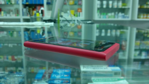
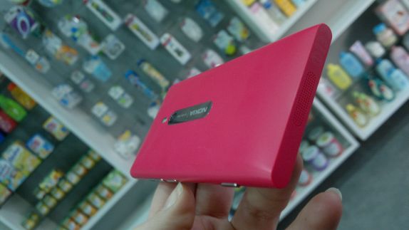
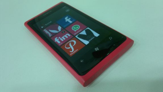
- Upon opening the box, my first thought was “Oh, Magenta!”. You can’t fail to tug at a girl’s heart with a Magenta phone. I might be the least superficial girl I know and I would carry a brick if it allowed me to do what I want (oh, wait, I already do => Desire Z), but Magenta? That’s downright painfully gorgeous. I’m two steps away from donning the teenage girl attitude and speaking in acronyms with a highly pitched voice “OMG, STFU this phone is sooo aaa-saaam, I’m freakin’ out.”
- The Pentile display and lockscreen wallpaper almost turned me off, throwing me into an immediate N9-nightmare rerun. I had anticipated the Pentile so I clenched on my teeth and decided to live with it for the trial period. I did change the wallpaper though.
- The Internet Explorer icon, as much as I had expected it to be there, was another “oh no” moment until I noticed that even though I had avoided opening it, many apps were using it to take me through the sign-in steps and it wasn’t doing a bad job. It’s a long process but I might end up reconciling with the Internet Explorer brand.
- I was quite glad to see that I didn’t need a Zune or a PC to activate the phone, and that my Google cocoon with Gmail and Contacts was a breeze to setup.
- Multitasking, notifications, search and push definitely need improvement. I won’t get into the specific details, they work but they’re nothing to be impressed with.
- Apart from 3 or 4 applications, everything I use on my HTC Desire Z is available on the Marketplace. There are even two free Pinterest applications, something you can’t say for Android. Impressive.
- Most applications use the same design language, which is similar to Metro. It’s uniform, easy to learn, clean, and very intuitive. I thought I’d be bored of the repetitiveness, and landed on one application that didn’t conform: FeedWorm. I eventually removed it because it felt out of place and disturbing to the workflow.
- I am a QWERTY person at heart, and I maintain that nothing could come close to a real QWERTY keyboard for my use, which involves 3 languages plus the awkward transliterated arabic, medical words and various abbreviations. The Windows Phone keyboard is surprisingly responsive and less error-prone than Android or, dare I say, iOS. Only time can tell if it works for all of my quirks or not.
- A lot of professional medical applications are available, most of which are as outrageously priced as on other platforms. There are two free ones that look useful: MPR and e-Compendium but I have yet to find time to try them.

All in all, less than 24 hours with the Lumia 800 and Windows Phone, am I still a “February 2011 Believer”?
Yes, yes, and heck yes.
Do I think Windows Phone, as it is, responds to the “convergence without compromise” promise?
Close, closer than Symbian ever was, closer than iOS will ever be, almost as close as Android, very close actually, but not exactly there yet.
Symbian, for all that it can do, for all the Belle improvements, for all the Qt uniformity, and for all the hardware add-ons like FM Transmitters and USB-OTG, is an old horse. It can do tricks, and it might win a race every once in a blue moon, but it’s not going to win any complete championship and you’ll be hard pressed to find a jockey who wants to ride it. Windows Phone is that new Arabian breed horse that’s so young, so full of vitality, so desperate to prove itself, that it trips at times, misses a few turns, but has the eagerness to stand back up and try again. And if you give it time enough to find a bit of maturity to erase those youngster errors, you might be surprised that it’ll take you straight through a championship, for many years to come. Any jockey is tempted to accept the job of riding it.
In the hand, Windows Phone is even better than I anticipated. The Live Tiles fulfill their destiny of efficient information glance. The Metro UI with those truncated words (that indicate sliding between panels is possible) looks awkward in screenshots but works quite well in reality. The choice of applications is wide and varied. Personalization is limited but can be achieved with some tinkering with WizzTiles. Most importantly, everything is fluid, responsive, gorgeous to look at, modern.
Windows Phone is not Android or iOS or Symbian or Meego, it’s neither better nor worse than them. It’s different, refreshingly so, enjoyable in ways, frustrating in others. But it has a future, a bright one. I might be seeing the world in Magenta right now, with the honeymoon phase still going on, but I can say for certain this: when I asked Nokia Connects for this trial unit, I ended with “Honestly, I want to fall in love with Nokia again” and it appears that I am.
