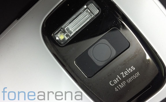
The Nokia 808 PureView, a cameraphone with a 41 Megapixel sensor, was a major disruption in the field of Smartphone cameras. It is a well known fact that smartphones are rapidly replacing the mainstream and traditional “point and shoot” cameras. With the 808 PureView, Nokia set a high benchmark for imaging quality for a smartphone. However, it had shortcomings in software. Running on Symbian, it was not much loved by the time it released. While it had its own advantages, it was still not able to cater to current needs, leading to one of the main reasons why Nokia switched to Windows Phone. However, it is not unnatural to feel that the technology is bound to end up in other Nokia camera phones, recently fortified with the rumoured and upcoming Nokia EOS PureView, purportedly running on Windows Phone 8.
It’s been a long time coming, and it’s a given that Nokia’s sprucing up its efforts in the camera department again, after a controversial, but successful launch of the Nokia Lumia 920, a different PureView device. But is it also a given that the new Nokia PureView will be as good as the old one? Currently, we would say no, unless drastic changes happen. What drastic changes are we talking about? Read on past the break to find out.
One thing Nokia did right in its 808 PureView’s software was the camera UI. The UI was fresh and offered a lot of intuitive menus and gestures for important functions. For example, here is a quick comparison of the main screen of the 808’s camera vs the Windows Phone’s camera, both in automatic mode –


As you can see above, both are quite similar with each respecting their own UI philosophies. The 808’s camera UI is full of buttons and pictorial representations of camera functions, while the 920 also has buttons but they more or less echo the Windows Phone UI philosophy. The 808 has a software shutter button which can focus in long press and allows touch to focus independent of the shutter. Whereas on the Windows Phone, a single touch on the screen, anywhere, can focus once and shoot it immediately, which is a bit counter productive for people seeking control over focus, but hey, the half step hardware shutter button works, so that’s reassuring. But remember that both these screens are in automatic mode of the camera. In case you want to take complete control over the camera, assuming that the upcoming PureView offers more control for enthusiast users, you might need controls like these –
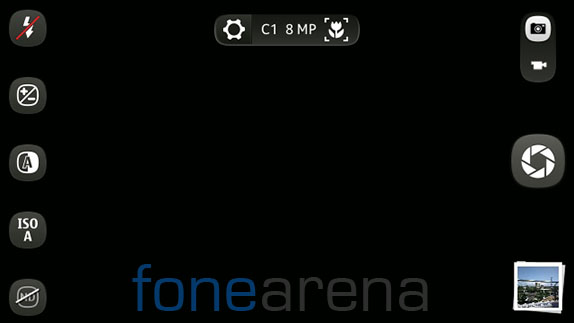
In what Nokia calls the “creative” mode of the 808’s camera are the most important settings with controls that are manual. A ton of options open up in the creative mode(image below). And most important of all, they all are easily accessible and selection is nice and easy.
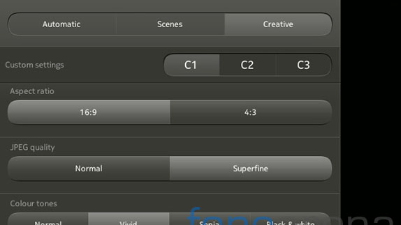

The above image is how you change the exposure compensation value, using a neat slider control. Not to mention the histogram when you open the exposure compensation setting, how cool is that! However, on the current Windows camera UI implementation, to do anything beyond the default set of controls, you need to dig through menus. When you touch the app bar options, i.e the three dots on the app bar, you get this –
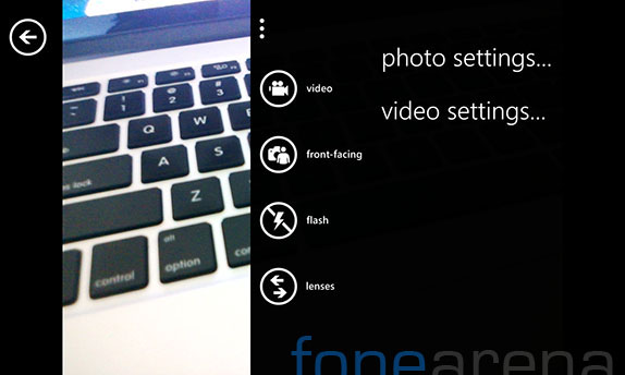
While it’s nicely in accordance with the Metro UI design philosophy, it’s a backward step even from before, because you have to dig into text based menus for more control, which is simply wasting one’s time. For example, lets take the example of changing the ISO on both the 808 as well as the 920. On the 808 it is a two step process, you hit a button, set ISO, done. It goes like this –

However, on Windows Phone, after digging through two menus(…-photo settings-ISO), you get this –
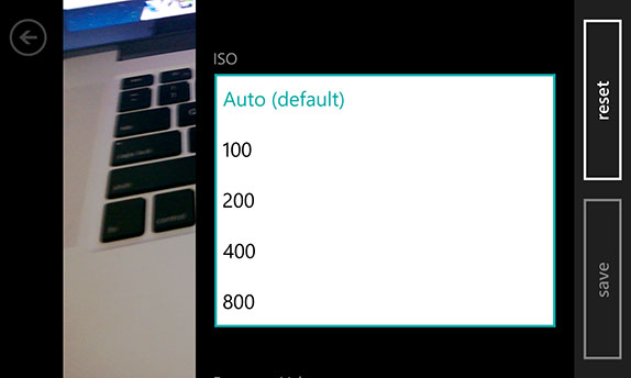
It is easy to see which is better in usage. Lets see how to change the scenes then, for a more casual photographer perspective, in case you feel cameraphones are only for the casual users. Tapping on the top center button on the 808 takes you to scene selection, that’s about it. And a similar slider control appears in which you can select the scenes immediately. And more importantly, the selected scene icon appears on the top center button where you select the scene.
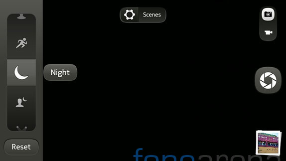
To do the same on the 920, you have to dig through two menus, yet again. And the scene selection too is text based, and even more annoying is, after you have selected the scene, the UI doesn’t show which scene you are currently on, but Windows Phone makes sure that it clears out settings when you relaunch the app, unless you want it to remember manually. But then, if you make it remember, there are no chances that you will now know which scene the phone is in. Pretty backward for a camera UI, in our honest opinion.
We have already touched on the interaction model too, with the 808 offering easier gestures for selection of scenes and creative settings. Even zooming, which is a major feature of the 808 PureView, is done intuitively by simply swiping up or down on the screen. It nicely shows a preview of the area to which the camera is going to zoom in, and the zoom out is self explanatory. There is no tap to focus on a specific part on the Windows Phone camera UI, while or before recording a video, the 808 does that well. The pinch to zoom gesture is the only way to zoom, in the camera UI, unlike the 808, which can slide zoom, or simply use the volume controls for the zoom.
Except for selecting the front facing camera, every aspect of the 808 Pureview’s camera UI is advanced and well thought out. The Lumia 920 can get away by saying that it is made for making the casual usage better and the UI suits that, but if there is a powerful 808-like Windows Phone in the plans, Nokia better step up their camera UI game on Windows Phone and make it much better. It needs to at least match the capabilities of the 808, not only with the hardware, but with the software too.
Concluding, I have to say that Nokia has a long way to go in terms of UI customisation on Windows Phone. The default camera UI/UX simply sucks and needs to change. It needs to at least match its own previous implementation, else, all that awesome PureView technology goes to waste with under utilisation and frustration. With that said, do you also feel the same? What more can be done in addition to the things above? Do let us know in the comments section below!
