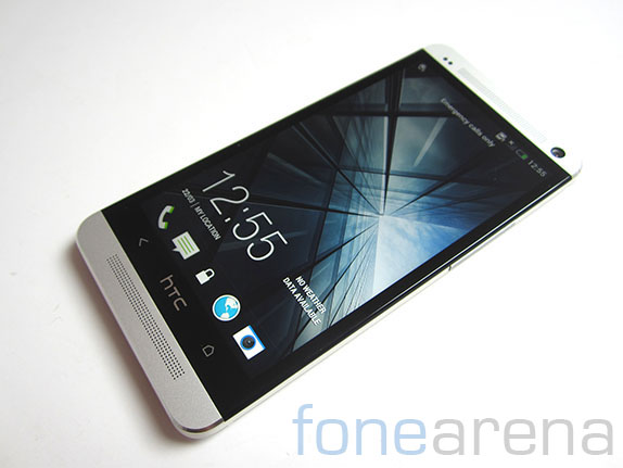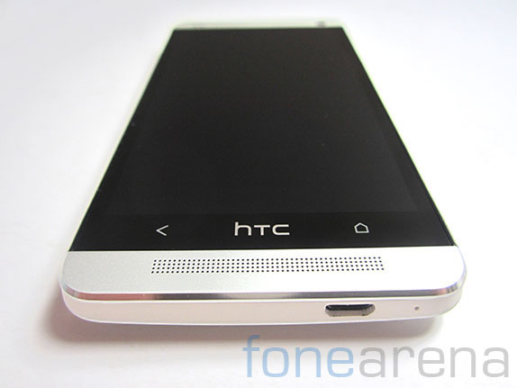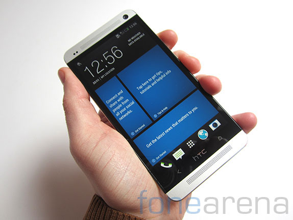

HTC’s latest Android phone is one of its most important releases yet. The company’s recent fortunes have been anything but rosy, and with rivals like Samsung and Sony producing some incredible handsets of late, the Taiwanese veteran really needs a best-seller to restore it to its former glories. We brought you the HTC One unboxing last month, here are our first impressions of the device. At first glance, the HTC One feels like that phone. From the brushed-metal casing to the gorgeous, “better than HD” Super LCD3 screen, the handset is dressed to impress. It feels solid and well-made, avoiding the plastic feel which is so common with Samsung’s popular Galaxy S range.


Powering up the device results in some mixed feelings. On the positive side, the HTC One is ridiculously powerful, despite having to push all those pixels. There’s no delay between you making a selection and the phone performing the task – everything is as smooth as butter and totally lag-free, thanks to the inclusion of a robust quad-core 1.7 GHz Snapdragon 600 processor. However, you need to counter this with the “love it or loathe it” Sense 5 user interface; while HTC has toned Sense down a bit in recent years, we predict that BlinkFeed – arguably the biggest addition to the new software – is going to divide opinion.


Personally speaking, we quite like the service. It’s reminiscent of Sony’s ill-fated TimeScape widget, which allowed you to aggregate social network updates into a continuous stream. However, BlinkFeed uses a tile-based interface which looks a lot like the Android app Flipboard, and also permits you to add news feeds to the stream. Whether you like it or not is a moot point; BlinkFeed is baked into the Sense UI and cannot be disabled. It’s also the first thing you see when you unlock the phone, unless you decide to set your default home screen to another panel. You’ll either have to grow to like it, or try to forget it’s even there.
Elsewhere, the phone’s much-hyped “Ultrapixel” camera is also something of a mixed blessing. The sensor is only 4 megapixels, but these let in three times as much light as typical megapixels (hence the name “ultrapixel”), which in theory means better photographs and superior performance in low-light situations. In practice, the advantage is mitigated by some fuzzy and ill-defined images. The shots taken by the HTC One’s camera are small in terms of file size and therefore perfect for sharing online, but when you zoom in to see detail, the quality takes a nosedive. Still, the idea behind the camera’s “Zoe” mode is smart enough; when shooting with Zoe enabled, the camera actually films a sequence of shots to ensure you always capture the best one. When you selected the perfect shot you also have a cool “mini video” as well. You can check out the HTC One UltraPixel camera samples and full HD video sample here.
The HTC One comes in either 32 or 64GB flavours and lacks a MicroSD card slot for expansion. It’s also a sealed unit, so you can’t replace the battery. Stamina is pretty average for the Android sector; regular use will ensure that you rarely get an entire day out of a single charge, but using HTC’s pre-installed power saver mode you can conserve juice by disabling features.
We’ll be delivering the final verdict on HTC’s biggest phone of 2013 in our full review, but for the time being we’re willing to admit it’s one of the best Android handsets we’ve seen this year. Of course, with the Galaxy S4 around the corner, that impression may be short-lived; while HTC has upped its game with this phone and produced a device which looks and feels fantastic, the firm has a hill to climb if its to catch up with its competitors.
Damien McFerran contributed to this report
