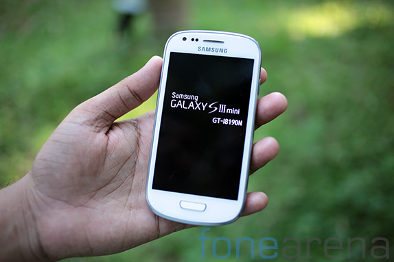
We are currently at a stage in which screen sizes of phones have become obnoxiously huge and whenever a manufacturer releases its flagship, it’s almost a certainty that it is going to be bigger than the previous flagship. This is the trend, and some people were sick of it, including some of us. So, when Samsung announced the Galaxy S3 mini, it was supposed to be the S3 for people with smaller hands, and for people who were just sick of huge screens. But, does it live up to the expectations of a smaller S3, or is it a completely different phone which is just smaller in today’s standards? We will be answering you these questions in our detailed review below.
Box Contents
The box was surprisingly tiny. We got the unit from Taiwan, so the inscriptions are in Chinese. Inside the box you get the phone, micro USB cable, power adapter, a in-ear headset and a bunch of information booklets. For more information and pictures, do check out our unboxing post that we did earlier.
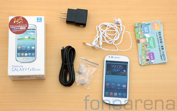
You can watch our unboxing video below –
httpv://www.youtube.com/watch?v=2AqMf9iAPu4
Hardware Walkthrough
The design of the phone pretty much resembles every other Galaxy phone released in the previous year after the Galaxy S3. With curved corners and curved edges similar to the Galaxy S3, this is very much a mini Galaxy S3 in its looks, except for some really minor changes in the physical home button, the placement of the speakers, the LED flash on the back, and of course the materials used.
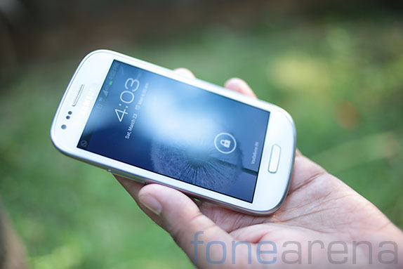
On the front face of the phone you have the display made of Gorilla glass spanning 4 inches of real estate. The slightly curved glass, which is the smoothest we have ever used, does not sit in a recess and covers the front completely, leaving space for some important components like the front facing camera, the home button, the proximity and ambient light sensors and the most important earpiece. It was disappointing to note that there was no notifications LED on the device, which is a must have these days on any Android phone.
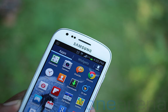
The home button is slightly different from the Galaxy S3’s design, and the build quality of the home button too is different.
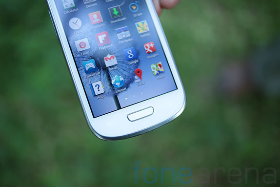
We felt that the elevation from the surface could have been higher, the tactility was ok though. Along with the home button, are two capacitive Android shortcuts, for options and back respectively on either side of the hardware button. This is the typical Samsung style layout that’s evident in all of its Galaxy devices.
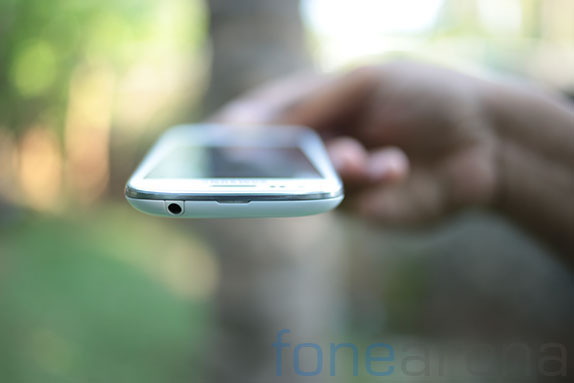
Over at the top of the phone you can notice the 3.5mm audio jack for all your audio needs, and a small opening for the battery door, which makes it easy for one to pry open the cover.
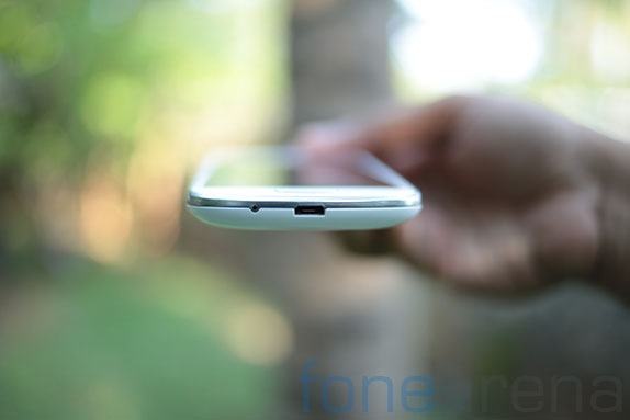
On the bottom you have the micro USB port and the primary microphone.
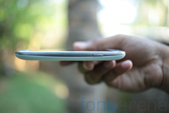
On the right side of the device is the power/lock switch and on the left side is the volume rocker, again resembling all the other Galaxy devices, no differences here.
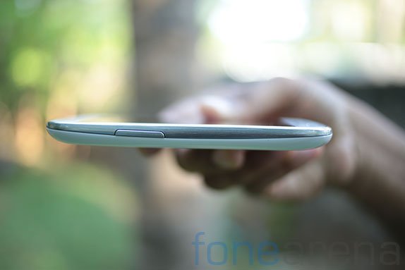
In fact, the chrome coloured plastic strip on the sides is very much the same one as the Galaxy S3.
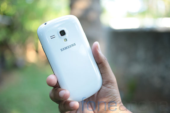
On the back, you have the 5 megapixel camera unit with a single LED flash and the loud speaker with two grilles. Below the LED flash is the Samsung logo. The battery cover is completely plastic. Even though the plastic looks similar, we felt that it’s really different and was of lower quality without the polycarbonate glaze that was applied on the S3. It also attracts a lot of scratches unlike the S3.
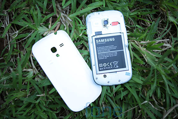
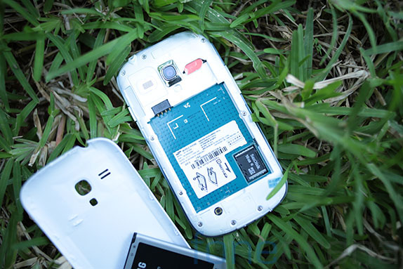
Opening up the back cover, you can see the 1500 mAH battery and the mini SIM slot, with the micro SD card slot tucked under the battery, rendering it impossible for hot swap.
Being a tiny device, it comes in at 9.9mm of thickness and weighs just 111g. This makes it so pocketable and light. So much that you might not notice it’s in your pocket sometimes. A far cry from the devices that have been flooding the market recently.
Display
The Galaxy S3 mini’s display, at first glance, seems like a great one. Only when you start using it, you realize something very familiar. It’s a 4 inch WVGA Super AMOLED display with a Pentile matrix sub pixel arrangement. Eerily familiar? Damn right, it is. The Samsung Galaxy S, the original superhit had the same display.
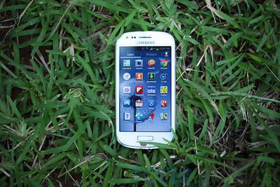
The screen this time is much better, with a great oleophobic finger print resistant coating and curved glass, but the display remains almost the same, with probably much lower brightness levels than the Galaxy S. The colours are highly saturated with infinite contrast rendering blacks really deep. The pentile matrix is definitely a distraction these days mainly because most devices comes with a RGB LCD and are of higher resolution almost all the time. In our time with the device, we found readability a concern. Major pros of this display are saturation and the brightness levels indoors, and yes, amazing viewing angles. Cons are outdoor visibility and the pentile WVGA display. Might be adequate for most conditions except for the ones stated above. Not a bad display in any stretch by the way.
Camera(s)
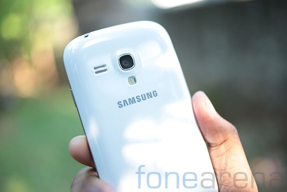
The camera on the S3 mini is a 5 megapixel unit. In our tests, it proved to be very mediocre, which is expected for this mid range device, but for the price it’s selling at, we definitely expected better. The images have plenty of noise even in daylight, and most images have washed out colours.Low light photos are too noisy and the LED flash is weak. Here are some full resolution samples in every lighting condition we could test in, for a better understanding of the image quality.
Day Light samples –
Low light samples –
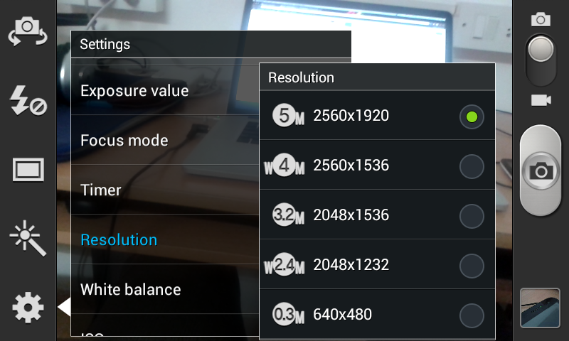
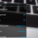
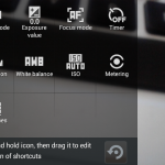
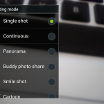
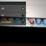
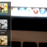
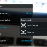
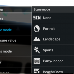
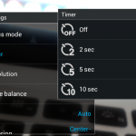
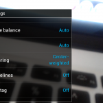
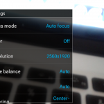
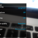
The camera UI on the other hand, which is part of the TouchWiz UI is very flexible. We really like it, as it offers a lot of options for configuration and creative control. You can choose image sizes, apply filters, and even configure the on screen shortcuts. Here are some screen shots from the camera UI.
There are plenty of scene modes and shooting modes to play around with, and there are artistic filters too. With options for ISO, White balance, metering and even GPS control, you will not be missing out on the camera UI features, but like we said, the image quality leaves a lot to be desired. We also noted that the zero shutter lag for stills and taking photos while recording video options were missing, probably owing to the lack of power from the SoC. The camera can record 1280×720 videos at 30 fps, and has decent mono audio recording in video. Again, there is nothing special to write about it, so kindly watch our video samples below to make your own opinion on the video quality.
httpv://www.youtube.com/watch?v=2-QVVtKCPYQ
The front facing camera can take VGA 640×480 videos and photos, pretty decent for video calls. We tested some Skype calls on it, and found it to be ok.
Internals and Performance
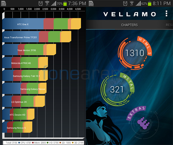
The Galaxy S3 mini is powered by the ST-Ericsson NovaThor U8420 SoC, which is quite interesting for a Samsung device. It is even more interesting because of the fact that details of this SoC are not listed on the ST-Ericsson website itself. However, the details from other sources and from Samsung themselves indicate that there is a dual core 1 GHz processor, based on the Cortex A90 architecture inside the phone and is powered by a single core ARM Mali 400 MP GPU for the graphics needs, which lines up nicely with the officially listed U8500 chipset from ST – Ericsson. So the U8420 might just be a cheaper variant.
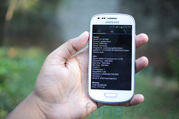
There is 1GB of RAM which is adequate for daily app needs as well as times when there is intensive load. There are two internal memory variants of this device – 8 GB and 16 GB. The one we have has 8GB out of the box, with around 4.54 GB available as user memory. And yes, as noted earlier, you are allowed to install micro SD memory cards of upto 64GB in size into the slot. We have a 16GB card working fine. We feel that the 4.54GB of memory which is both phone memory as well as internal storage, is completely adequate for app storage.
httpv://www.youtube.com/watch?v=bLOM-TUpMDs
The day-to-day performance of the S3 mini is great, with fluid animations and lag-free games. However, we found ourselves clearing out apps in the burgeoning app list after a while as the RAM started to choke the system. Apparently, we get only 804 MB of usable RAM in total, and most of the times, with a couple of apps in the background, it fills up to >507MB. So, you can imagine what it will feel like after loading up a lot of apps. But when we are careful, the device is almost always lag free and very zippy.
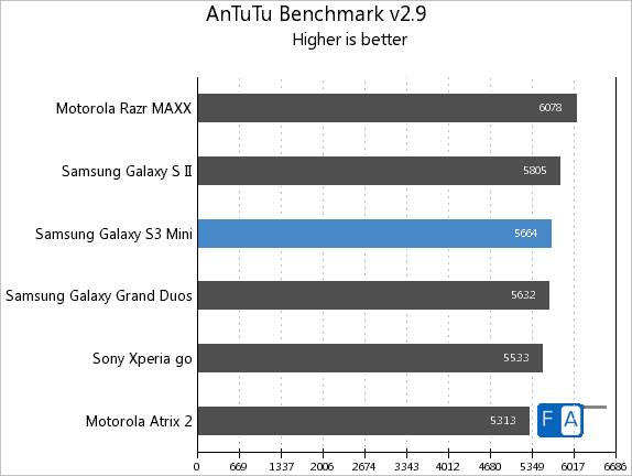
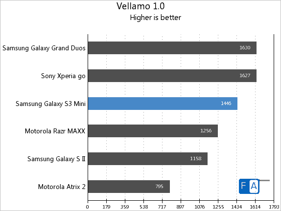
The benchmark scores were appalling though, you can check out all the other benchmark tests in our benchmarks post here. In comparison to most other devices, the performance seems to be lacking, but we never found that to be a concern in our day to day usage to be honest. Games ran great too, with no stutter. So, overall, we are pleased with the performance of this device, and we largely attest it to the optimization work done in the OS with respect to Project Butter.
Connectivity and call performance
The device comes loaded with all the usual connectivity options you would expect from a smartphone. It has 3.5G HSPA support, WiFi a/b/g/n, WiFi Direct, DLNA, Hotspot support, FM Radio, Bluetooth 4.0 and even NFC for contact-less communications.
The call quality was decent, but with a lack of a second noise cancelling microphone, we found that some callers frequently complained of muffled output on their side. Not a dealbreaker to be honest, but that was a small bit of concern for us. Otherwise, we didn’t find any discrepancies with mobile data speeds or other details regarding connectivity. In fact, we found the mobile data performance on our 3.5G connection to be very speedy. The loud speaker was good enough and does not get muffled easily, paving the way for overall good performance.
Software
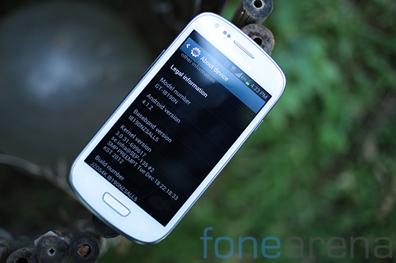
Running on Android 4.1.2, the device packs all the improvements that JellyBean brought to Android which includes Project Butter, Google Now and expandable notifications. On top of all this goodness is the TouchWiz UI layer that is plastered on all Samsung devices. If you ask us, we like and dislike TouchWiz at the same time for different reasons.
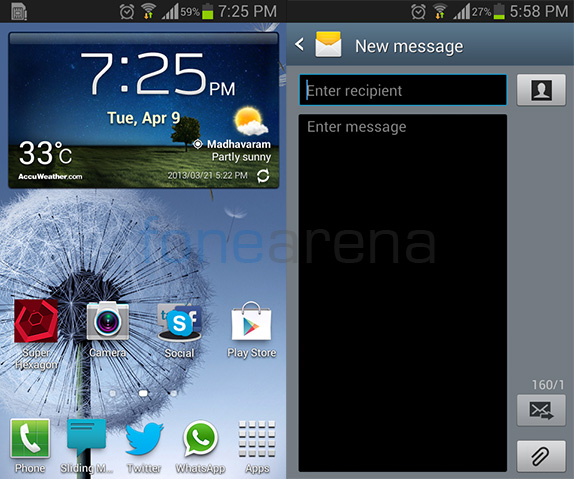
First, the design is dated in most of the modified apps, especially the messaging app, which looks absolutely horrendous. Same goes the settings page, and the blue bar in most modified applications.The bloop sound in the UI is ridiculous and thankfully there is an option to turn it off. The lockscreen is barebones, and the font is ugly. We also hate the fact that basic apps like the dialer, call UI, calculator and calendar(S-planner) are messed up with Touchwiz-like UI, and are devoid of anything holo, the direction that every Android device should take in terms of UI. There are also these unused gimmicks like Smart Stay and the various motion gestures that we have never used at all. Oh, and some features from S3’s TouchWiz are missing here, for example, the ripple effect lock screen, multi window, zero shutter lag, stills while recording video etc
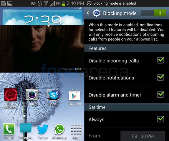
But there are also the things we like, for example, the pop up play feature, which lets you overlay any video on a small pop up on the screen, and text or do whatever on the UI. The blocking mode powers down notifications for a specific time interval with granular control over apps. Our love doesn’t stop there.
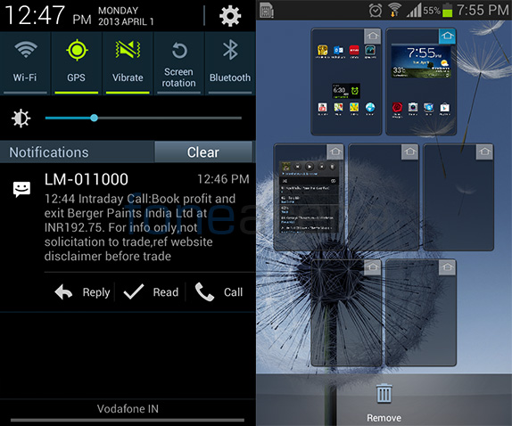
The customizations that TouchWiz brings are even better, and most are not available in stock out of the box. Lets start with the home screen. There are seven customizable home screens, which you can fill with widgets and folder of apps or shortcuts. The notifications drawer has quick toggles for the most used actions on Android, which is a huge time saver. There are really useful widgets like the assistive torch light for example. Even the music player widget has much more content at a glance. Even the multi tasking switcher has shortcuts for the task manager, which we find really convenient.
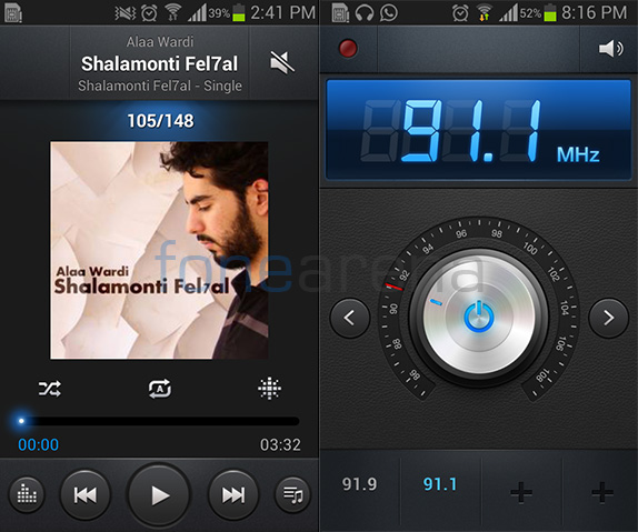
Samsung also has a lot of its own custom apps for media, including the music player, video player, voice recorder and the FM radio which offer a lot of features and look better than other TouchWiz apps.The FM radio app especially is pretty nice, and offers RDS output when available, along with in app recording.
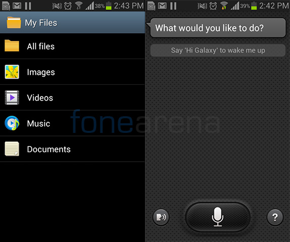
A neat file manager is also included for all your file management tasks. There is also the Siri-like virtual assistant called S-voice, if you are into that kind of a thing. We definitely like the video player because of the face that it offers a lot of playable codecs so we never needed to worry about downloading of loading up a video from our PC.
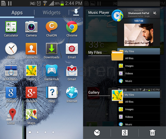
Apart from the default Google apps like Gmail, Gtalk, Chrome, Google Now, YouTube and Google plus, and the Samsung apps like S-Memo, S-Planner, S-Suggest and Samsung apps, Samsung also bundles its own messenger called Chat On and the magazine app, Flipboard.
PC Connectivity
Over micro USB, the S3 mini can connect to the PC, but there is no bundled software, and you can only use MTP, rather than mass storage for data transfer. It’s a good thing as well as a bad thing in terms of functionality, but we didn’t find any issues in our time with the device.
Battery Life
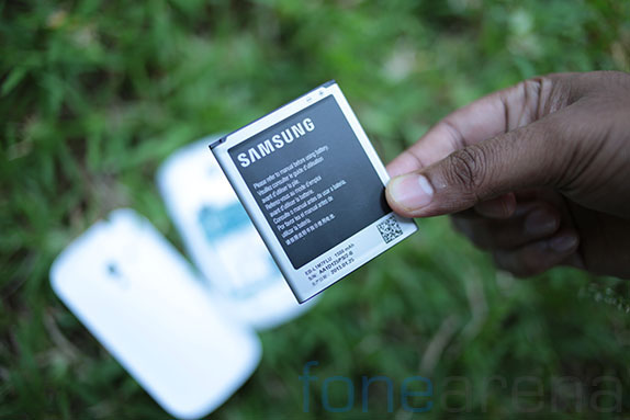
With a battery rated at 1500 mAH, the S3 mini is ok in terms of battery life. After days and days of real life testing, we found that normally, under our usage which includes a lot of Twitter, Whatsapp and playing games, we got 11-12 hours of up time and then we had to connect the charger, with battery remaining in the low twenties.
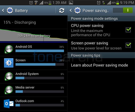
But there is a power saving mode that is actually a great way to increase your usage times. Basically what the power saving mode does is, decrease your CPU clock speed to lower levels because most of the times you are into less demanding tasks and then also lowers the brightness level and frame rates of the display to substantial levels so that it saves battery. Why we are emphasizing on this is because it easily gave us 4 extra hours of up time with minimal loss in display performance or even gaming performance for that matter. So, in the end, we got around 16 hours of uptime with similar usage, with power saver enabled. We definitely recommend using this mode if you are getting this phone.
Conclusion
The Galaxy S3 mini is a great little device. Is it just a smaller S3? No, it totally looks like a S3, but there are features and performance benefits you will miss if you are looking for a smaller S3. And yes, it is completely unique and stands on its own when it comes to device capabilities. This device is not available in India, but its extremely look-alike brother Galaxy S Duos is, and is available in the Dual SIM variant which makes sense for the Indian market, and did we mention it is cheaper? Retailing at 300 EUR elsewhere, this might not seem like a great device for that price, but compromises on the display and camera aside, you get great performance in a small package, and if you are looking for a pocketable smartphone with most of the features from the S3, then this might be it.
Pros
- Portability and pocketability
- Thin and light weight
- Great performance
- Smooth glass makes it a breeze to use
Cons
- Outdoor visibility of the display not up to the mark
- Plastic build quality might put you off
- Cameras are poor
- RAM buckles under pressure


