
Facebook Home, the launcher aimed at overtaking your Android phone has just leaked out in a half baked beta release. We took it for a spin on our Google Nexus 4, and found it to be quite buggy, but using the UI for the first time was a fresh experience. So, what do we think about the Facebook home? Will it change your mind about Facebook on mobile? Should you go for Facebook home, if you are a heavy user? We will try to answer them in our initial hands on impressions, past the video below –
httpv://www.youtube.com/watch?v=Bq2JsyFOVeA
We were required to install three APKs to make the Facebook home work. Once installed, you need to select Facebook home as the default launcher.
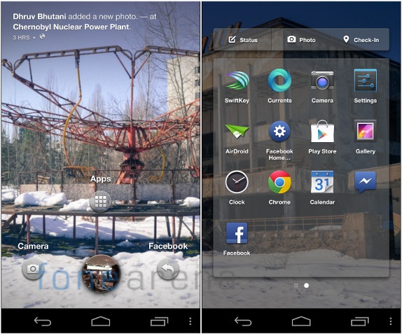
The first screen on the left is the one you get once you unlock the device. The background is a slide show of your news feed with pictures animating slowly with the Ken Burns effect. On the top you can see the information about the photo. The round button at the bottom is the profile bubble, which, on activation reveals three quick shortcuts. On the left is the camera, which currently doesn’t work, while on the right is the most recently opened app, and on the top is the shortcut for the app drawer shown on the right.
The app drawer has all the pinned apps, which are selected from the app list when you swipe to the right. Above the pinned apps, there are three facebook shortcuts for posting a status, a photo and a check in. While these are not working in the current build, it is expected that they will get the respected functionality done.
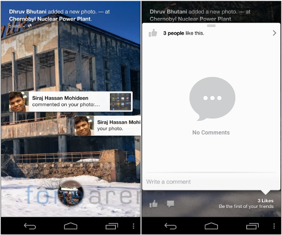
If you have received any notifications, they will appear on the lock screen and you can swipe them away or tap to open them. If there are a bunch of notifications, you can grab them and throw them with a swipe down gesture. Coming back to the cover feed, you can quickly preview the likes and comment on the photo by touching the bottom right part of a cover feed picture. Shown on the right side picture above.
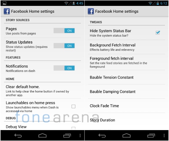
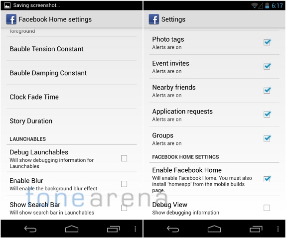
Since this is a beta app, there are two Facebook home settings, one is full of developer related tweaks and filters, while the other is more facebook management oriented, with full of filters and notifications tweaking. The one above is labeled “Facebook home settings”, and the one below is labeled just “settings” when you press the overflow menu.
For now, only a few functions work as we said earlier. We couldn’t get the camera or the chat heads working for example. Clearly is a beta app, and we hope to get the real deal on the 12th, which is just 4 days away.
So, coming to our impressions. Basically the cover feed is a slide show of your news feed in full lock screen style pictures and a nice animation. Do we like it? Yes. It is beautiful and makes browsing the news feed easy and liking, commenting from outside the app is much welcome. The app list with pinned items too makes sense, but we definitely miss our widgets. Once enabled, the Facebook shortcuts on the app list will make sense, but currently we can’t do anything about it. Overall, we find the aesthetics pleasing to the eye and the animations really snappy, which, for a beta app, is a great achievement.
If you are totally into Facebook and it is really an important part of your life, then we think Facebook home is the right fit for you. However, we are slightly concerned with privacy, because the lock screen is going to show everything. If that’s totally not a problem then, Facebook home should be really enjoyable.
Also, this changes the game considerably in the social networking space. Facebook have managed to create something so integrated and far from the default experience, making any Android phone look like a Facebook phone. With Facebook being the numero uno app in all the smartphone app stores, it’s not really hard to guess if Home will be widely accepted or not. Starting 12th, we will be seeing it roll out to a few devices and then more, with monthly updates planned for adding more functionality. Exciting times ahead.
Have any questions about Facebook Home on the Nexus 4? Let us know in the comments section below.
