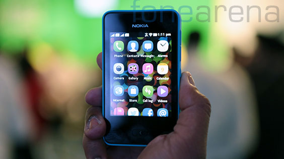
Nokia Asha 501, the company’s latest attempt at out-innovating the low end smartphone market, was launched today in New Delhi and we got some fair play time with the device. Based on the new Nokia Asha platform, the device was previously demoed by Nokia’s Peter Skillman, who led the whole effort of bringing the intuitive N9 UI to the low end. After a healthy hands on time with the device, we can’t withhold ourselves from telling you about this device. But before that, here is a complete overview of the device –
httpv://www.youtube.com/watch?v=0MgZbZObE7s
If you haven’t read our earlier Nokia Asha 501 posts, you must, now –
And now, our first impressions of the device. There is one thing that stood out from the presentation and that was the software, so lets start with that!
No more series 40!
This has been a long time coming. Lets go back a couple of years. After the Nokia N9 was declared the only Meego device ever, Marko Ahtisaari, the Design head at Nokia said that the swipe UI will live on, but days and months passed without any information on how it is going to endure at Nokia. Then suddenly, one fine day, the codename “Meltemi” appeared on the interwebs. This was supposedly the low end platform in which the Swipe UI was going to live in. After officially killing off the project and one acquisition later(Smarterphone), we are at the point where we are finally starting to the see the N9’s famed UI coming back and how! The Nokia Asha platform, as it is called now, is completely new and Nokia is finally losing the Series 40 monicker that was associated with previous full touch Asha devices like the 311.
Beautiful hardware
Nokia’s strategy this year has been clear. Right from the Lumia 920 to the Nokia 105, you have bright colours, a similar design language, robust build quality and more than anything, a new familiarity for the Nokia brand. With devices like the Asha 501, it is even more evident. Coming to the Asha 501, the body immediately reminds you of most of the recently launched Lumia devices, especially the Lumia 620. Right from the curved corners, a strip of Nokia branding below the camera, and a slightly curved back that sits nicely in the hand, Nokia has done everything to ensure they maintain the design language.
There is also this interesting design decision to keep intact the original colour of the phone in what, Nokia calls, the beauty spot. While there are interchangeable shells, the phone’s original colour remains intact at the beauty spot, making it dual tone when you use it with other coloured shells. Another interesting design decision is that Nokia has decided to bundle red headsets with all the Asha 501 devices irrespective of the colour. Nokia says that they initially chose the “red” as the hero colour of the Asha 501 and they say that the red earphones, if consistent across all the colours will make a style statement. They also assured us this is no cost cutting measure.
Overall, we are pretty impressed with what Nokia has done with the Asha 501 in terms of hardware. It’s certainly a good looking device! Regarding the internals though, the device is powered by a 1 Ghz processor coupled with 512 MB of internal memory. Nokia insisted we do not need to care about the internals when the performance is good enough, we kinda agree. There is a single SIM version as well as the dual SIM version, with hot swap facility for the second SIM as well the micro SD card slot which can support cards up to 32 GB. Nokia has bundled a 4GB memory card in the device by the way. Curiously though, the 3G version of the device is expected to launch a little later. The camera is a fixed focus 3.2 megapixel camera, which looks and acts similar to the one on the Nokia Asha 311.
Swipe returns!
As we mentioned above, the Meego-Harmattan UI is back, in a different platform, yes, swipe is back. The swipe gesture, coupled with the Harmattan UI brought some jaw dropping user experience to the N9. Nokia promised they would bring it back and they have delivered.
You can double tap on the sleeping screen to unlock the phone, you can swipe away the lock screen to open up the app screen in a nice 2 axis animation, you can swipe away apps from the sides and it will take you back to the app screen, you can set the alarm using the very intuitive Meego-style clock, you can select keyboard language by holding on the space button on the keyboard and swiping left or right, you get squircles on icons, the radio buttons, the check boxes, the whole UI with rounded edges, almost every aspect of the UI will remind you of Meego-harmattan.
However, there are some differences and new changes. First of all, there are only two home screens now. This is a change, even when compared with the previous full touch Asha devices. There is this app screen and there is this other screen called the fast lane. It was interesting to note parallax scrolling was applied to the wallpaper which was prominent in the background of both the screens. The app screen will have all your default as well as downloaded apps, with the important ones at the top. The fast lane screen however, is an interesting take on notifications, multi tasking and the timeline. Nokia says they have segregated the fast lane into three parts, the present, which will have all your current notifications(sometimes with actions), the past, which are your previous interactions and events that are visible when you scroll down, and the future, which are you calendar appointments and other things that appear when you scroll up.
The fast lane knows which app you have recently swiped out of, and displays the app in first priority. if you receive a message or a missed call, they will appear on your lock screen and on your fast lane. Fast lane will have special controls and actions for specific apps like the music player(the controls appear), unsent messages(tap to go straight into editing it again) and a lot more. It will also support Facebook and Twitter notifications and whichever app supports notifications, right out of the box, which is very handy. This certainly feels like a modified take on the N9’s timeline that appears when you swipe to the right. And regarding multi tasking, all the apps are in frozen state and they get back to the same state when invoked from the fast lane, this interestingly applies to videos as well.
Another interesting UI change is the contextual menu. While the N9 as well the previous Asha touch UI had an options button in the menu bar below or at the top, the new UI incorporates a shade at the bottom that you can pull up with a swipe up gesture. This, we feel, massively increases the usage of the real estate, which is good for a small 3 inch screen. And the overall performance is very awesome for a low end sub 100$ device like the Asha 501, for proof, watch the video above, again.
Xpress browser and Xpress Now
Pre-installed with the Asha 501 is the Xpress browser and a web app called the Xpress Now. The Xpress browser was the fruit of an acquisition, which specialised in server side data compression for mobile browsers. This helped Nokia reach the low end market which usually is very data sensitive. With unto 90% data compression, the data usage when you use the Xpress browser is much reduced. This however, has been prevalent with various other mobile browsers such as the Opera Mini. However, with the Xpress cloud platform, Nokia has slightly improved the usability of the browser and that brings us to Xpress now.
Xpress Now is a new web app that is built into the browser. This web app, when invoked, automatically generates a feed of articles, news and various content that is automatically curated based on the location and data from the other 80 million users of the Xpress browser. Presenting the content in a magazine style view, the Xpress now web app lets you share the articles to social networks in a jiffy. Nokia believes that the automatically curated content will serve the needs of a casual user of the Xpress browser. It has two filters for the curated feeds, one is titled “What’s hot” and the other is “You may also like”, both pretty self explanatory. The content refreshes itself for every fifteen minutes of usage. One can even like articles, and those likes are registered on the Xpress cloud platform, acting as a parameter in curation. Pretty cool, eh?
Other goodies
In addition to all this, Nokia has said that their mapping technologies will be present on the Asha 501, along with various pre installed apps like Facebook, twitter, LinkedIN, Foursquare and more. When asked about whatsapp, which was curiously absent from the device, Nokia said that they are in talks with Whatsapp to develop an app for the Asha 501 as soon as possible. Being based on a completely new platform, Nokia has sought endorsements from various app developers like EA games, which is bundling 40 of its games with this device, Reliance games, a local developer which has pledged to develop games for the new Asha platform and more. Nokia has promised to bring 80% of the Nokia Store apps on the Asha 3xx series of devices will be available on the Asha 501 soon.
And finally, one important hardware aspect of the Asha 501 is the battery life. Nokia promises 17 hours of talk time and 48 days of standby with the BL-4U 1110 mAH battery, which is pretty damn impressive! We will have a lot more to say when we have the device for review. Till then, we feel that Nokia’s attempt at re-inventing the affordable smartphone is solid and time will tell if the device is a success or not.
