Indian smartphone manufacturers have improved their game significantly over the past few months. On the forefront alongside its contemporaries is Gionee that has been introducing some truly compelling hardware. We were quite pleasantly surprised by the Gionee Dream D1 that we reviewed some time back and were hence quite excited when the company passed us the Elife E3 to check out. What do we think about the handset ? Read on to find out more.
Design
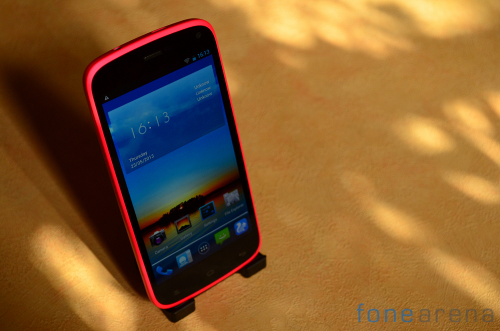
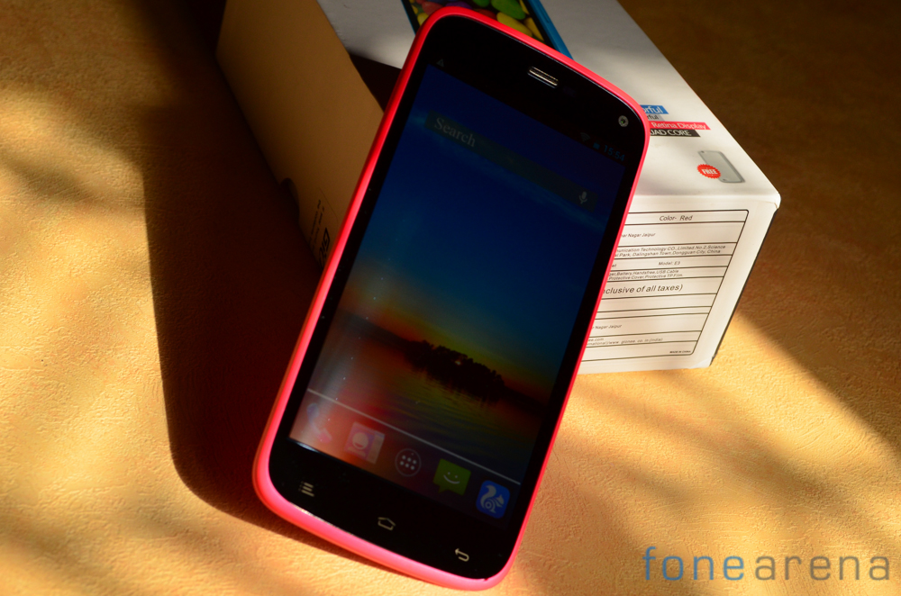
The moment you set your eyes on the Elife E3, you know that the handset stands out from the crowd thanks to its svelte 7.9mm profile. The use of muted pastel shades instead of the drab black and white used by most too makes the handset appear attractive.
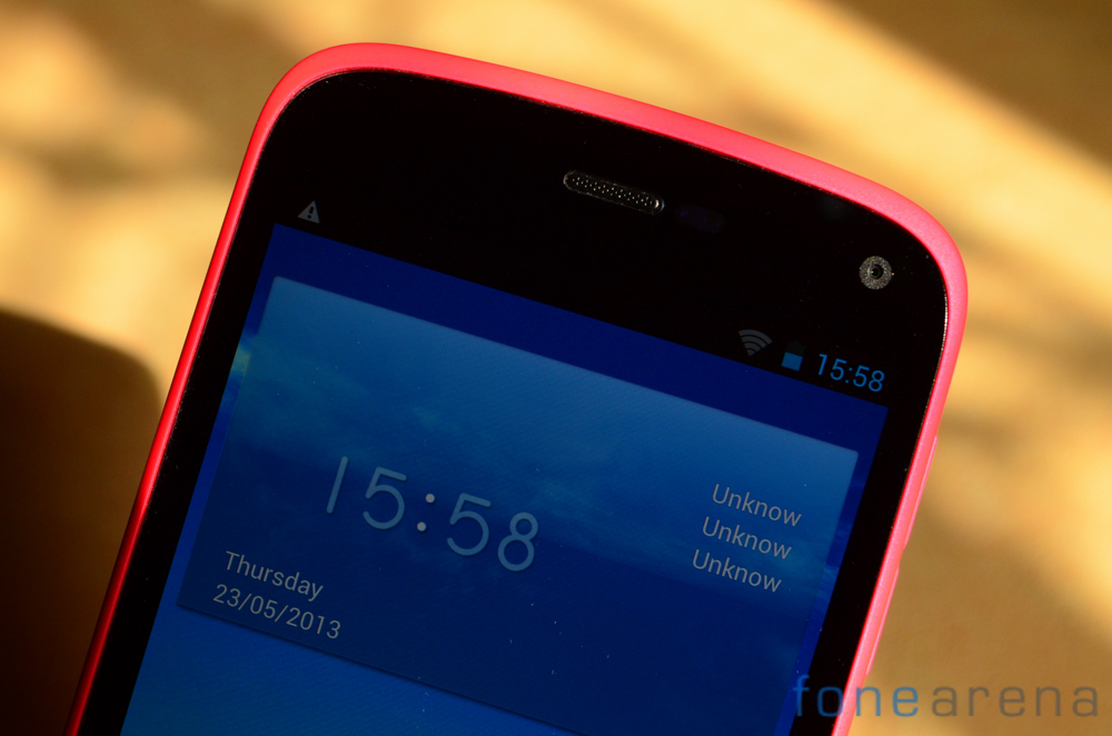
The front of the phone is mostly dominated by the 4.7 inch 720p LCD IPS screen. Fairly large bezel space can be seen on the top and bottom but not so much on the sides of the handset which makes it quite comfortable to hold. A 2MP front facing camera is located above the IPS display to facilitate video calling.
Below the screen lie three capacitive buttons as is the norm for Android running devices. The buttons correspond to back, home and menu and are sensitive enough. The backlighting below the buttons however tends to be a bit uneven though it does not get in the way of functionality.
Moving over to the back of the handset we can see Gionee logo sitting proudly in the center of the handset while a DTS logo can be seen in the lower half. The 8MP camera module and its accompanying LED flash is located towards the top left of the Android running phone. The Gionee Elife E3 has a removable back cover as expected under which you can spot the dual SIM card slots and a micro SD slot. We really like the soft touch, matte finish plastic used here and the colors too are very appealing. While we reviewed the hot pink variant, the cyan colored version of the phone too looks very appealing.
Display
The Gionee Elife E3 has a 4.7 inch 720p HD display that is of the IPS variety. As is, the viewing angles are quite decent though not the best. Color saturation is great and brightness too is very adequate under normal usage conditions.
Where the display does let us down a bit is usage under bright sunlight. While definitely visible, we would have preferred it if the brightness levels could be cranked up a notch or two higher.
Software
The Gionee Elife E3 runs Android 4.2.1 under the hood with a custom UI layer on top. While good looking for the most part, performance can be a bit iffy. It is not uncommon to see interface lags though this does not carry over in most of the system apps. Gionee has provided an option to skin the interface and provides a range of options baked in the firmware. This includes a ‘stock’ look theme as well. Let’s take a brief walk through the software on the E3.
There are some thoughtful additions through out the interface and this includes the ‘common settings’ tab under the settings pane. This should make it easier for new smartphone buyers to access important settings without getting overwhelmed. Additionally the availability of the option to switch off and then turn on the phone on a set schedule will be appreciated by some users.
The theme interface choser panel can be seen above where Gionee has provided five different theme options. While the Android theme sticks closest to the stock experience, you can try out whichever theme you want. We’d recommend switching over to a faster and more feature packed launched like Nova Launcher though as it really speeds up the interface.
Performance
The Gionee Elife E3 does not set any new records in benchmarks but performance isn’t too bad either. The random interface lags and can be narrowed down to unoptimized software as the phone blazes through with a third party launcher. All system apps remain smooth and the gaming experience too is lag free. We’ve previously posted about the Gionee Elife E3 benchmarks in a separate post that you can check out, below we’ve embedded a few of the critical ones.
The Quadrant benchmark measures CPU performance on the phone and as we can see the E3 ranks right alongside the Micromax Canvas HD. The only phone that gives it stiff competition is the Karbonn Titaniumm S5 which is powered by a Qualcomm processor.
The Vellamo benchmark measures web rendering performance and as we can see here, the Elife E3 doesn’t fare too bad and is again in line with the Canvas HD. In real life usage too the performance is satisfactory for the most part and we can’t really complain about it.
Camera
The Gionee Elife E3 is equipped with an 8 MP camera that can also shoot video in Full HD. This is accompanied by a 2MP front facing camera. Our experience with the camera on the E3 was a mixed bag and we can’t say we were very satisfied by the results.
The camera module gently sticks out from the shell of the handset that makes it susceptible to picking up scratches. An LED flash is located to the right of the phone. Coming to the image quality, The Gionee Elife E3 manages to take fairly noisy images even in brightly lit conditions. While the white balance tends to be spot on most of the time, we noticed that the camera module tends to underexpose images which results in dull looking shots.
As can be seen here, the brightly early morning scene turned out quite dim. It is also possible to see a bit of a purple tinge in the shots.
Digital noise can be an issue as well in lower light conditions but our concern was mostly to do with the underexposed shots. Thankfully this does not carry over into video content which makes us think this is just a software bug that will hopefully be corrected.
httpv://youtu.be/a8IdKtnIWAY
Video footage is in focus for the most part and detail levels are good with consistently sharp footage. Audio levels can be hit or miss at times with the phone struggling with particularly loud noises but that is an issue that is faced by most smartphones.
Connectivity & Storage
The Gionee Elife E3 offers standard connectivity options like Bluetooth 4.0, WiFi and GPS. Built in storage is 16GB and this can be expanded via the microSD card slot built into the phone. The phone is of the dual SIM variety and users get access to full size SIM card slots hidden behind the back cover.
Battery Life
The Gionee Elife E3 is equipped with an 1800 mAh battery pack that delivers decent though not exceptional battery life. In our standard battery life test with the screen set to 60% brightness, WiFi on and connected, active usage we were able to get about 3.5 hours of usage time.
In average usage it was definitely possible to get over a work day of usage time out of the handset though we’d recommend charging it overnight to make sure you don’t end up with a dead battery the next day.
Conclusion
The Gionee Elife E3 is a really nice phone that blends great and original design with performance that is just about sufficient to deliver a decent experience.
We weren’t too impressed by the camera and the occasional lags in the interface were a cause for concern but we can still recommend the handset which delivers a really good experience at a great price point.
Pros
- Gorgeous ergonomic design
- Good display
- Decent performance
Cons
- Camera performance
- Occasional interface lags


