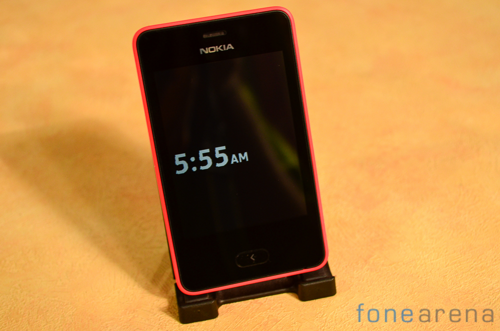
The Nokia Asha 501 forms the next generation of feature phones. Bright colorful designs, a touch centric interface and the legendary Nokia build quality are poised to offer a very compelling smartphone-like experience to a first time user. Here’s a gallery of Nokia’s latest while we work on the review.
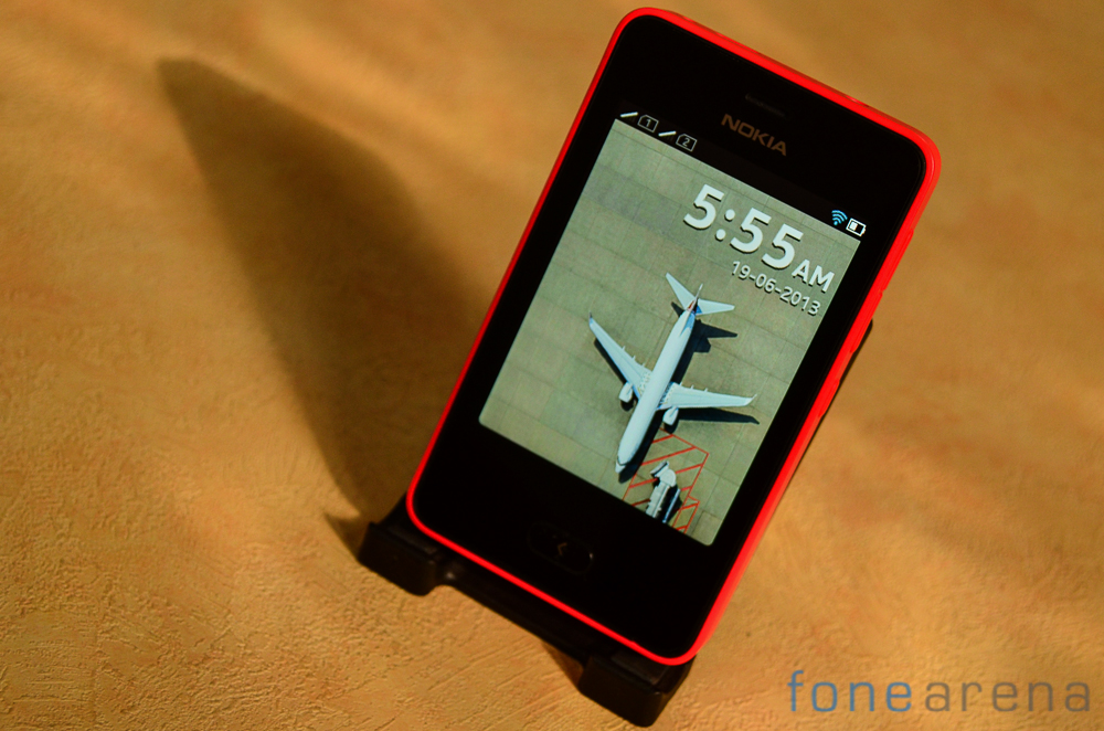
True to the all touch design philosophy,the Nokia Asha 501 can be navigated for the most part using gestures. The handset sports a single button below the screen. The button corresponds to going back.
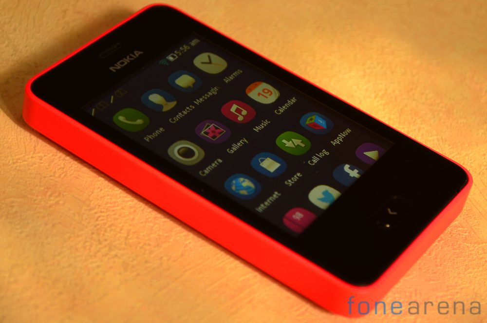
Those of you who are aware of and have experienced the Harmattan based Nokia N9 will feel right at home on the Asha 501. The interface elements are very similar and the iconography used is reminiscent of the N9.
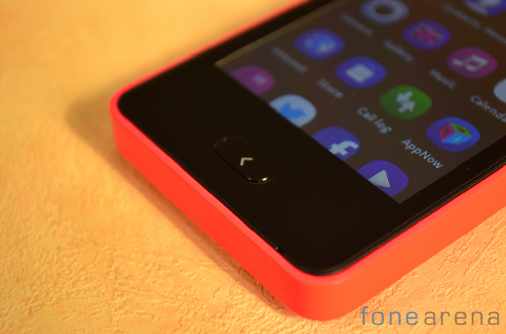
A single button can be found below the display and is used to go back a menu. The button provides good tactile feedback.
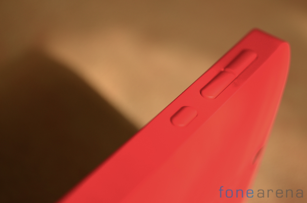
The remaining buttons can be seen on the right side of the handset. The segmented volume rocker and power keys all provide sufficient feedback and have a very reassuring click to them.
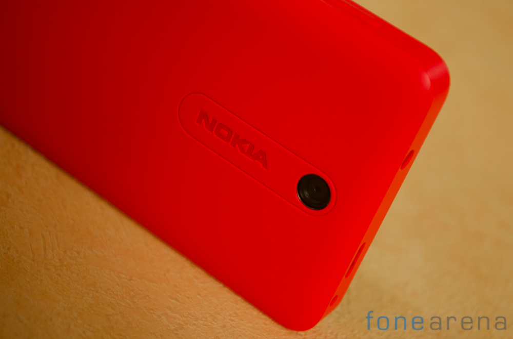
Continuing the Lumia inspired design language is the back of the phone. The camera module can be found inside an ‘island’ etched into the back with the Nokia logo next to it. The chrome plate from Nokia’s Windows Phone devices however is missing here.
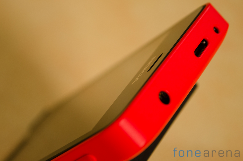
Over at the top you get a 3.5mm audio jack, a USB port and even a 2mm pin charger slot. This should come in handy as it will allow users with existing Nokia feature phones to continue using their chargers with the handset.
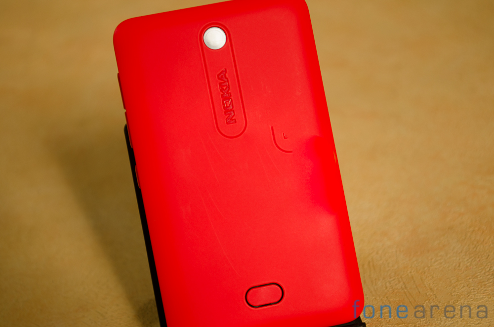
The back of the Nokia Asha 501 features removable back covers and presumably you should be able to buy replacement colors to freshen up the handset. Our early impressions of the handset are quite positive particularly in the hardware quality department. As always, check back for the review soon where we’ll bring you the lowdown on the Nokia Asha 501.
