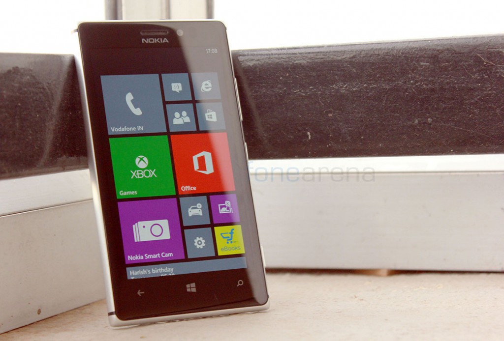
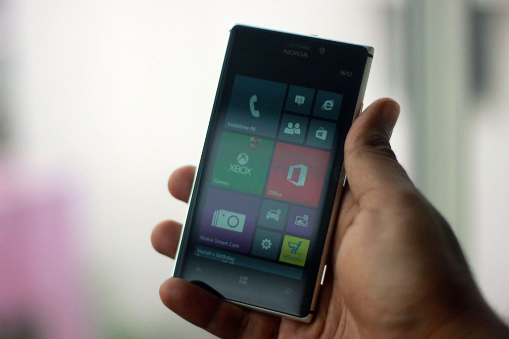
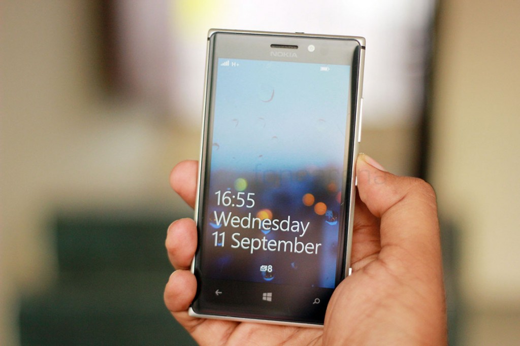
The Nokia Lumia 925 was launched in London a few months back, as the company’s answer to all the issues related to the Lumia 920. Concerns of bulk, thickness and similar looking design were addressed, with the Lumia 925 sporting a new Aluminium based design, a thinner and lighter build, bringing along some needed changes. The Lumia 920 was already a well rounded flagship smartphone, and with Nokia supposedly fixing all of its issues in the 925, does it make it the best Windows Phone currently available in the market? Our detailed review might help answering that question, read on.
Video Review
httpv://www.youtube.com/watch?v=QKjcWbwpJc8
Box Contents
The Nokia Lumia 925 comes with all the standard box contents you’d expect. Nothing more, nothing less. The box contents are –
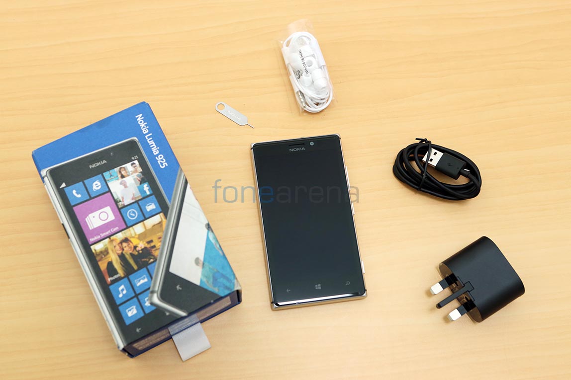
- Lumia 925 in White
- White ear phones with mic, in-ear type
- SIM ejector tool
- Micro USB cable – black
- Travel charger plug – black
Design, Build and Ergonomics
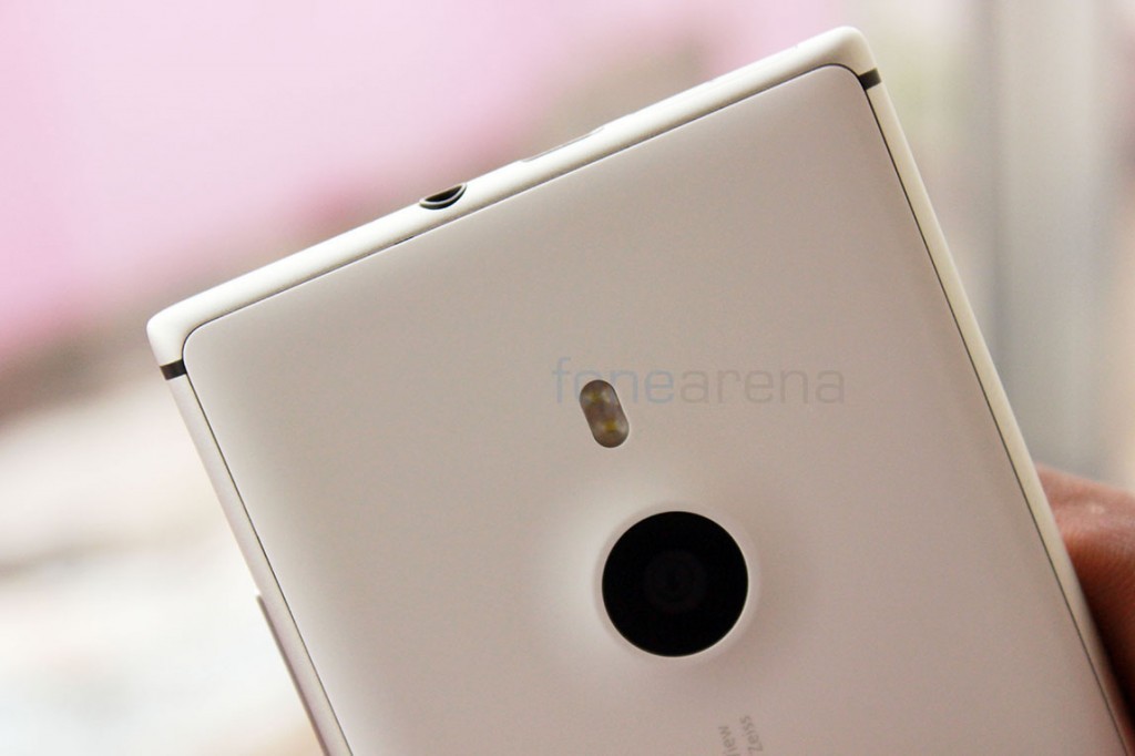
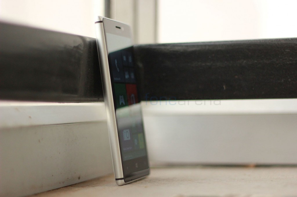
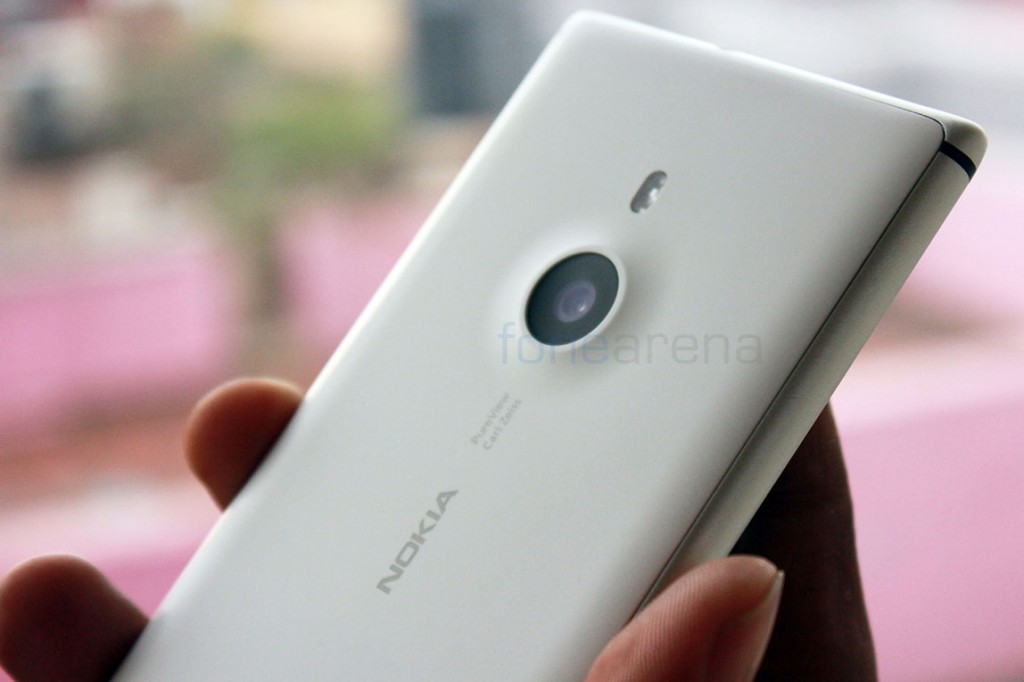
As noted earlier, the design of the Lumia 925 was one of the key changes that Nokia did to the device, in terms of fixing the 920’s complaints. The all new design, that doesn’t resemble any previous Nokia device, is built in aluminium and polycarbonate at the same time. The flat top and bottom parts are now curved like the sides and with the screen and the back also curved, the device, although made of various parts, feels cohesive.
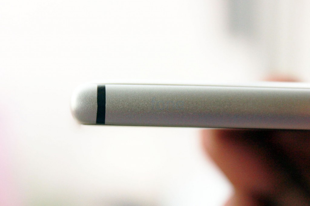
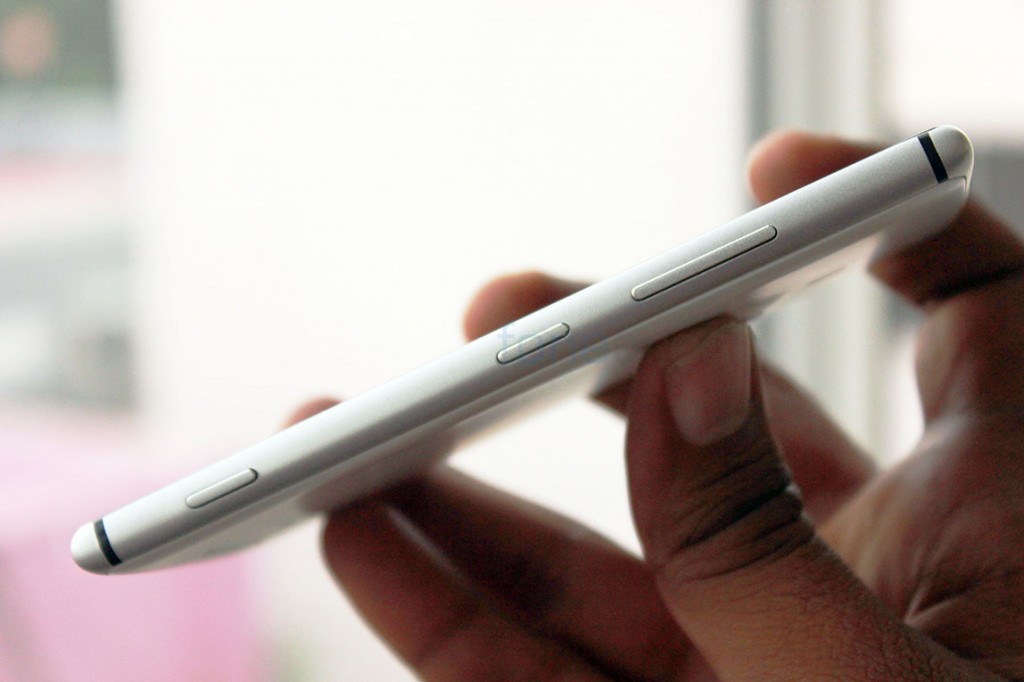
There are four black bands on the sides which are purpose-built for better antenna reception, that also improves the aesthetic value. The build can be considered a mix of three materials. The front is a single piece of gorilla glass, the sides are aluminium and the back is matte polycarbonate plastic. While it makes the device much more premium than, say, the 920, there are also pitfalls associated with this design and build.
One, the device is too slippery. With a really smooth finish for the aluminium sides and a soft matte finish for the polycarbonate back, Nokia has really dropped the ball in terms of grip. The sides are just too slippery and almost always requires a firm grip to not let it slide out of your hands. The back doesn’t help either, with a smooth finish only adding to the worries of it sliding not just off your hands, but off any other smooth surface you keep it on. Even worse is the fact that the back plate loses its soft matte grip and becomes even more smooth after prolonged usage, mainly due to our naturally greasy palms. This was also observed in previously matte Lumia phones like the 800.
Second problem is more akin to an isolated unit issue, which is very slight creaking of the back plate’s top left part. This problem, although just unique to our device, is a thing you can’t look beyond once noticed. This is also a build quality issue, as we have seen devices with gaps between the polycarbonate back and the metal frame. While our device is packed tight and doesn’t reveal any gaps, the small creaking sound on the back was indicative of how a three layer sandwich might not work out for these kinds of phones.
Coming to the dimensions, the device again massively improves upon the Lumia 920 in this department. It is just 8.5mm thick vs 10.7mm of the Lumia 920 and weighs 139g instead of the 185g Lumia 920. Really great improvements here, and we feel that this is one of the best feeling devices in the hands Nokia has ever made. It feels deceptively light and really thin, although we are almost used to thinner devices from other OEMs. You might have seen us exclaiming how thin and light the device was in our first impressions. While we got used to the dimensions, the phone still feels as good as ever in the hands.
Hardware Walkthrough
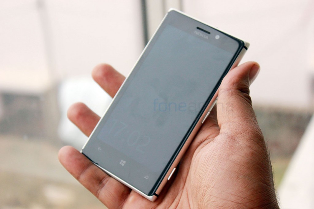
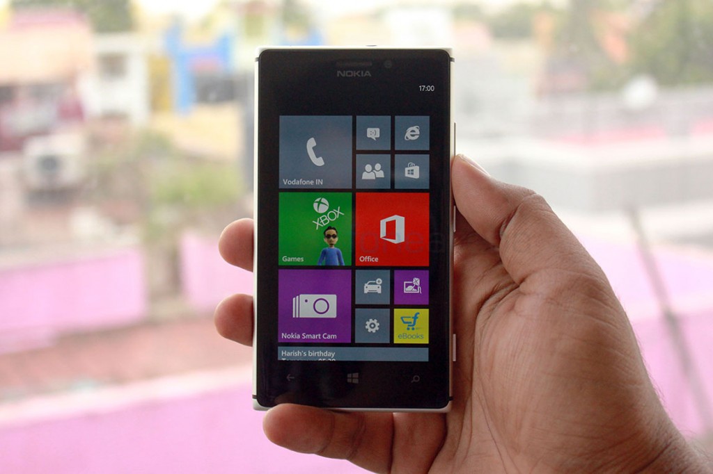
Lets go through the hardware now. The front of the phone is dominated by the curved gorilla glass with a 4.5 inch SuperAMOLED HD display underneath.
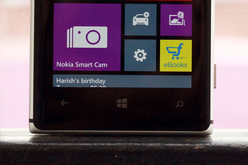
There are three capacitive shortcuts at the bottom and they offer haptic feedback and backlighting when needed, and right below those buttons resides the primary microphone for voice calls.
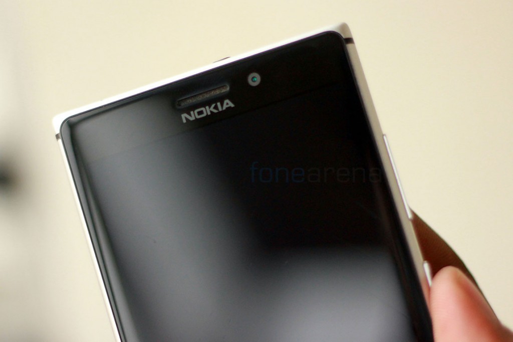
Above the display is the earpiece, the 1.9MP front facing camera and the usual pair of proximity and ambient light sensors.
While the left side is empty and just has these black bands for better antenna reception, the right side is where you can find the volume rocker, the power/lock switch and the two step camera shutter key. All of them are made of metal and feel really good.
The camera shutter key is special though. Slightly raised above the other keys, the two step shutter is a pleasure to use and works without any wobble or any sort of issues. It’s been a while since we started testing the device and it has stayed strong till now, which is pretty great.
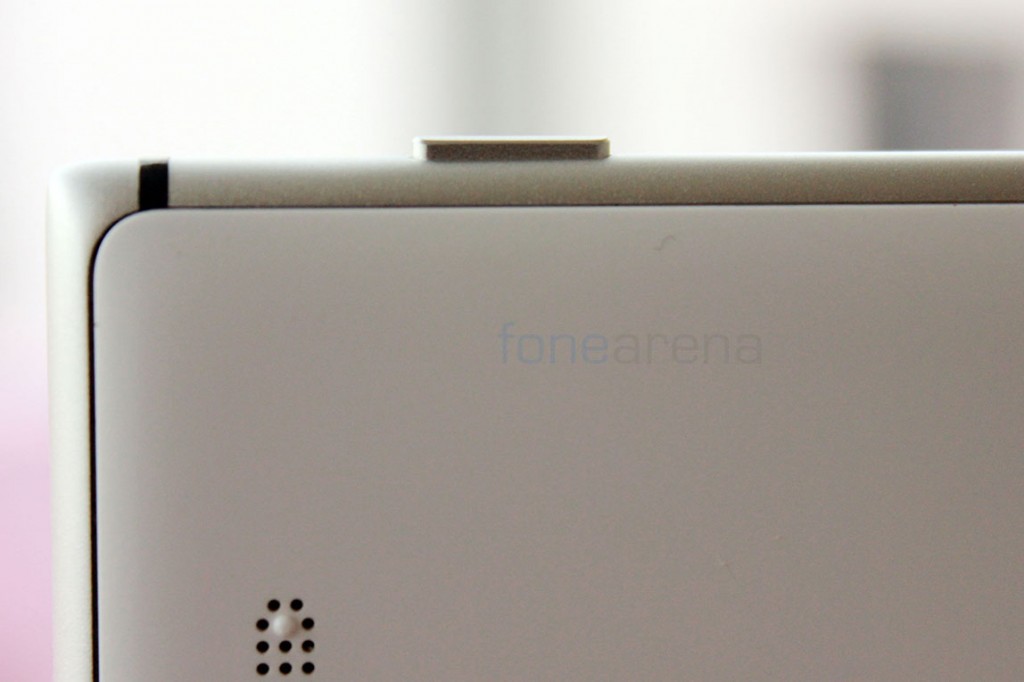
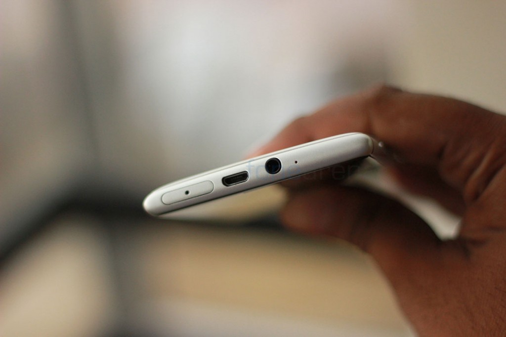
Over at the top, you have all the inputs and ports lined up, including the 3.5mm jack, the micro SIM pull out tray and the micro USB port. Also along with it resides the secondary microphone, which along with the primary one can works for noise cancellation feedback in calls and HAAC recording in video.
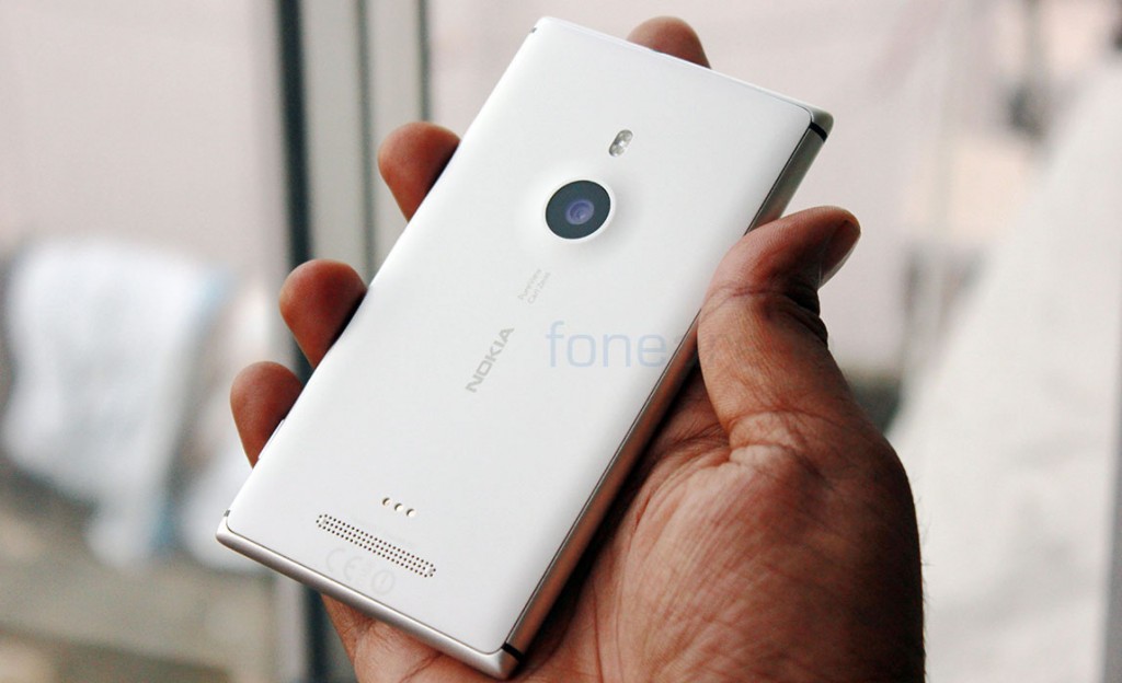
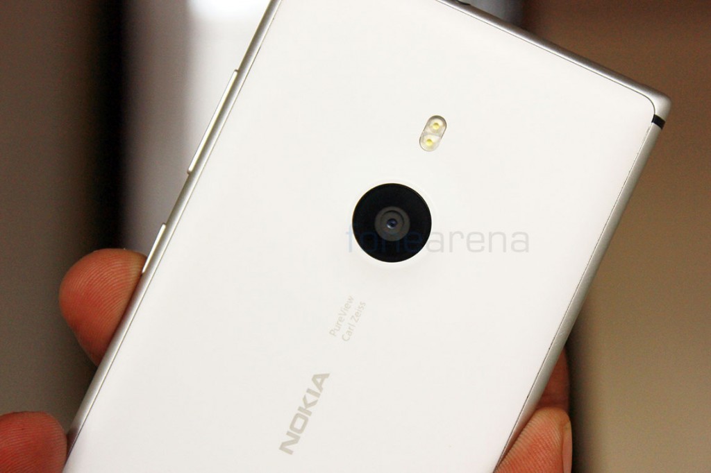
On the back of the device, you have the dual LED flash, a raised hump for the large 8.7 Megapixel camera and the Nokia/Carl Zeiss/PureView branding in the middle.
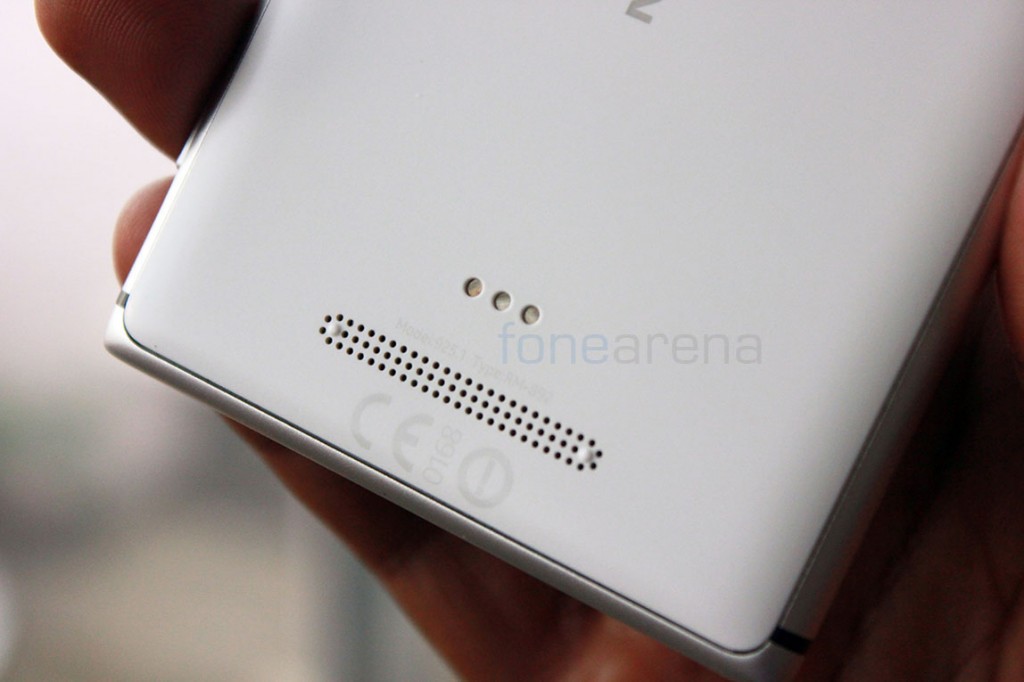
Down below the logo, you have the three contacts for wireless charging accessories. Yes, the Lumia 925 doesn’t come with Wireless Charging inbuilt and needs a case to enable that functionality. Below the connectors is the really loud loudspeaker with two bumps to counteract muffling on hard surfaces. There is nothing present on the bottom of the device, so lets take an in-depth look at the marquee hardware parts of the Lumia 925.
Display
The Nokia Lumia 925 has a 4.5 inch 1280×768 SuperAMOLED HD display of the pentile variety. This is much changed from the 920, and the obvious fact is that Nokia wanted to thin the device down and eliminating backlighting seemed like a good option, hence AMOLED is in, with its apparent thinness and power saving traits. Talking about the display itself, Nokia still affixes the Puremotion moniker to the 925, which purely means that the display has a fast refresh and software enhancements to boost the already good outdoor visibility. Along with Super sensitive touch, we were able to see that all the said advantages of the 920’s display were kept intact.
The display has excellent viewing angles, a common AMOLED trait and surprisingly not as over saturated as we thought it would be. It is really bright and contrast-y but this time, the colours were almost spot on. Even if it doesn’t conform to your personal tastes, you can always tweak it the way you want, with the Nokia Display Profiler. We had toned down the saturation and made the slightly warm display a bit cooler for a much more pleasant experience. You can find the display colour profile under the settings page list.
One advantage of it being AMOLED though, is the selective lighting of pixels, which comes in very handy for one of Nokia’s great software enhancements. The Glance Screen on the Lumia 925 adds the option for one to set a clock screensaver to the screen even after the phone goes on standby. When that is turned on, only the pixels that light up on the screen are powered and the rest of the screen draws no power. One advantage of AMOLED screens that has been taken advantage of rather well. The implementation is not new though, Nokia has been doing it for a long time. Only one thing that bothered us occasionally was pentile arrangement which made text fuzzy when looked up close
Camera
When the Lumia 920 released, much was said about the PureView phase 2 and the camera performance. Simply said, the photos had too many issues, like defocusing due to the OIS unit, less sharpness in low light and so on. Once again, Nokia has tried to fix it with the Lumia 925. They have introduced the world’s first six element lens on a smartphone with the same 8.7 Megapixel Sensor and a f2.0 Aperture lens. The sixth element supposedly adds more sharpness to the images and with the addition of new camera algorithms with the Amber update, the performance is touted as better than ever. But before finding out about the camera performance, lets talk about the user interface(s).
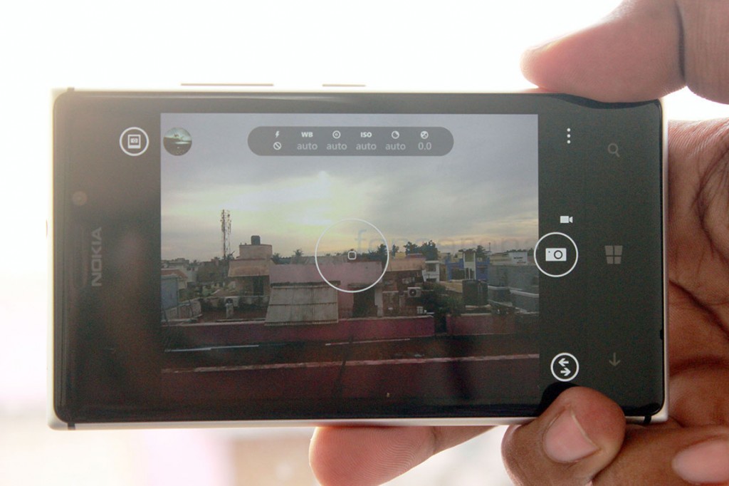
Ever since Nokia made its Pro Cam app available for the Lumia 925, we straight away set it as the default and used it exclusively for all our photos. The interface and the capabilities are just too hard to ignore. Take a look at the video demo that we did for the Nokia Pro Cam for a better idea of how it works.
httpv://www.youtube.com/watch?v=tCw1v1gnVrY
To read more about the capabilities and some specific samples, do read our in-depth overview of the Nokia Pro Cam app.
But that’s not it, Nokia also introduced the Lumia 925 along with another special camera specific app and that is called the Smart Camera. This app builds upon the expertise that was acquired from Scalado, with various implementations like Remove and Best Shot taking center stage. You get Best Shot, Action Shot, Motion Focus(one of our favourites), Change faces and of course, remove moving objects. It’s better if you watch a video demo of all the features –
httpv://www.youtube.com/watch?v=ueoNPLlY4bk
As you saw in the video above, there is also the Cinemagraph app that really interested us, so you can check out the complete overview of both these apps in this post that we did earlier.
Apart from these Nokia specific enhancements, the stock camera app is barebones and is like how it has been on all Windows Phone 8 devices. So, there is actually no point in discussing it further, lets move on to the all important camera performance then. Take a look at the sample shots in various conditions – (click on them to view in full resolution)
Daylight
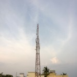
As you can see from the images above, some are highly detailed and very true to reality which some are slightly over-processed(see the ones with foliage) and sharpened more than what we would like. But we definitely have to say that all those defocusing issues of the 920 are gone, and this is possibly the best Windows Phone camera yet(not considering the 1020). Consistency is a key in Smartphones and Apple was the only one that mastered it in their phone cameras. Nokia struggled to do it with their Windows Phones, but they seem to have finally got it. Talking of consistency, one area where it failed earlier was the Macro mode. Previously it was too hard to focus something up close and it always ended up slightly defocused, but now with the Pro Cam app, the touch focus and the manual focus options are so good, the photos came out really well –
Macro
Low light
Equipped with optical image stabilization, the Lumia 920 was one of the first devices in the world to shoot at low shutter speeds and be shake-free at the same time. Coupled with f2.0 aperture, this enabled the 920 to create some really amazing low light shots, but most ended up getting criticized for the lack of detail, overblown highlights and unnatural colour tones. With the new algorithms, Nokia might have just fixed it, check out these various low light samples.
As you can see, these low light samples show that the clarity and the sharpness have massively improved on the Lumia 925. Most were taken in absolute low light conditions, but may not seem like low light in the final result at all and that’s one of the camera advantages, we guess? That said, we believe that Nokia has really improved upon the 920, which is welcome news for anyone who is keen at low light photography. The low light performance was so good that the dual LED(short pulse high power) flash was almost never used in our time with the device.
Overall, we think that the still performance is as good as it can get. Before the Amber update arrived on the Lumia 920 and the 928, we did a test with the 925 comparing the obvious software and hardware advantages, you can take a look at the camera test here. If all the samples above did not convince you yet, we also did a blind test shoot out with the Lumia 925 and other popular cameras, see which one came out as the best of the lot with public voting.
So, still performance is ok, what about video, you ask? Well, the device can record full HD 1080p video at 30,24 and 25 fps using the Pro Cam app and offers 1.8x lossless zoom too. So, you get pixel level high quality performance, which makes shooting macro videos really nice. Watch this video we shot with 1.8x lossless zoom –
httpv://www.youtube.com/watch?v=wBQdHtOwHVM
The video also takes advantage of the Optical Image Stabilizer by reducing the apparent shake on most videos taken with Smartphones. We took it further by capturing video on a bumpy road inside a car, and this is how it turned out –
httpv://www.youtube.com/watch?v=NqPdHecrJuc
The OIS unit seems to have improved too, like we noticed in our 920vs925 comparison that we did earlier.
As we have noted in all our camera reviews, Audio is also a very important part of video and the Lumia 925 is a bit special in that aspect. It has the Nokia Rich Recording audio technology which plainly means that it has 192 KHz high quality HAAC mics inside, that can record in a wide dynamic range. There are two HAAC mics on the Lumia 925. While they record in stereo, the final encode is only in mono. The Pro Cam app actually offers options to even change the cut-off frequency for creative manipulation of audio according to the scene. To explain it better, we had shot a video at the Nokia Lumia 1020 party in New York, with loud sounds that are not at all a problem for the mics on the Lumia 925, take a look –
httpv://www.youtube.com/watch?v=7d_89yOfdlU
Talking of the video quality, that too has improved from before, thanks to the new algorithms. The images look nicer, but may be too much of contrast, and we are not a fan of Nokia’s aggressive metering in videos. We hope to see a way to lock the exposure in future Pro Cam updates. That said, overall we think this is one of the most consistent Nokia cameras we have ever used, and that is a huge compliment to begin with. The images look a lot better than the 920 and we feel this should have been the 920’s performance since the beginning. It took the company so long to fix it, but we are glad they finally did.
Internals and Performance
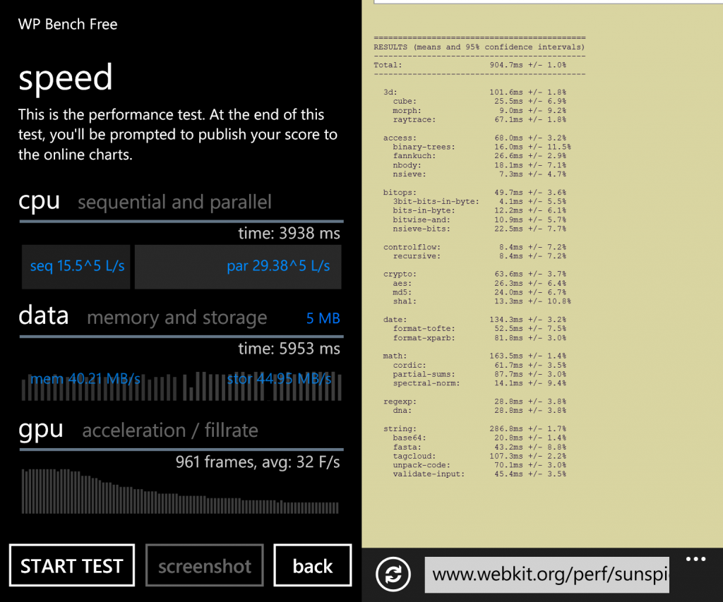
The Lumia 925 has the same old MSM8960 Qualcomm Snapdragon chipset that was introduced as the chassis specification for high end devices. It’s a 1.5 GHz Dual Core processor based on the Krait architecture and has the Adreno 225 Graphics for all the gaming needs. Since Windows Phone, as a standalone OS, doesn’t need that much of raw power for executing the super-simple user interface, the apps do need it. We tested out the Javascript performance of the browser, which gave a respectable score, and then ran a benchmark for a score that is easier to compare with. Here are the results –
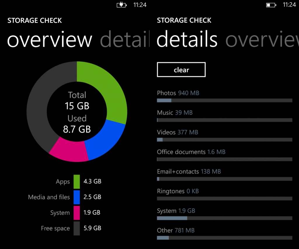
There is 1 GB of RAM for sufficient Windows Phone style “fast resume” multitasking and 16 GB of internal storage, out of which about 13 GB is available for user storage.
Thanks to better “other” storage management on Windows Phone 8 GDR2, we were able to see only a less attributed to its name unlike before, where a chunk of storage literally vanished in the name of other. While the storage might be enough for many, the lack of a micro SD card slot is a worry for media junkies who like to store tons and tons of music on the phone.
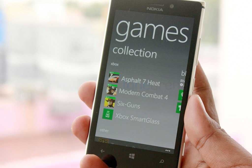
When it comes to real world performance though, you will never really see a hint of lag in the operating system nor in many of the apps, but games are a completely different scenario. We managed to get some high quality games like Modern Combat 4, Asphalt 7 and Six Guns installed onto the phone and our experience was mixed. Out of the three, Modern Combat 4 had the best graphics on any platform we had played it on, Asphalt 7 was ok but had great performance, but Six Guns was a bit laggy than the other two. We think it has a lot to do with Direct X porting and the Adreno 225 which is decidedly mid range in today’s standards.
httpv://www.youtube.com/watch?v=n2XeTZvcVZ8
httpv://www.youtube.com/watch?v=KDpmcNtgZBs
We certainly hope Nokia steps it up in the SoC department for their subsequent releases because laggy games on high end phones are a no-go. Also, we noted that the phone heats up quite a bit when playing games or constantly taking photos. Nothing to worry about though, it was manageable.
Connectivity and other hardware
The device comes with the regular connectivity options like 3G HSPA+, WiFi, Internet Tethering, Bluetooth 3.0 and DLNA(through supported apps like Play To). There is also NFC for wireless pairing with accessories and Tap to send file transfer over Bluetooth. These connectivity options have become commonplace these days and the Lumia 925 seems to have not gone overboard with offerings here, partly to blame the OS too for that. There is no Screen mirroring or USB OTG functionality, both of which were prominently featured in Nokia’s yesteryear Symbian phones. There is also no FM transmitter, but FM radio is finally back with the Amber update, which the 925 comes pre installed with.
Nokia devices are second to none when it comes to call quality. The Lumia 925 is no different and has excellent quality on the ear piece as well as on the loud speaker which is considered pretty loud in our opinion. There is Dolby support and equalizer options for Audio, which is a nice addition that has been there in most Nokia phones since Windows Phone 8. Other hardware specific features enables Double Tap to Wake, a touch screen dependent enhancement and super sensitive touch, which enables one to touch the screen with gloves on.
Software
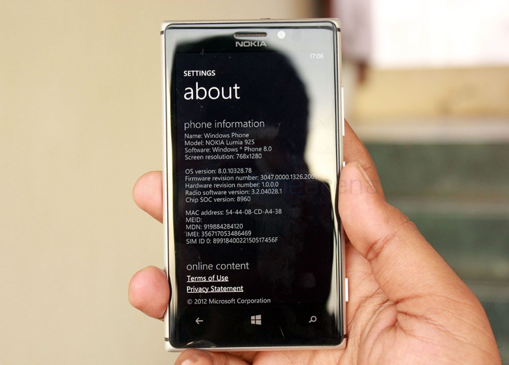
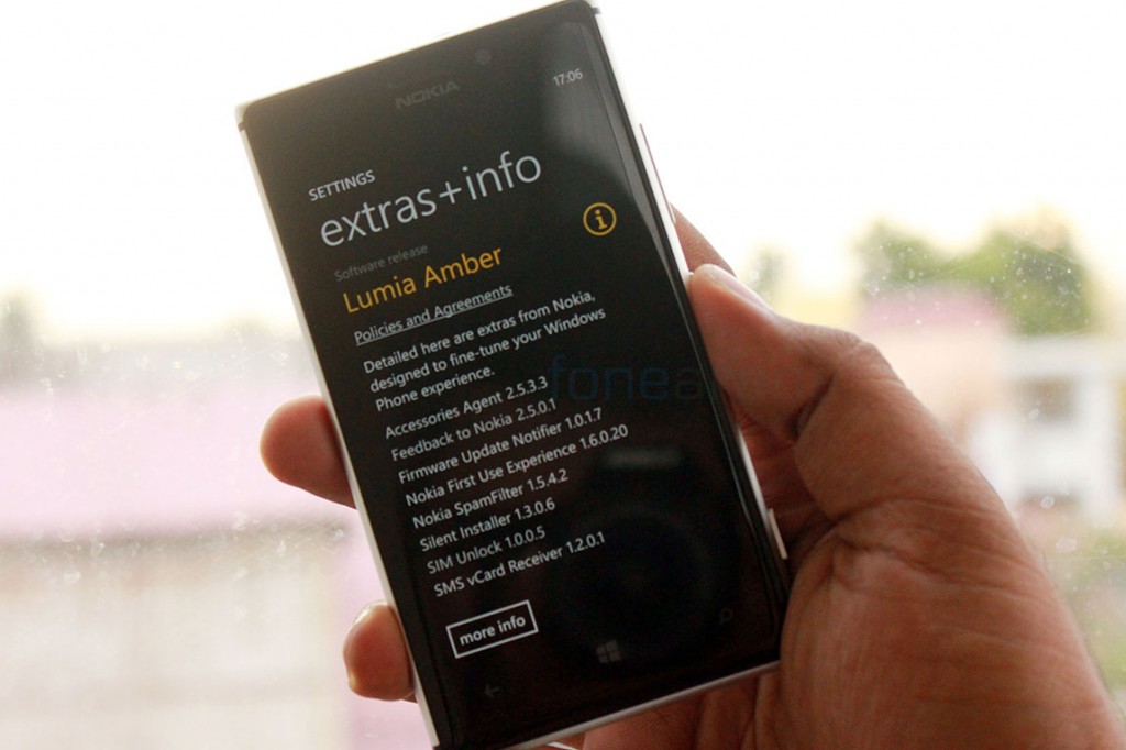
If you had read our Lumia 620 review, you might have seen us complaining about the lack of features and apps on the platform. It is almost unchanged and our complaints remain the same, but there have been a lot of improvements in the mean time. The Lumia 925 runs on the Windows Phone 8 GDR2 update with Nokia’s own Amber Firmware on top of it, with specific enhancements and features. We made a video to show you all the features of the update, watch –
httpv://www.youtube.com/watch?v=ACOEAbO9Em8
You can get a complete rundown of all the new features in this post here. Adding to that Nokia also brought Call and SMS blocking to Windows Phone with another update, which is now available for all devices running Amber. It’s quite surprising how many features Nokia themselves brought in to Windows Phone while Microsoft did almost nothing, yet. We expect Nokia to push forward more innovations into Windows Phone after getting acquired by Microsoft, hoping they don’t cut the suggestions off due to corporate red tape.
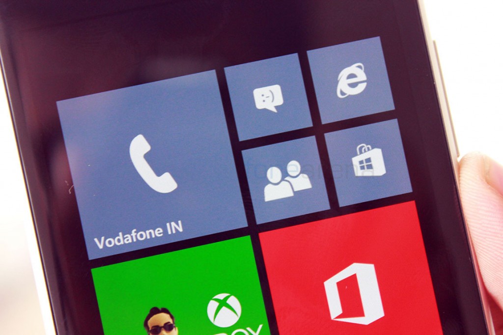
All aside, the Windows Phone experience hasn’t changed vastly from before. the introduction of new tile sizes is possibly the only major user interface change, and even 8.1 doesn’t likely include more changes. Aesthetics wise, it’s still good for small screens, but with bigger phones rumoured for this month end, we expect Microsoft to work on changing the user experience and make it more like Windows 8’s start screen and its core apps. The harmony between these OSes is missing and since the phone UI is drastically different, we feel that it is too complicated for other platform users to make the switch. You can read about all the other Windows Phone 8 features in the review here.
Nokia Specific Apps
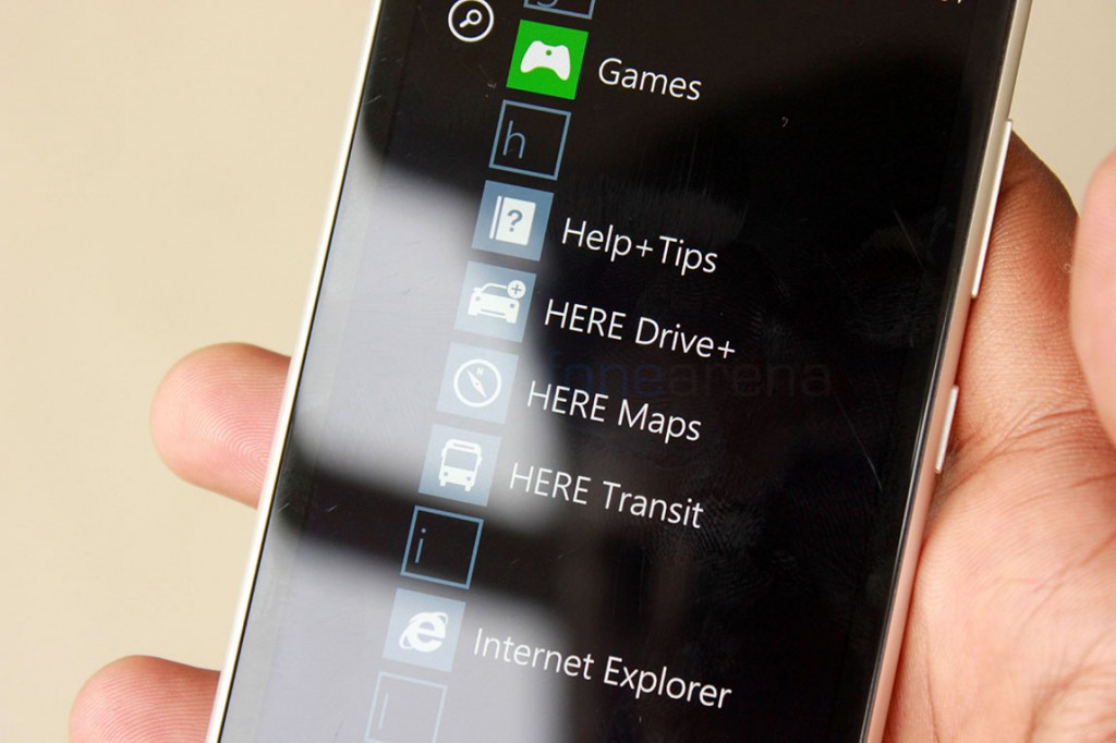
While Windows Phone and the third party apps keep improving, there has been a thing that has been constant ever since Nokia jumped to Windows Phone and those are the Nokia specific apps. The mapping solutions strike our mind when we think of Nokia apps, although they have changed its name to Here. These apps are arguably at their best right now, and provide possibly one of the best solutions for your navigation needs. But lets not kid ourselves, there is a lot more to be done here when it compares to the competition, especially our local data which is quite lacking, but we believe that these things will get better soon as the company now focuses on solutions completely now.
Apart from mapping and Navigation, you also have these fun camera specific apps like Cinemagraph, Creative Studio, Nokia Glam Me, Nokia Video Uploader/Trimmer, Photobeamer, Panorama, Here City lens and more. There is also a Nokia Xpress browser that saves data, a Ringtone Maker that can cut and make ringtones from library music and so on. And last but not least, one of our most favourite Nokia services, Nokia Music is available with a 3-month unlimited subscription for the Lumia 925 in India. Possibly one of the best things Nokia did in India as other services launched really later. All these apps combined add tremendous value to Nokia’s Windows Phone and are a must have if you are a Lumia user. These apps are all available for the Lumia 925 inside the Nokia Collection on the Windows Phone Store.
Battery Life
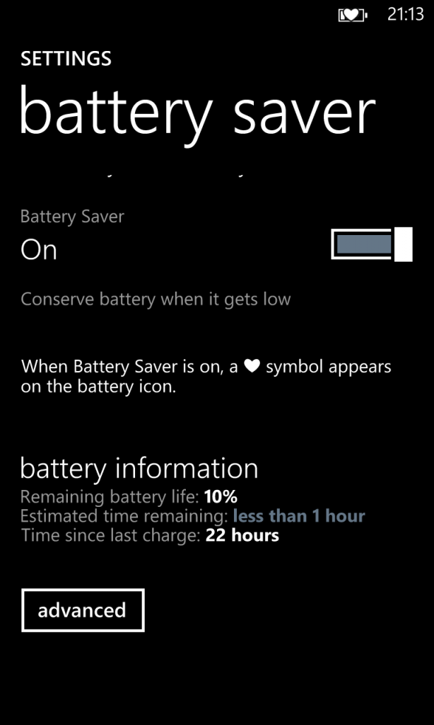
The Lumia 925 has the same 2000 mAH battery as the Lumia 920 and several other Lumia devices. But we felt that the battery performance was mixed. With average use, you will easily get through a day. For example, we got 22 hours of usage with occasional calls, regular whatsapp messaging and intermittent twitter usage. This is largely thanks to the display being off most of the time, however we had Glance Screen timed to 15 minutes and Double Tap to Wake turned on. On the other hand, constant use of the display+3G meant the battery ran out in less than 5 hours. We understand that this is heavy usage but the display draining out the battery is not acceptable. So, if you are completely addicted to something on your phone someday, it’s better to carry a charger, but if it’s just another normal day, you can leave the charger at home. Overall, we think the battery life is mixed and a typical heavy user might not feel satisfied with the performance.
Conclusion
In the end, the Lumia 925 feels like Nokia’s best Windows Phone device yet. The over abuse of the Fabula design language made us wanting something different and Nokia provided with the Lumia 925’s stunningly different design and build. While it may be really slippery, the device still felt great in the hands and that really stands out in a sea of me-too Android devices and similar looking iPhones. The camera is much improved and is really consistent now and all the other aspects of the hardware too seem much more refined than ever, save for some small isolated issues we faced. The new additions to the software that took advantage of the brilliant display, like the Glance Screen and Double Tap to wake are natural additions that made us feel like we are using a Nokia device again.
But we all know and have acknowledged the fact that the software is the only aspect that is holding Nokia back, and that still stands true. Microsoft has been moving at a terribly slow pace in terms of Windows Phone updates, and it’s inexcusable. Right from SoC support to new APIs, there is still no substantial improvement for consumers as well as developers. With Microsoft all set to acquire Nokia, the outlook seems even more gloomy for Windows Phone. Only now are third party apps getting better, like 6sec and 6tag which are credible alternatives for Vine and Instagram, in fact arguably better than the original experience, but the first party support is desperately needed and it needs to get better fast. We might see Microsoft implement all the Nokia-specific features to all of the Windows Phones, but will there be more and will there be anything new? We’ll leave it to Microsoft to tell us the rest of the story in the coming months.
Price wise, the device launched in India at Rs. 33,499/- . Yes, the Lumia 925 is far lesser than what the Lumia 920 launched for. Listed below are the pros and cons of the device that might help in deciding your purchase –
Pros
- New Design and premium Aluminium build
- Great display
- Awesome and consistent camera performance in stills as well as video
- Nice little software enhancements from Nokia adds a lot of value
Cons
- Very slippery to hold
- Mid range performance in games
- Windows Phone hasn’t reached feature parity
- Third party & first party app selection is comparatively lesser

