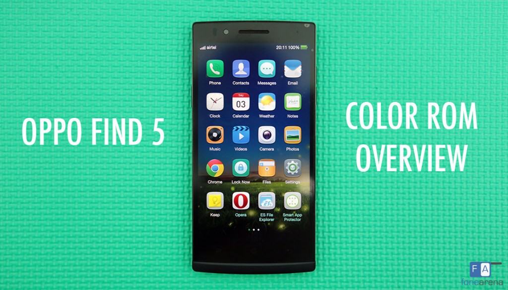
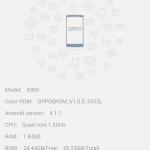
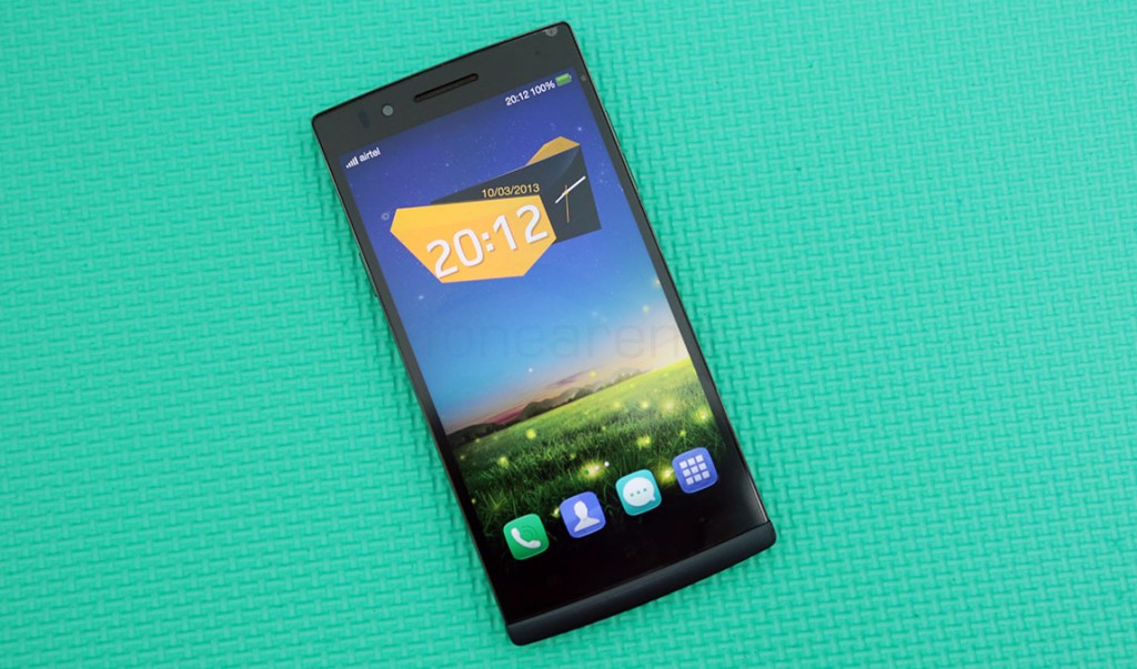
Oppo launched its all new camera centric flagship – the N1 a while back and also announced that the International version of the N1 will come with the Color ROM pre-installed. We know you’re wondering what the Color ROM is all about, and this is precisely the reason we are going to show you an overview of it on the Oppo Find 5. In short, it is more beautiful, more functional than the original firmwares Oppo shipped its phones with, and is possibly the best looking Android UI out there. So, dive into our video to see what it’s all about, and go past the break for a visual walkthrough –
httpv://www.youtube.com/watch?v=uD8NeDfVyUQ
As you can see from the video above, the Oppo Color ROM has various interesting additions over the original firmware. Lets talk about the most interesting customization parts first.
Lockscreens, Wallpapers and Themes
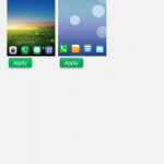
Under the “Themes” app, you get a ton of options for customizing the lockscreen, the wallpaper and even the icon packs. The default theme and lockscreens are pre-installed but you can download a lot more from within the same app, with online resources a touch away. The pre-installed lock screens are Glassboard, Weather unlock, Card Unlock and Map unlock, but you can download lots more if needed.
These icon packs, wallpapers and lockscreens are fan made and are curated by Oppo themselves which is cool. For customization freaks, this is a treat.
Take a look at all the options in the screenshots here –
Design overhaul
If you had read our Find 5 review, you would have seen us calling the Find 5’s UI beautiful and functional, with a lot of things to like and some things to detest. The overgrown icons and ugly widgets are gone and have been replaced with more pleasing smaller icons and a much better default launcher experience than before. The other parts of the UI have been made even better, with white and green accents throughout, in line with the design language of the company. Right from the dialer, contacts and the call screen to the calculator, everything has been touched up with the right accents and fonts.
Launcher –
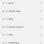
The notification panel has also been redesigned with a black, white and green combination to provide a much more consistent and a pleasing experience. Since the ROM is based on Android 4.1.1, there is no quick toggles or lock screen widgets but there are plenty of toggles on the main notification draw to play around with. And as before, they are completely editable.
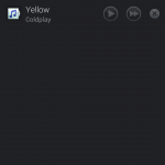
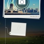
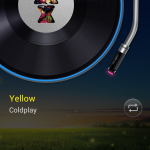
The home screen can now support full screen widgets called “Spaces”. These are accessed on the contextual homescreen area with the huge Color logo in the middle. There are currently two full screen widgets available, one being the Photo Space and the other being a Music space. Both are highly interactive and can be played around with for quick controls and viewing. You can also straight away switch between themes, wallpapers and widgets from the contextual menu. And as a new option, the Color ROM also lets you switch between different effects for the homescreen.
The application list is barebones. The uninstall and drag app to homescreen options are similar to before, with long press and pressing the “X” icon being the way to uninstall, like on iOS.
New Features
Here is a list of new features that have been added to the Find 5 thanks to the Color ROM –
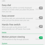
- Flip to mute, Easy Dial and Easy Answer gestures
- Motion picture, Swipe with three fingers for a screenshot
- Double tap to wake up screen
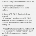
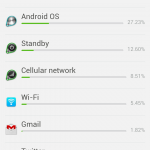
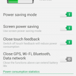
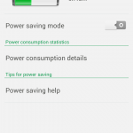
- New Battery manager app with Power consumption details and Power Saving mode
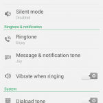
- New Ringtones
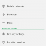
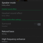
We think these features are pretty self explanatory. You can get a detailed look in the screenshots here.
New/Updated Apps
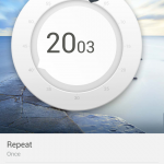
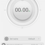
The default apps on the Oppo Find 5 were heavily customized to fit into the design language of the UI, and it remains the same for the Color ROM too. You have some new apps and the default apps too have been updated. The new clock app has a really nice Dial-Like alarm UI, which looks to be very similar to the one of the Nokia N9, which we like a lot. The Timer and the StopWatch too have a really nice UI.
The Notes app has been named “Near Me Notes” with added functionality for cloud sync. Talking of cloud Sync, the Color ROM now has added support for syncing and backup to Oppo’s own cloud service called the “Near Me”. The Near Me Cloud app can be used to set up the account and sync/back up the respective files needed.
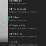
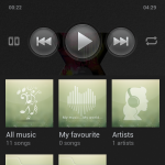
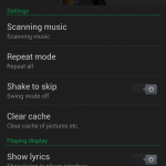
Media apps like Music Player too have been massively improved. They have the same options but re-arranged for better accessibility. Almost all the apps have a slide up function for revealing the contextual menu, leading us to believe that Oppo’s upcoming devices might lose the hardware or capacitive buttons on the front entirely. The Photos app too, like videos, is themed in black with pivots for camera roll and all pictures in separate folders, with a direct shortcut access to the camera. Talking of the camera, while the features remain the same, it too has gotten the design overhaul treatment with better arrangement and new icons and tabs that resemble the ones on the Oppo R819.
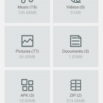
The “Files” app now is pivoted and has larger icons for the commonly used file types. We already acknowledged that this is one of the better file management solutions on Android and it stays the same. But there are some new apps too. Like “Lock now” which is a simple utility to lock the screen without using the hardware button. For people fed up to reaching up to the power button coupled with double tap to wake, this is a good option. And then we have the “myfacebook” app that lets you sync facebook contacts, event and add birthdays to the calendar. But apart from that, there’s aren’t any other entirely new apps.
Conclusion
It’s always good to see design consistency in a custom Android UI and we think Oppo has nailed it with the Color ROM. There is no dearth of features too, with the Double Tap to wake being one of the highlights of the ROM. Overall, we think it is one of the best designed Android custom UIs and it looks great on the Find 5’s screen. Mind you, this is still in beta and is constantly improving at a rapid pace through feedback in the Oppo Forums where one can suggest new features for the next builds of the ROM.

