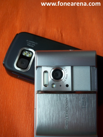
Yes, you read that post title right. We outdid ourselves, by a long shot on this article. Not only did we land a prototype of the Sony Ericsson Satio and show it to you in intricate details, but we were also able to pit it head to head against its concurrence, with Nokia’s current lineup of similar S60 5th Edition devices: the Nokia N97, 5800 XpressMusic and the most recent X6.
The comparison will look shortly at the software differences between the Satio and the current S60 5th Edition UI from Nokia (which we will develop in another post with some very long video reviews), then it will focus at the hardware side-by-side comparison with the 3 devices.
S60 5th Edition Software UI Comparison: Sony Ericsson vs Nokia
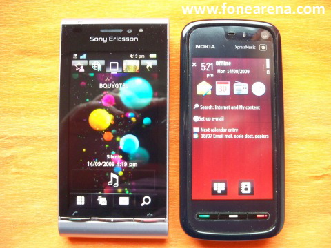
The first thing you will notice when launching the Satio is a different homescreen from the usual S60 5th edition one were’s used to on Nokia devices. This homescreen is divided in 5 panes (5 icons on the top) that are Contacts, Bookmarks, Main Homescreen, Photos and Applications. The Main homescreen has an integrated Music Player widget and a quick access to the Dial-Pad, Media Browser, Messaging and Search function. In comparison, the homescreen on the 5800 Xpress Music is dull with a couple of application screenshots, Search, Email and Calendar, with quick access to the Dial-Pad and Contacts.
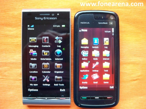
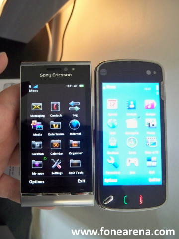
The Menu UI and most of its structure is very similar between both variants of S60 5th.
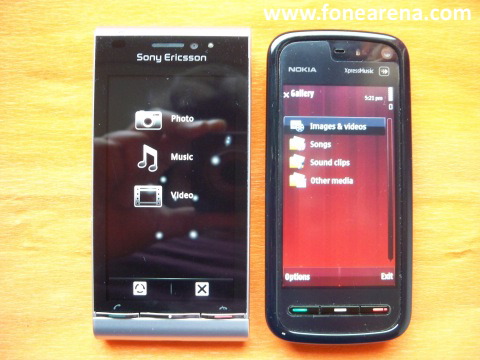
The Gallery on the Satio is divided in 3 main views: Photos, Music and Video, and uses a whole different UI system than the Gallery on Nokia’s Symbian devices.
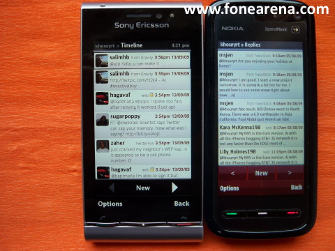
Next up is Gravity, the Twitter client, running on both devices side by side, and proving that applications written for S60 5th Edition are not only compatible with Nokia’s devices, but also with the Satio from SE.
We won’t go into more details in this post, as we have prepared some video reviews of the Satio’s UI in action, so keep you eyes on FoneArena for that 😉
Side by Side comparison: Satio vs Nokia N97
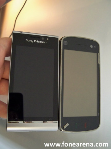
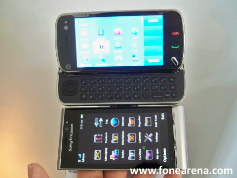
The two flagships go head to head here, or side by side if you want. We can see that although the frontal size of the twi is very similar, the N97’s rounded angles make it look and feel much smaller than the Satio that has very square and angled corners. The Satio hence comes out as an imposing handset, whereas the N97 looks more hand-friendly. In terms of materials, both devices rely heavily on good material plastic, a nice clear screen cover, and some metallic accents.
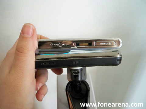
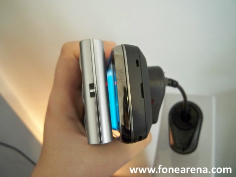
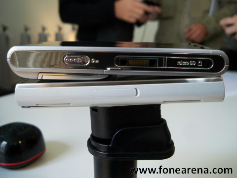
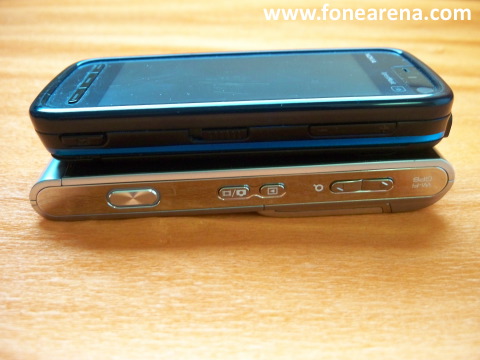
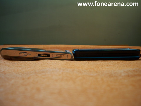
Although both devices have almost the same thickness, they use it differently. The N97 embodies a slide-out qwerty keyboard, whereas the Satio’s thickness is mostly in the top part due to its sliding camera cover that protects the 12MP lens module.
Both handsets feature a flicking keylock on their left side, the N97 has the standard microUSB port to connect with the computer and to charge it, whereas the Satio has the more archaic pop-port connector. It also has a microSDHC slot.
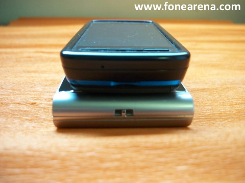
The bottom side on both devices is clean of connectors or buttons.
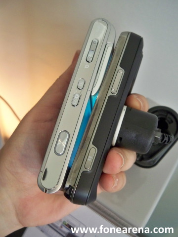
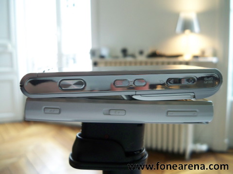
The right side is where a great difference can be observed. Like the N97, the Satio has volume keys (also used for zooming) and a dedicated camera key, but this one is circled by an LED light that turns blue when the camera is in action, and it also has a Photo gallery quick access key, and a dedicated photo/video capture switch for the Camera.
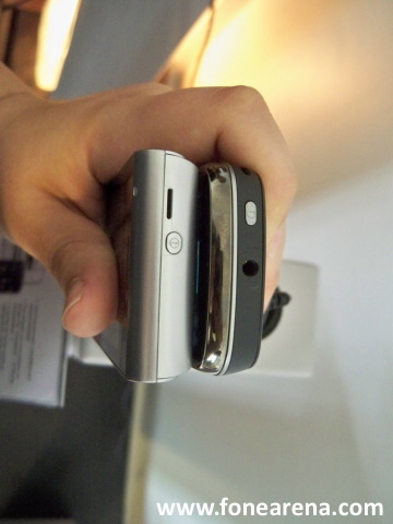
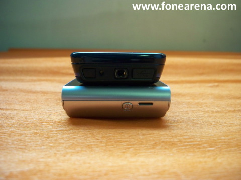
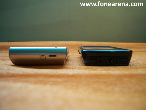
On the top, you can see the power button on both handsets, as well as a 3.5mm headset plug on the N97. The Satio uses its pop-port for music headsets.
Side by Side comparison: Satio vs Nokia X6
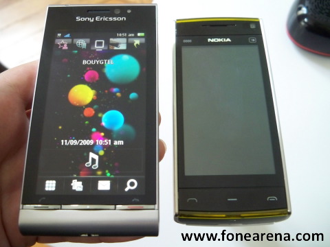
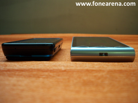
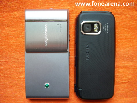
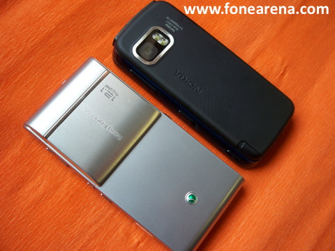
The Satio and the Nokia X6 share a very similar rectangular design and form factor, the Satio though is a a bit bigger (not as much as the first image shows, the Satio was placed closer to the camera than the X6), longer, larger, but also way more thick. The main unit on the Satio (without the camera cover) is almost the same thickness as the X6, but add it, and you have a lot of bulk showing up. Another main difference is also with the X6 having 3 touch-sensitive keys (call/menu/end call), whereas the Satio has hardware buttons.
Side by Side comparison: Satio vs Nokia 5800 XpressMusic
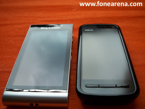
The Satio outperforms the 5800 XpressMusic in nearly all aspects, yet still manages to be only a bit bigger. Take a look at the images below to see for yourself how a 3.2MP plastic-covered cameraphone looks next to a 12MP metal clad device.
What are your opinions of the Satio after seeing it next to its competitors? Are y put off by its size, or willing to compromize given the many features it offers?

