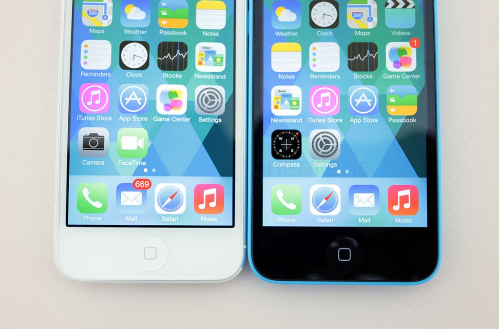
Much has been said about Apple’s iOS 7. The radical new change in the user interface launched for the public recently and it had surprised a lot of people, with most of them caught off guard. With the official and final release, more critics chimed in on how Apple got it all wrong. The animations caused nausea, some reported, the icons were too ugly, others said. The reactions have been funny as well as serious enough for Apple to keenly take notice, or at least we hope. On the matter of icons, we would agree too. They looked amateur and frankly, didn’t look like the work of talented Apple designers in our opinion. But here’s a wild thought! What if Apple had used Microsoft Word to design iOS 7?
Ok, it’s obviously a joke, but what if..? One very talented Microsoft Word user on YouTube – Vaclav Krejci asks you this question in his video titled “Was iOS 7 created in Microsoft Word?” You just have to watch and find out –
httpv://www.youtube.com/watch?v=RZp7BvQJnU8
Well.. consider our minds blown to pieces. It’s hilarious that he could design the whole UI in Microsoft Word, let alone Illustrator or some other Pro software which the actual designers would have used. But the main takeaway I see from this video is 1. He is incredibly talented. 2. Woah, I didn’t know you could do all this inside Microsoft Word.
Well, this is one of those very few videos that you will see shared here, and it’s definitely worth watching. If you still have second thoughts, I don’t know what to say. You are probably missing out on some epicness the Internet consistently produces. Don’t forget the share it with your geek friends.
via Chilko(Twitter)

