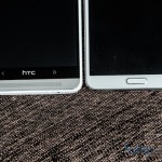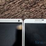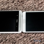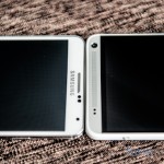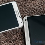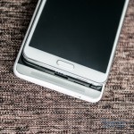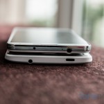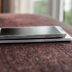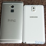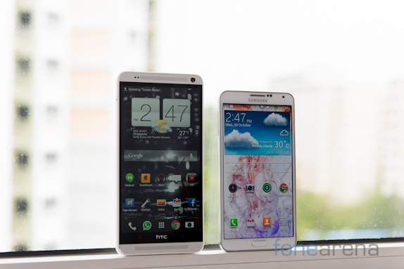
We previously brought to you the unboxing of the HTC One Max. Now here is the photo gallery comparing the phablet to it’s closest rival, the Galaxy Note 3.
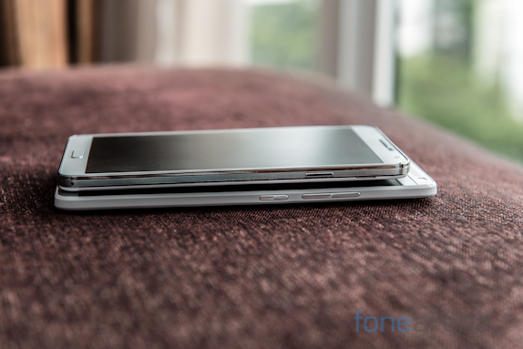
The One Max isn’t a small phone, despite packing only a 0.2″ larger screen, the device is much larger than the Note 3 especially in terms of length due to the two boomsound speaker above and below the display. It’s also more difficult to handle because of the increased thickness even though the curved back design helps a bit.
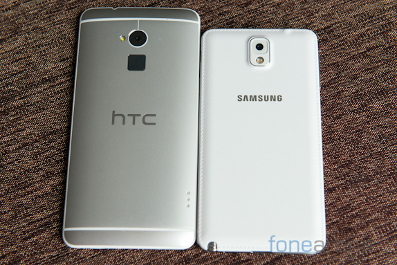
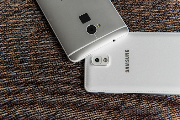
The main new feature is the fingerprint sensor which is located at the back just below the camera. The matte finish does help to grip the device and also reduces the amount of fingerprints on the back.s
The lock/power key which is usually on the top of the device is now located on the right just below the volume keys. I do prefer the power/lock key on the right side however on this particular model, the volume keys are so close that it often causes confusion.
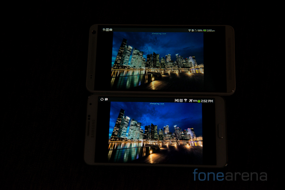
We compared the displays, the HTC One Max definitely has a really good display. There is a slight greenish tint present on our device but we’re trying to confirm if other units have it as well. Even though it’s blacks aren’t as deep as the one on the Note 3, it’s one of the best we’ve seen out there.
We’ll give you more detailed views on the devices and comparison in upcoming articles. Please stay tuned for more coverage on the HTC One Max.


