Google announced the Nexus 5 a while back, and with it came the latest iteration of Android – 4.4 KitKat. Within a day, Nexus 5 made its way into the hands of talented developers and Google too helped along, with the AOSP builds instantly going live. We then rapidly saw ports and AOSP builds popping up, with one for the Nexus 4 claiming to be a direct port of the Nexus 5 ROM. That was intriguing enough for a flashing opportunity, and so we jumped on it, right away. It turned out to be exactly that, with the complete feature set, rather than the lacking AOSP builds. We used it long enough to discover and use all the user-facing features of Android 4.4 KitKat and hence, presenting you an in-depth overview of the same in a 26-minute video –
httpv://www.youtube.com/watch?v=Kd_fYgWEnns
Read past the break for a walkthrough in text and photos.
Changes to the User Interface
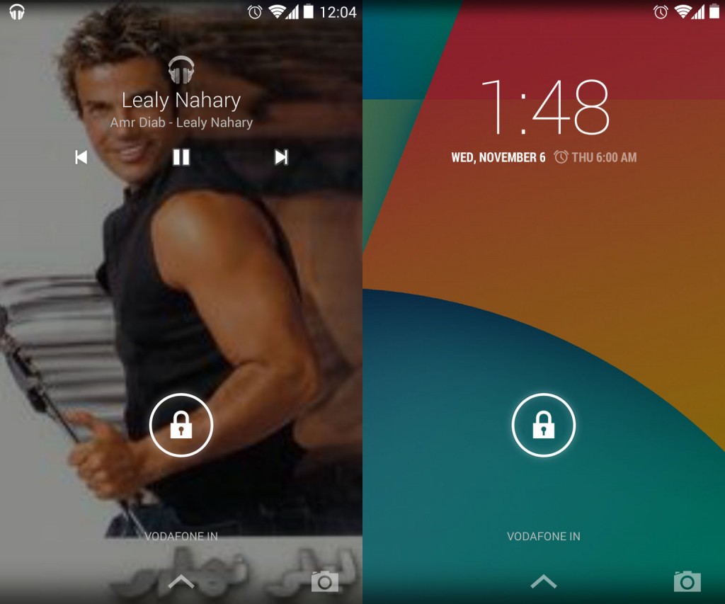
The first thing you will notice when you power on your KitKat phone is the lockscreen. While the lockscreen has always been clean, gone is the bold hour clock and in comes the light font for the whole clock. More notably, there are two extra icons at the bottom of the screen, one an upward arrow and the other a camera icon. The upward arrow replaces the dotted circle, but has the same function of opening Google Now. The camera icon on the other is an indicator for the side swipe lockscreen widget, as there is no indication of widgets when you power the phone on. So, it’s upto you to drag the icon to the left to open up the camera shortcut widget on the lockscreen. Another interesting implementation is that the lockscreen now supports fullscreen album art for music playback.
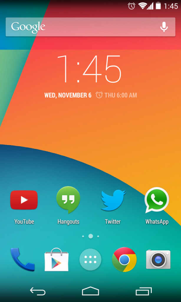
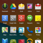
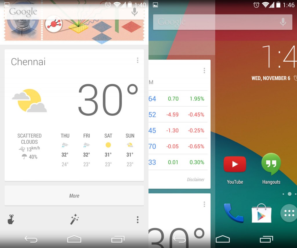
Upon opening the lockscreen you have the new launcher. This launcher is intertwined with Google Now and is called the “Google Search Launcher” or just “Launcher” in the settings, depending on where you see it. The new launcher has several new interface elements and is much changed from the stock one that used to be on Android 4.3. The icons are bigger, the wallpaper and widget pickers are different and the app list is now just an app list. Google usually dictates a 48px size, but with its own apps like Google search and Google+ having different sizes, the overall icon size is now 60px, to making it much better for the super high resolution 1080p screen on the Nexus 5. The whole launcher now features the Roboto condensed font which makes is slicker than ever.
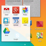
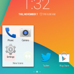
One other major user interface change is that the neon blue accents that were introduced all over the interface in Android 4.0 ICS as a part of “Holo” have been turned white. The icons too have been slightly modified to suit the new design language of whiter apps and overall a much cleaner experience than before. Talking of icons, we have entirely new icons for the camera and the settings while there is a slightly modified icon for the new dialer.
Other minor but aesthetically pleasant user interface changes include more rounded tooltips with Roboto Condensed font, which was rectangular and with older font before. Gotta say, we really dig this new font that is all over the launcher.
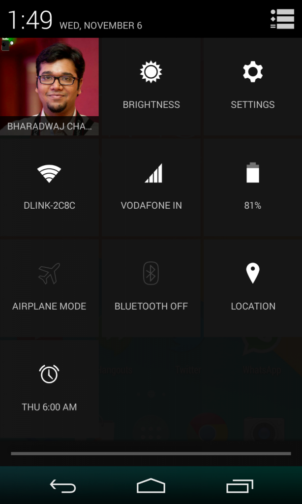
The translucent UI has been talked about, a lot, and it doesn’t apply to the launcher alone. There is no “glass” or gaussian blur effect from Google here, just a plain opacity change for the nav bars, the status bar, the app list and even the notification center. Touchwiz did this already with 4.3, which was unexpectedly nice, so it’s good to see Google follow through, with a similar approach. Also, as we mentioned earlier, Google is now going for a cleaner white-based UI here, so it was illogical to have the dark pop ups everywhere.
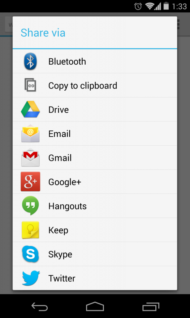
In an effort to clean that up, the company has gone for a cleaner and whiter pop up UI in several places, like the sharing menu, which now has a list instead of icons. This is well known as Holo Light, and is now less jarring when in a completely white app-interface. Talking of app-interfaces, we have all new or some apps modified to fit with the new design, lets take a look at them then.
New Apps
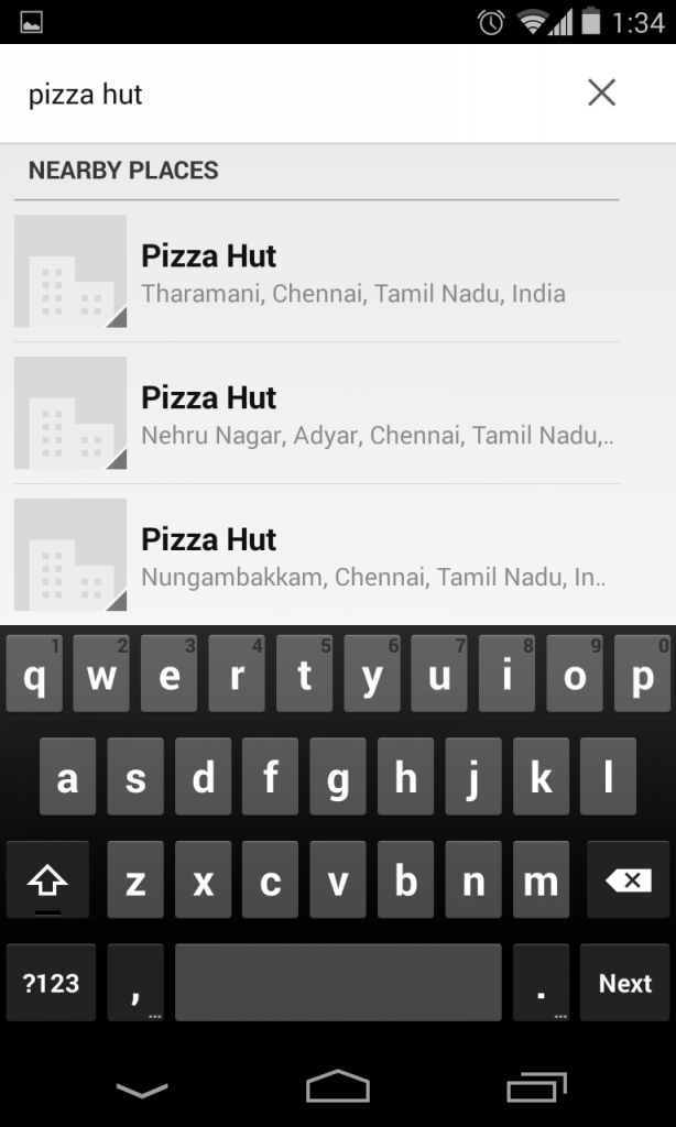
First and most major new app in Android 4.4 KitKat is the awesome dialer. Why we think it is awesome? Plainly because it is now integrated with Google Map’s local business listings, letting you instantly search local business like a restaurant, a pizza place or anything. It is well known that Google’s database of listings is one of the best, in this online age, and having that right into your dialer is something amazing. For example, if you search for “pizza” you will get all the listings of the pizza places near you. We have always had to resort to third party apps for this, but since it is built in to the dialer now, the need for an app or any difficulty in finding a local number for a business is gone. We highly rate this, and probably is our no.1 feature in Android 4.4 Kitkat.
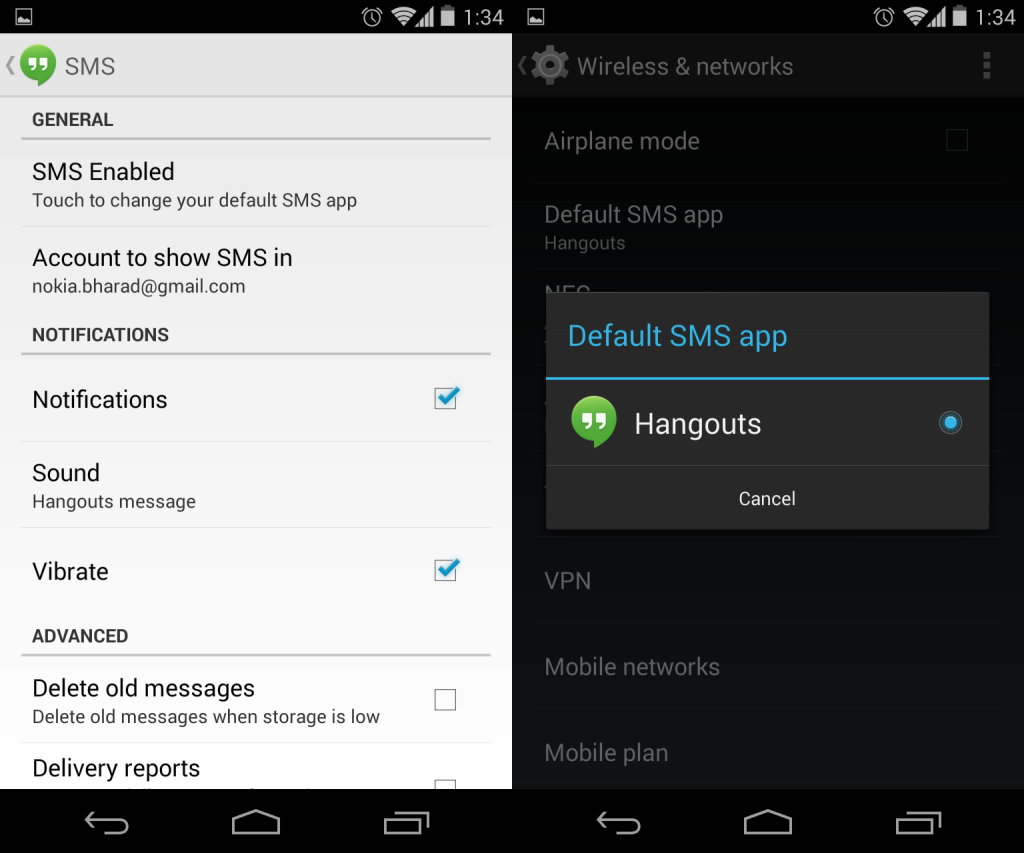
Next up, we have the new Hangouts app, which adds support for GIFs and is now integrated with SMS functionality in KitKat. This is certainly the biggest feature in the latest update, because KitKat totally does away with the default messaging app, leaving you with only Hangouts out of the box for all of your SMSes. But, with KitKat, any one can build a messaging app that can directly take advantage of the notifications, essentially becoming the default app, if the user chooses so. The setting for changing the default app is now available inside Android’s settings under “more”. Here’s a walkthrough of all the SMS related features of Android 4.4 and hangouts.
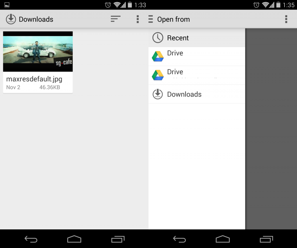
Some other basic apps have now seen visual facelifts, like for example – Downloads. It used to be archaic, with a pre-Gingerbread UI and icon. While the icon remains the same, the app now gains the Holo Light styled white and clean user interface, inspired from QuickOffice. In fact, thanks to the new Storage framework, you can access the downloads app directly from Quickoffice which has a very similar UI. The same storage access framework lets you access files from your Google Drive or even box, dropbox accounts, all this from inside the Quickoffice app. Neat integration, that.
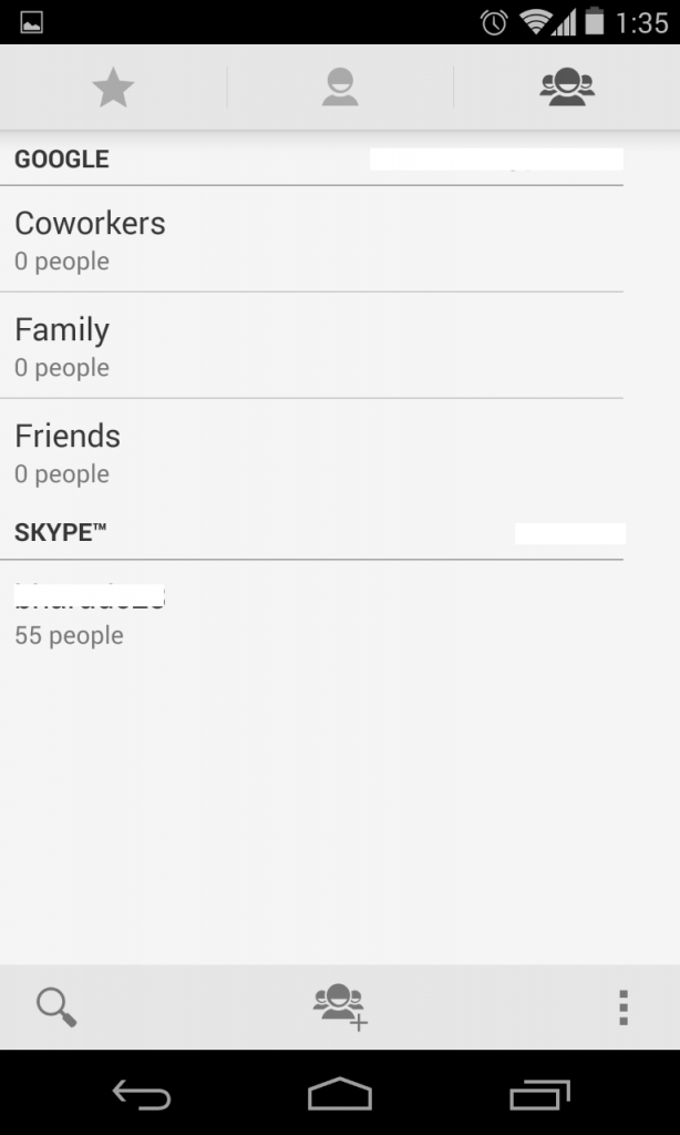
Another app that has received the new visual treatment is “People”. It used to have a bright blue bar for the shortcuts, but now it’s gone and is exactly like all the other Google apps. There is a pattern going on here, a revolution of whiter and cleaner app design, and that’s only doing good for Android, or rather Google, as a whole.
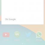
Finally, we have the new Google Now app, or.. lets call it the Google Now launcher. Well, because it integrates right into your homescreen and is always just a swipe away from your default screen. Swipe to the right and you are inside Google now. Even opening the Google search app or activating any shortcut to it takes you to the homescreen page of Google Now, which is an app in itself, but also a full screen widget. Confused? You have to watch the video to see how it actually works. The new app also adds options for customization and reminders right from the main page, and of course, you have a lot of new cards as a part of this update. Another important feature of this new app, or launcher is the always listening voice commands. Anytime while in the launcher, you can say “Ok Google” and it will pick up your voice command and display the listening screen of Google Now. It works great.
New Features
Apart from all the user interface and the features, we also have some new features in Android 4.4 KitKat that adds or enhances the functionality of existing hardware.
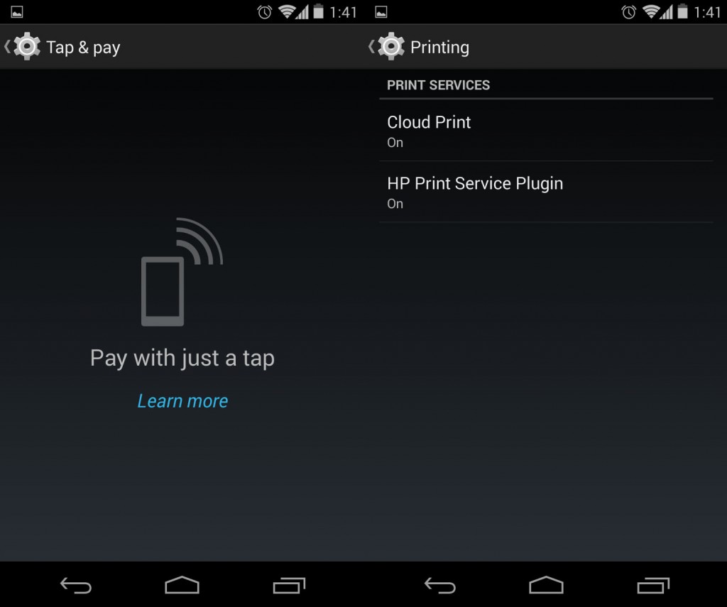
1. Tap and Pay – new NFC feature
The Tap and Pay feature is a new extension of the already robust NFC support in Android. As explained in the developer portal –
With HCE, any app on an Android device can emulate an NFC smart card, letting users tap to initiate transactions with an app of their choice — no provisioned secure element (SE) in the device is needed. Apps can also use a new Reader Mode to act as readers for HCE cards and other NFC-based transactions.
2. Printing options baked into the OS
Android now natively supports printing of documents. Yes, it used to be able to print directly already, but now we have robust support for choosing the formatting options and so on.
3. Better memory optimizations for lower end devices, and better multi-tasking(no visible changes)
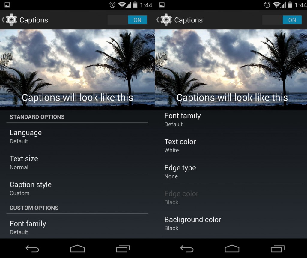
4. Subtitles and closed captioning in video player
Hidden beneath the accessibility settings, we have support for closed captions in the native video player. Also known as subtitles, this should be immensely useful for impaired Android users, or even just watching foreign language movies. A welcome addition to Android 4.4 KitKat.
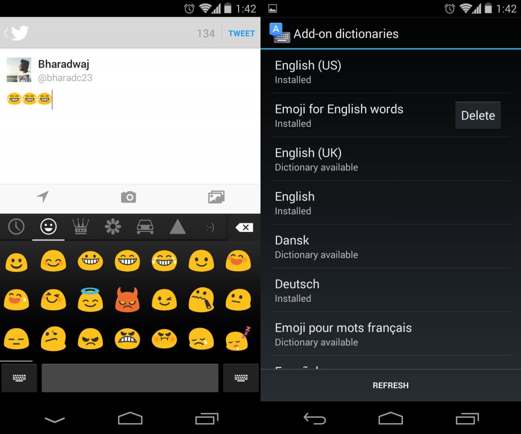
5. New Google keyboard now has native Emoji support
Google hangouts saw the introduction of the Android Emoji, but now it is available throughout the OS thanks to the additional dictionary options as well as the option in the Google Keyboard. Third party apps too now display the colourful Emoji in the text. Another highly requested feature now baked into the OS. We particularly liked how it showed Emoji as suggestions for certain expressions in the keyboard, nicely integrated.
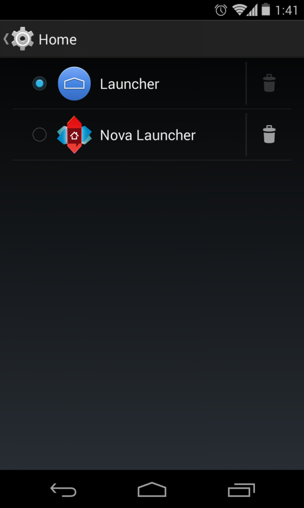
6. Switch between launchers with Home setting
Google finally comes to terms with customization freaks, by offering a native switcher for the Home settings. It is right on top of the second set of items in the settings page, and lets you easily manage the launchers, with options for even deleting them with a single touch.
7. Pro-level native photo editing
Finally, we have another great feature baked in to the OS, and that is the native photo editing inside the Gallery app. The editor is much improved from before and provides pro-level options for editing your photos, right from adding basic instagram-like filters to editing the colour curves of your photos. We are guessing all the Google+ features will eventually be baked into the Google Photos app, but it is clear that Snapseed have done a great deal of work for the native photo editor. It works great, and there are tons of options to manipulate your photo. Best of all? It’s non-destructive, so all your photos stay intact, with the new one being saved in a copy, and you can always go back to the original if needed. We haven’t seen any OS to come with this amount of functionality for the photo editor out of the box, and we are now kinda thankful that Google acquired Snapseed.
So that concludes our in-depth walkthrough of each and every change or new feature that has been introduced in Android 4.4 KiKat. We think this is really a huge deal for Google. The design direction is fresh and inviting, but it still has some more strides to make before it gets totally streamlined. The new dialer is a revelation and is easily our pick of all the new features in KitKat, the native photo editor comes in close second. We hope you liked this article, and we hope it was deep enough in terms of user facing features. There are a lot more when it comes to developer features but we have cautiously avoided them, as they already know their way around the documentation.
Anyway, let us know what you think, in the comments section below. Have we missed anything? What would you like to know more?

