Carbon, one of the popular third party Twitter clients has recently received a massive overhaul. Carbon is considered one of the better Twitter clients because of its buttery smooth UI and minimal design. The Carbon team pushed the version 2 just in time for New Year and it brought along a major redesign.

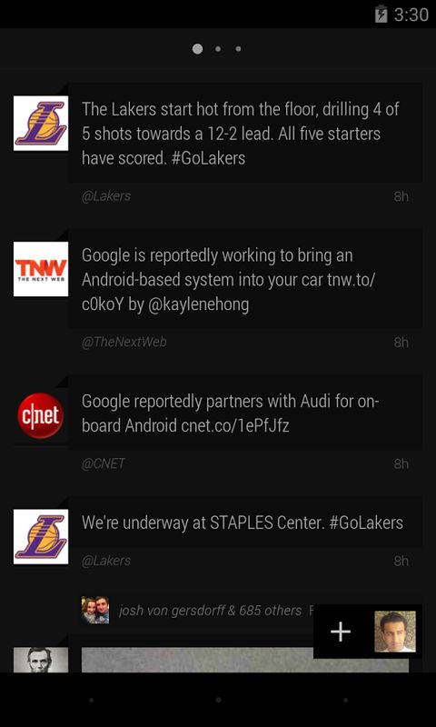
The starting screen that you see is your timeline. Swiping right takes you to the mentions and swiping right once more takes you to the direct messages. This is the basic structure of the application and it makes it quite easy and smooth to navigate between them. You can swipe up or down with two fingers to reach the top or bottom of the timeline respectively. This can be particularly useful if you want to go back to the top after checking out a lot of tweets.

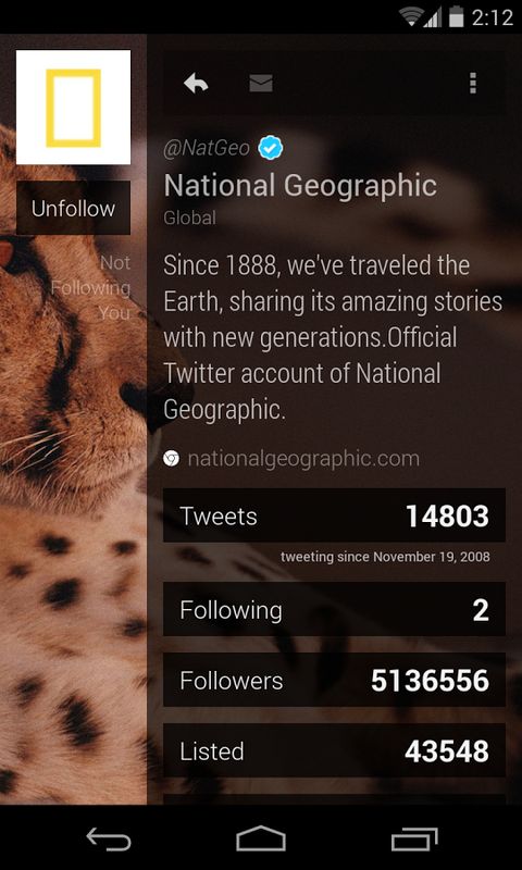
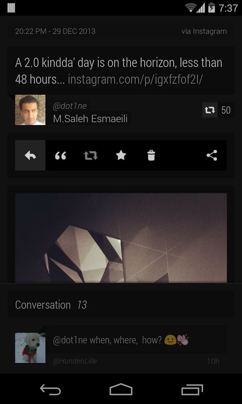
A single click on the tweet will make the links, hashtags and mentions clickable. It also displays a quick action menu that lets you retweet, favorite or share the tweet. When you double tap a tweet, it will let you edit and retweet it. Swiping right from edge brings the favorites menu that has your favorites, retweets and recent searches. You can compose a new tweet with the + sign along with your display picture on the bottom right corner. The latest redesign also changed the way a profile is display and the new look is just gorgeous. Clicking on the Profile picture at the bottom right reveals a small menu with the settings icon and links to your profile.

Do you use Carbon? If not, are you willing to try? Do let us know what you think in the comments below.
