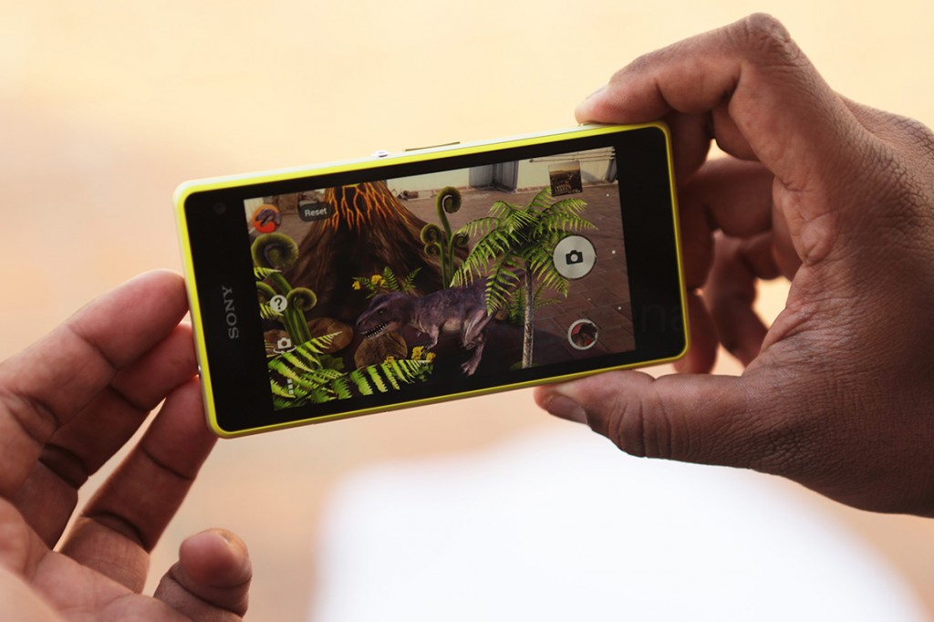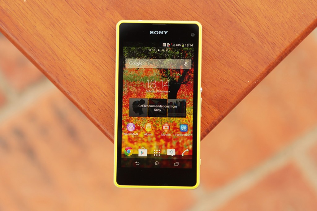
In a world where gargantuan phones, as big as tablets, are released regularly, started a trend of “mini” flagships from companies like Samsung and HTC. They were supposed to be just scaled down versions of their popular flagship devices to cater to the market that just doesn’t want huge screens; instead they were scaled down even from the inside. They sported the same design, but a ton of compromises were made otherwise. A lot of companies followed suit with this, with their own “mini” offerings, and so did Sony, but with a twist.
The Xperia Z1 f was first launched in Japan, showing us the first glimpses of what seemed like the perfect “mini” of a flagship. Sensing the potential, Sony undoubtedly went global and announced the Xperia Z1 compact. It was, much like the Z1 f, just a smaller version of the Z1. The internals and the most important USPs of the Z1 were left untouched, hence becoming the “mini” we all yearned for, and deserved. With the burden of being almost the perfect Android replacement for the iPhone, can Sony’s “mini” flagship match the deservedly high expectations? Lets find out in our detailed review of the Sony Xperia Z1 Compact.
Video Review
httpv://www.youtube.com/watch?v=XmR85EJy3_8
Check our Unboxing of the Sony Xperia Z1 Compact here
Design, Build and Ergonomics
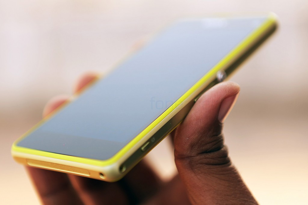
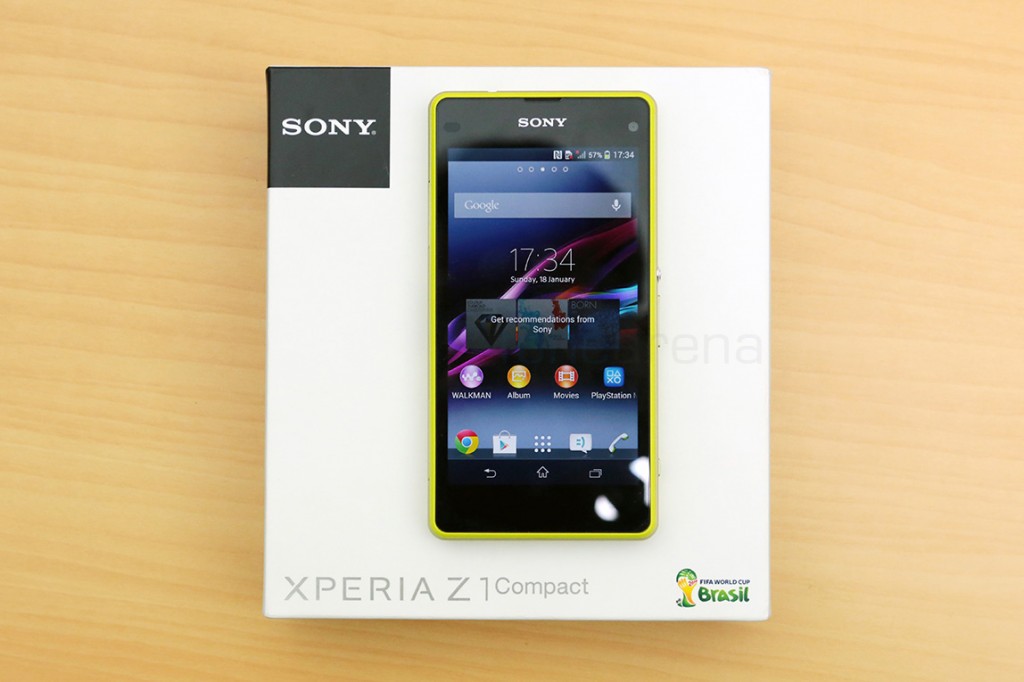
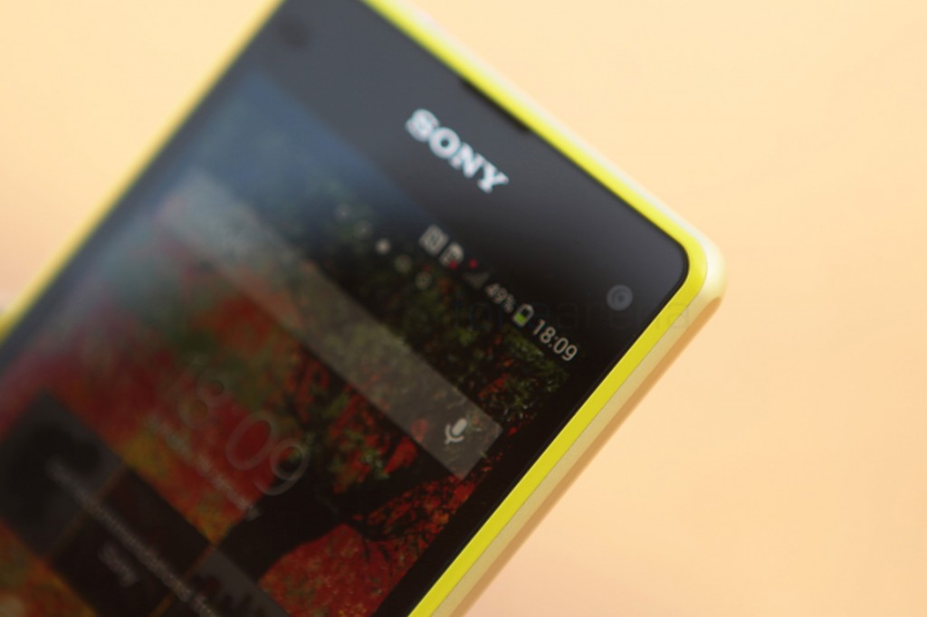
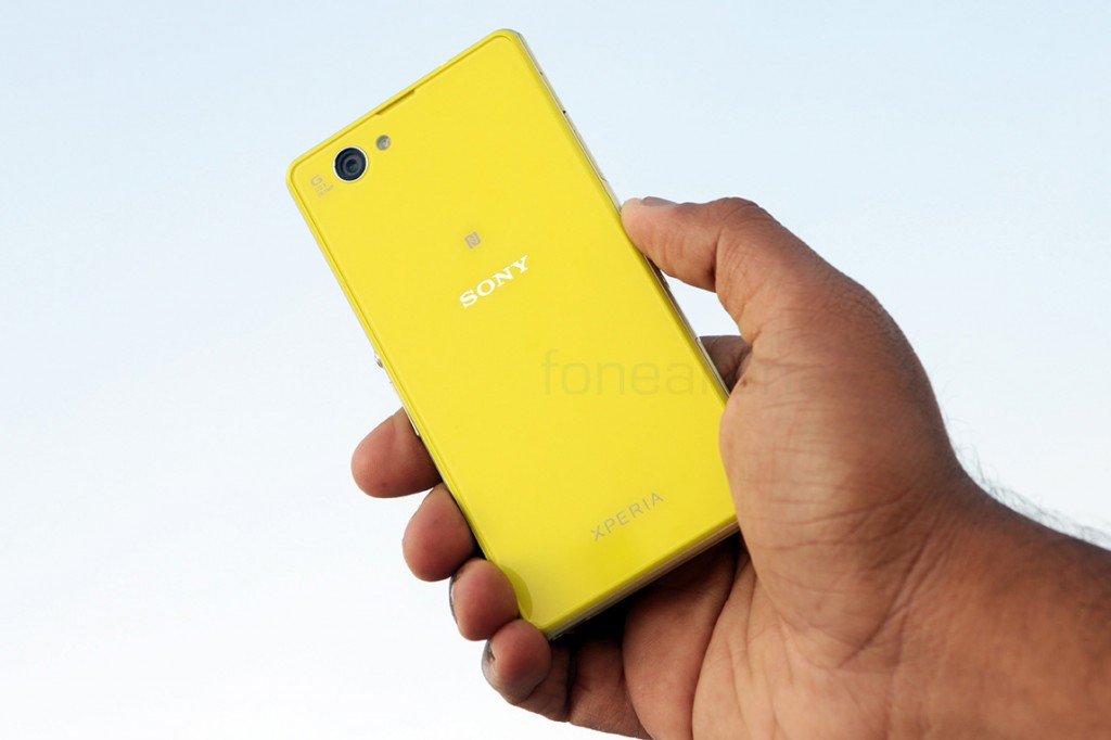
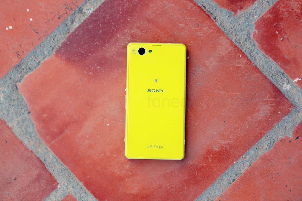
The Sony Xperia Z1 Compact carries forward the design language of the Z1, which itself was an evolution of the Z. We have the familiar flat sides and the curved corners, but also the new not-so-subtle colour variants that stand out. We have got the Lime version of the device, which looks really great. Sony touts symmetry in its design and we can see why. The device has equally sized bezels on the front and even the same cutout openings for the microphone on the back, just like the one on the front for the earpiece. Overall it is really clean and minimalistic, with the aluminium power button bringing the distinct Sony look.
Talking of premium, the Z1 compact is built with materials like aluminium and tempered glass. The frame that is sandwiched between the two sheets of tempered glass is made of aluminium, which has been lathed with different textures for the curves and the flat parts. Sporting a different olive green colour for the sides, the solid frame holds the phone together. A thin plastic layer runs along the sides of the front, showing off the colour and in turn acts as the outer rim for the glass.
Over at the back, the coloured plastic acts as the outer rim again, but also shines through underneath the tempered glass layer. While the phone’s glass layers bring in a unique reflective look, they are highly susceptible to scratches, grease and dust. This is the exact same issue we had with the Z1 too, but we feel it is less pronounced with the Z1 compact. For what it’s worth, the colour hides the scratches rather well, but using a case is highly suggested as it gets quite greasy and latches on to dust easily.
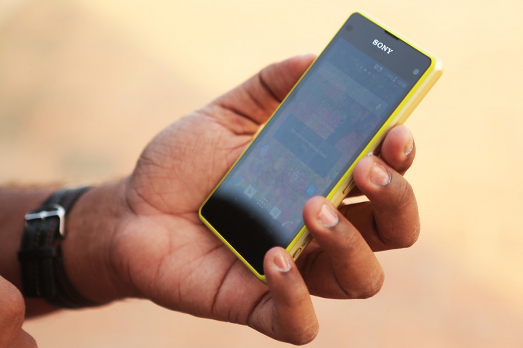
When it comes to ergonomics though, we think Sony has nailed it, almost. The device feels perfectly balanced in the hands, and being small, it comfortably sits inside the palm. The curved edges of the sides negate the flatness of the back and actually make the device really comfortable to hold. Coming from a 6-inch device, it was almost nostalgic to use a phone that fit in your hands.It is, by far, the best Android replacement for the iPhone, even matching it closely in size. Here are a few snaps to prove that –
That said, the Z1 compact is not without its minor setbacks. Coming in at 9.5mm of thickness and 137g of weight, the phone is neither thin nor light. It is the obvious mandate set by components that are usually seen only in bigger devices. Thanks to the decision to keep most of the internals from the Z1 intact, the phone has had to bulk up. A decent compromise we’d say, but one can feel that the phone is blocky and slightly heavier in use, with lesser surface area being the cause. With that said, lets take a walkthrough of the device.
Hardware Walkthrough
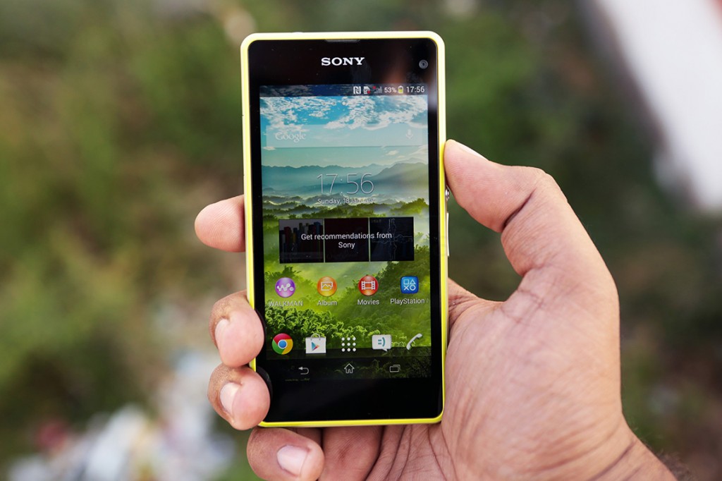
Over at the front we have the full sheet of glass covering the 4.3 inch 720 display, with an earpiece on the top. The earpiece also doubles up as the notification LED, as it incorporates a multi colour solution inside.
The 2.2 megapixel front facing camera is placed at the top right whereas the usual couple of sensors for ambient light and proximity sensing sit diametrically opposite.
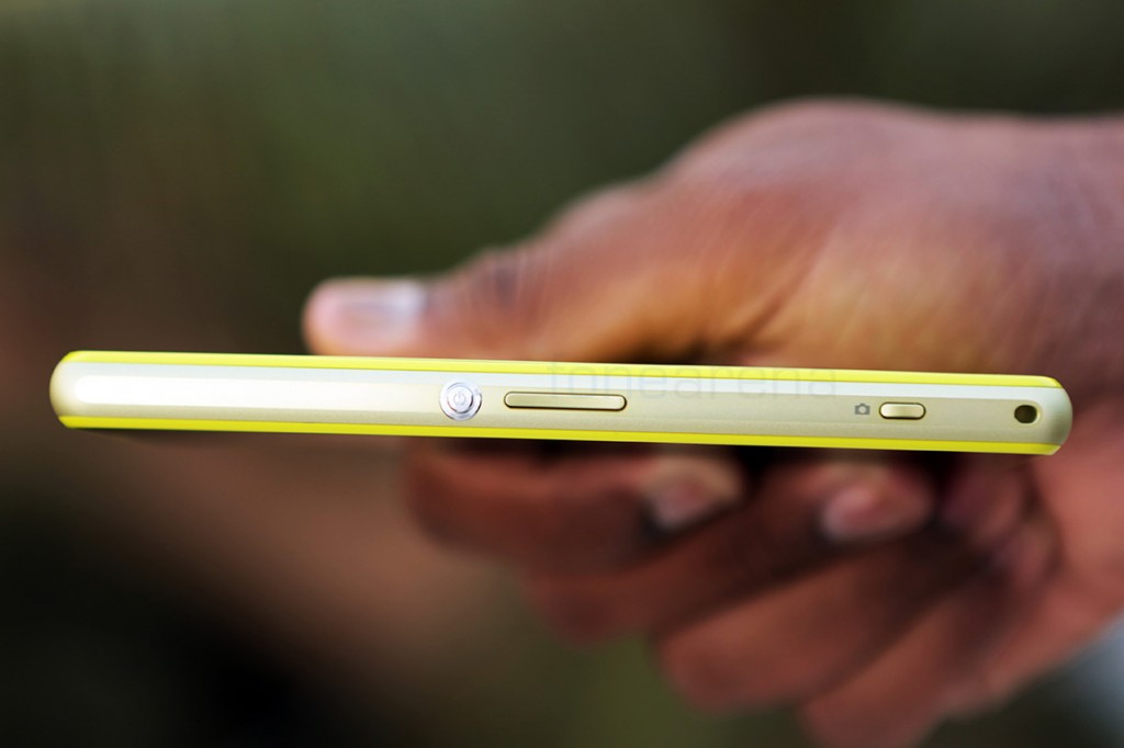
The top houses the 3.5mm audio jack, sitting amidst the shiny aluminium frame while the right side houses all the buttons, like for power/lock, the volume rocker and the really tiny two-stage camera shutter button.
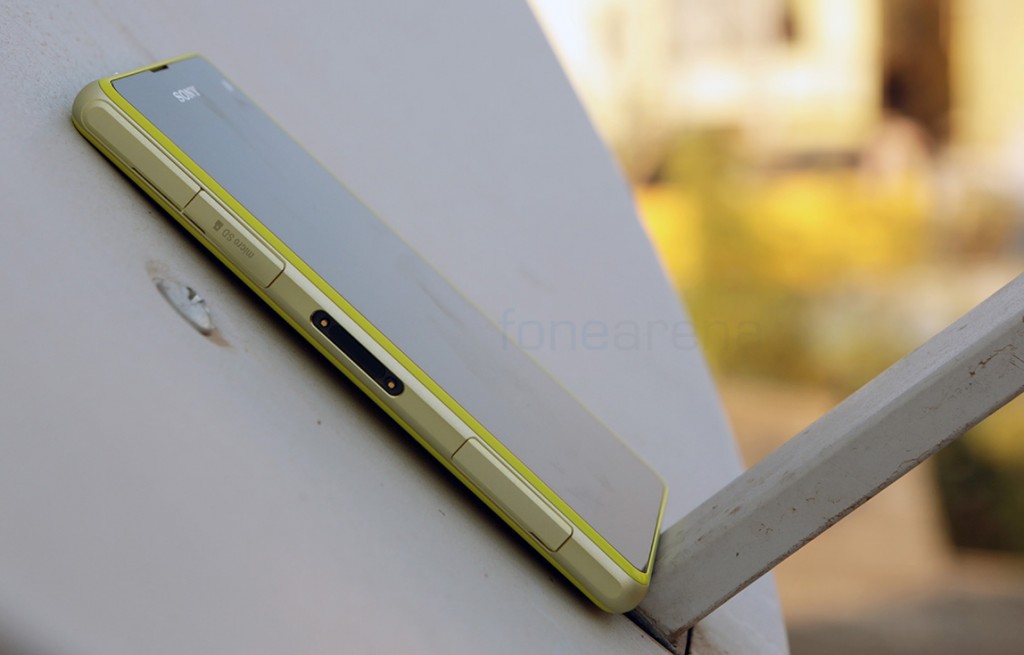
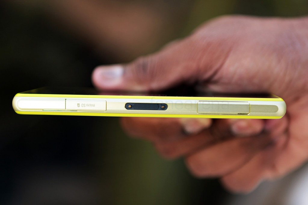
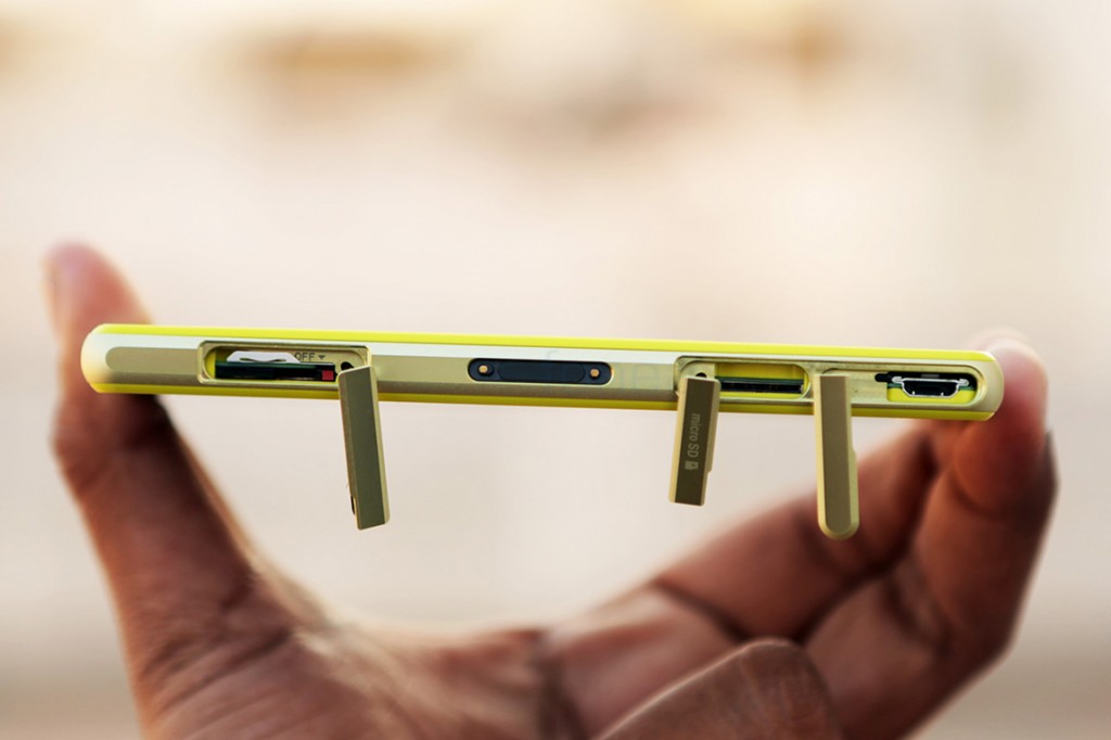
The left side on the other hand houses the ports and connectivity options like (from left to right) a micro USB port, the micro SD card slot, the docking connector and the micro SIM card tray (with the hard reset button). On a side note, the tray mechanism is really wonky at best, and we really hope Sony improves that design.
These flaps covering the ports ensure that the phone is waterproof at 1.5m for a maximum of 30 minutes, as the phone is certified with IP55 and 58 ratings, just like the Xperia Z1.
Tip: The best way to open the SIM tray is using a watch buckle in the appropriate direction.
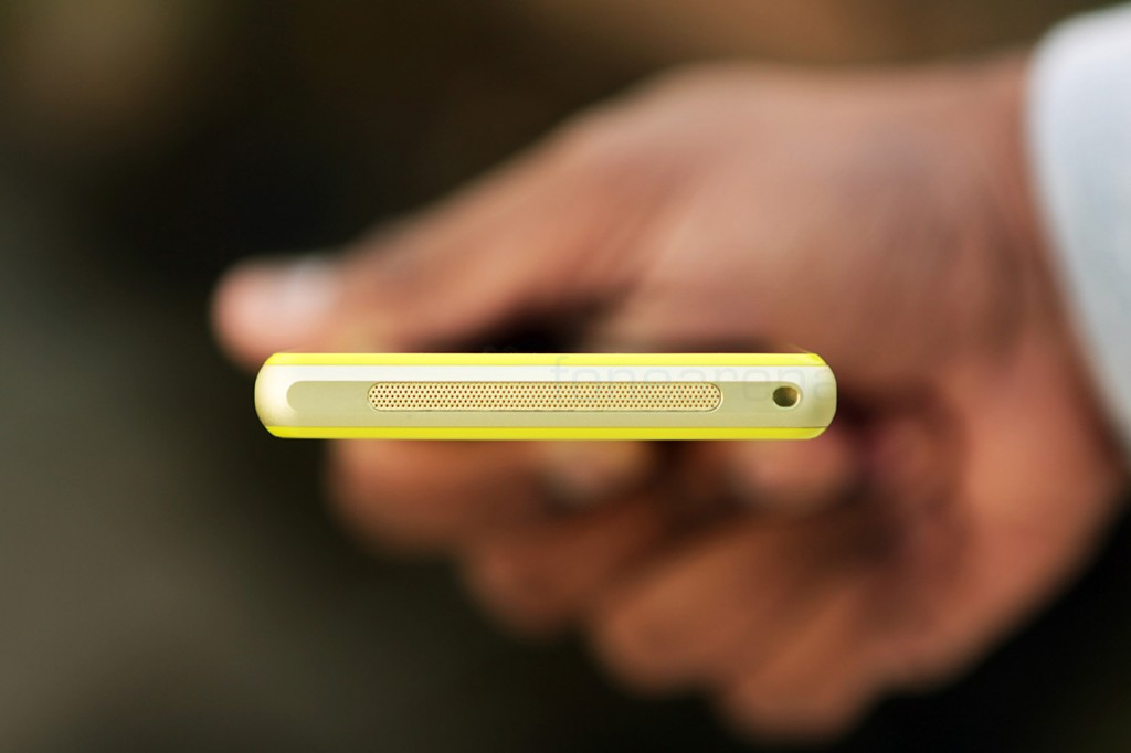
The bottom houses the loudspeaker and the primary microphone covered by the large grille, while the lanyard hole sits to the right.
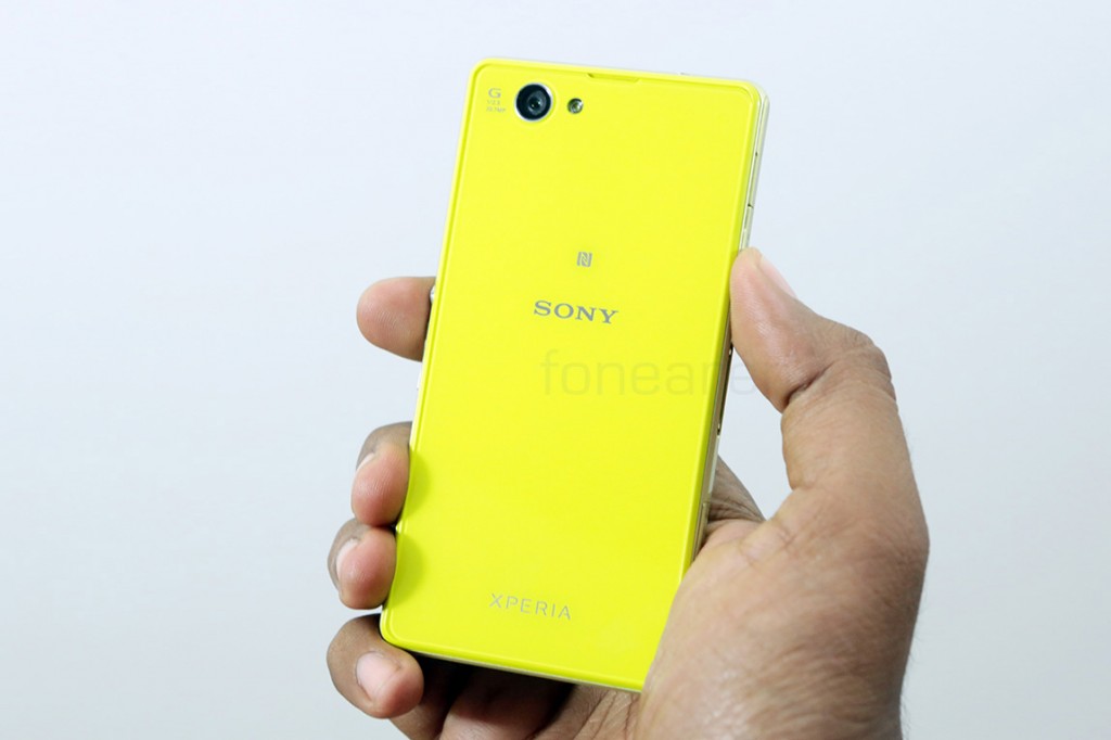
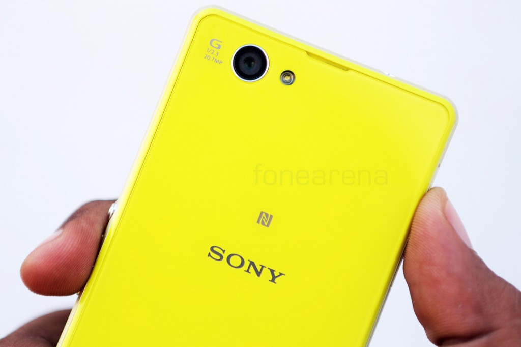
The back has the 20.7 MP camera, the single LED flash, along with the Sony, Xperia and NFC logos. The colour really shines through here. With a non-removable back cover, this brings us to the end of the hardware walkthrough. Now lets take a deep dive into the hardware highlights.
Display
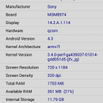
The Sony Xperia Z1 Compact comes with a 4.3-inch 1280×720 display with a pixel density of 342 ppi. This is not to be seen as a downgrade because of two primary reasons. One, it is a small phone with a small screen by today’s standards, so a pixel density of 342 is more than acceptable. Second, it is actually better than the display on the Xperia Z1.
The display comes with the same Triluminous and X-Reality branding, but comes without the washed out colours of the Z1’s display.
Marketing terms explained
Triluminous – A wider colour gamut for the display.
X-Reality Engine – Software based post processing of pictures and videos for better contrast and saturation.
Better viewing angles, better colour reproduction and an overall better performance points to a similar experience that we had with the Xperia Z Ultra. However, if we were asked to nitpick, we would pick the auto brightness setting to be the worst offender. It is too aggressive and brings the brightness way down in most conditions, rendering it unreadable in sunny outdoors. In fact the brightness is not the best overall, mainly due to the lack of an Opti-contrast panel here, which could have helped with the thickness too. That said, this is easily one of the best displays from Sony for a smartphone and we really liked it, despite the minor shortcomings.
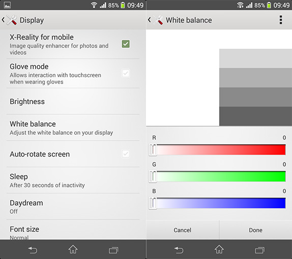
Additionally, it even supports the glove mode (high sensitivity) that the Z1 lacks and white balance modes for better control over how the whites look on your display. Overall, the display is crisp, colourful and apt for a smartphone at this screen size, but you have to squint initially if you are used to the large displays like us.
Camera
The best thing Sony did to the Xperia Z1 compact was retaining the camera from the Xperia Z1, which was a major upgrade from every Sony smartphone camera that came before. It uses Sony’s own ½.3” EXMOR RS sensor, with a 20.7 megapixel count and a bright, fast G lens with f2.0 aperture. The sensor uses the BIONZ mobile algorithms for various image-level processing including, for the first time on a non-Nokia phone, oversampling and lossless zoom.
Marketing terms explained
EXMOR RS – Stacked CMOS sensor from Sony, has more light gathering capabilities.
BIONZ for mobile – Sony’s custom imaging algorithms, highly useful for real-time processing, post-processing and burst shots.
G lens – Sony’s DSLR lens brand comes to mobile, touts better clarity and fidelity. 27mm wide angle, f2.0 aperture are its highlights.
Yes, this is the first time a non-Nokia phone makes use of oversampling algorithms using a large sensor (largest in an Android phone yet). Oversampling is the way of using super pixels, like gathering data from a cluster, rather than a single pixel, hence creating more room for processing and extracting more detail. It works the exact same way as it works on the Xperia Z1, but here is a picture-to-picture comparison of it with the manual mode that lets you take full resolution pictures.
The way we see it is that oversampling helps in brightly lit conditions, but falls flat in low light. There is simply too much processing going on in low light that makes the images look very unnatural. Lossless zoom works quite well, but it is better suited for low resolution sharing.
Anyways, we took a whole lot of samples with the Xperia Z1 compact in various conditions; here are the full resolution samples – (linked to Flickr because of file size limitations)
As you can probably see from all the pictures above, the camera performance of the Xperia Z1 compact is exactly the same as the Z1. It is right up there at the top when it comes to the Android world, with really clear and vivid pictures in most conditions. The intelligent auto mode is best used in day light while switching to full resolution will help in taking natural pictures in low light. But if you’d ask us to rate it with the Nokia Lumias or the best cameras in the Android world, we’d say the performance is a hit or miss. At times, the Z1 Compact has the ability to best the others, but those times might be rare.
These modes we are talking about? Well, they are all part of the standard Sony camera app that we saw on the Xperia Z1 as well as the Xperia Z Ultra. We have a walkthrough video of the camera’s UI, in case you are interested to see each and every aspect of it –
httpv://www.youtube.com/watch?v=2tw5DBkQz1A
Interesting modes include Timeshift Burst, which can take 30 snaps in one second, albeit at a lower 1080p resolution. Actually, the 1080p resolution is applicable to most modes on that screen including the fun AR modes like Info View and AR effect. These aside, the basic modes do work great, with Superior auto almost always good at recognizing the type of scene and the manual mode offering a lot of options including image stabilization through software.
Coming to video, the options are rather limited. You can only record up to 1080p video at 30 fps, no signs of 60 fps or 4K here, although the hardware is capable to support it. The audio recorded is in stereo and of good quality, and the video is really good quality too. You also have the options for enabling steadyshot image stabilization (software) and HDR video. Even though HDR video has better dynamic range than the normal one, the tradeoff with quality is worrisome. Best stick to the default or superior auto mode for the best performance, which is almost always good.
Internals and Performance
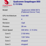
If the camera being retained is the best thing to have happened for the Z1 compact, the second best thing would be Sony deciding to retain the powerful internals. Yes, the Z1 compact has the same Snapdragon 800 chip from Qualcomm that powers the Z1 as well as many other popular flagship devices. Running at 2.26 GHz, the quad core Krait CPU is accompanied by the capable Adreno 330 GPU. Like we had seen with many other phones, the performance on the Z1 Compact is top notch.
To verify this claim, we ran a bunch of synthetic benchmark tests to see how the phone handles the stress, especially with the extra headroom for the GPU provided by the 720p display. Here is a sample of how it turned out –
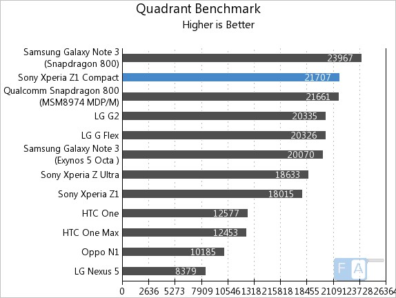
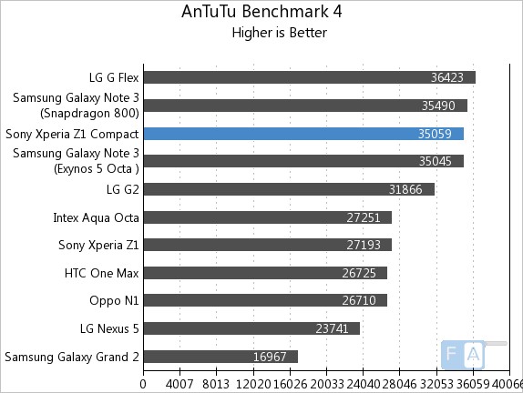
You can check out the complete set of benchmarks here, and suffice to say, the Xperia Z1 compact is right there at the top along with all the flagships, as expected. The realtime day to day performance is not a problem either, with the UI being one of the fastest we have ever used on a phone with a custom skin. It is way faster than what it used to be and that’s a welcome change. Another main aspect of gauging any device’s performance is gaming, which we dedicatedly do for each and every device we get. Unsurprisingly, that proved to be the Z1’s home turf too, especially thanks to the lesser resolution stress on the GPU. This is how it turned out –
httpv://www.youtube.com/watch?v=x3HYgQe3poo
httpv://www.youtube.com/watch?v=aP6wMDkE9dY
Performance is a total non-issue for the Xperia Z1 compact. It is blazing fast as expected and doesn’t fail to match the flagships. However, we did find some software based instability issues, which we will discuss in the software section. In terms of multi-tasking, the phone blazes through thanks to the 2 GB of RAM, out of which around 1.7 GB is available for the system. We found around 600 MB free after regular use, and it never lagged for us while switching between any number of apps.
Connectivity and Storage
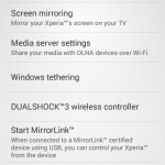
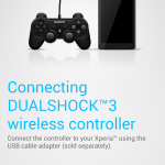
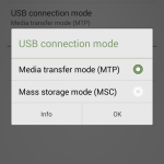
The Xperia Z1 compact comes with tons of connectivity options. It has 4G LTE support, 3G HSPA+ and all the other usual suspects like WiFi, Bluetooth 4.0, NFC and FM radio. But it also has USB OTG support and even comes with a cable out of the box, which is something new for Sony. All Sony Xperia devices come with support for the company’s dualshock 3 wireless controller and the Z1 compact is no exception. Once paired over USB, the controller was be used wirelessly for games, or even just navigating the UI while mirroring the screen over Miracast. On top of that, all the in in-built Xperia Apps have the “Throw” support to project any kind of media. The app intelligently selects the kind of options available for projection and uses the technology available to do so.
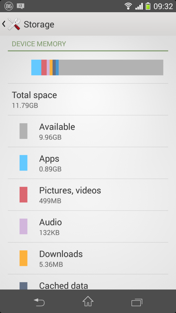
Storage wise, the device comes with 16 GB in-built, with 11.79 GB available for the user. However, you also have the micro SD expansion slot, which can be used for app storage as well. To top it off, Sony even offers SSH FTP connectivity through its storage options, which is really thoughtful for users willing to use this kind of functionality, which brings us to Sony’s software.
Software
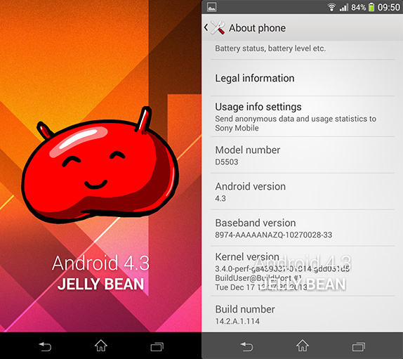
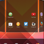
Sony’s software had been a sticking point in many of its products before, but we are glad to say that it is not the case anymore. Running on a heavily skinned version of Android 4.3 Jellybean, Sony’s UI has evolved from the messy Timescape age to a much cleaner and more functional experience. There is a lot to like about the refreshed interface. It tends to be very clean, with clear black transparent layers on the homescreen and white UIs for anything inside an app. This brings it a lot closer to KitKat and the lack of a Holo-style settings app is actually quite refreshing. We have seen similar UIs in other phones too like, like in a HTC or a Oppo, which are equally good in terms of design.
However, the functions here are equal to the delectable forms. Every bit of customization is tailored to be useful, like the quick settings page with a total of 10 shortcuts, completely configurable. So much that you can even completely remove that thing and use your own quick settings. The default launcher supports theming, with a change in icons, accent colours and even custom on screen navigation buttons. This creates a whole lot of difference in looks and completely blends in with the launcher. Can’t be said for other launchers or theming engines that don’t support the skinning of default apps. Here, the theming permeates to every app that uses system elements, so the inherent customization capabilities are really great on the Xperia launcher.
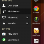
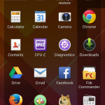
The app list too is unique, with its own slide-right drawer for customization of the order, quick uninstallation of apps and a lot more. Android 4.3’s features like lock screen widgets nicely blend in with the custom skin and the internal changes are brought on here, which may indicate the reason why the UI is very fast. While the launcher is great, it is not entirely customizable like some other launchers, for example one cannot have different pages of dock icons or have folders in the app list, but the minimalism brings with it the compromises, and that’s certainly understandable. Some of the additions like the mini-apps in the multitasking drawer are quite useful on the Xperia Z Ultra, but goes to waste in a small screen such as the Z1 compact. Another impact of the smaller screen is that the scaling is off in some places like the notification drawer where the quick settings icons become too small, which is not the case of the bigger screen phones. Just a small occurrence though.
But above all, it’s the performance factor that impressed us so much. The UI is zippy fast and snappy thanks to the core optimizations that Android 4.3 brought, as the GPU accelerated animation perform butter smooth on the Z1 compact. The fading animations when switching to a new app, the switching animations and everything that pops up on the screen does so, fluidly, which we could see only on Android 4.4 devices earlier, and the platform is just at 4.3. However, stability was a big question mark, as the phone crashed to a black screen a couple of times. Once it just restarted, while the other time, we had to resort to the hard reset button that sits alongside the SIM tray. This was a small frustrating point in our experience with the otherwise surprisingly good Z1 compact’s software.
Apps
Like the many customizations in the UI, there are many custom default apps from Sony and all of them are better than what we usually get on AOSP. Right from the messaging app, dialer to the media apps for photos, music and video, all the apps are definitely sleeker and more functional. Taking advantage of the GPU, the photos app can do a real time re-arrangement of the photos in a pinch gesture, which is quite cool. The phone supports 4K video play back, so if you are looking to project through MHL on to a 4K tv, that is possible. The music player (the iconic Walkman) is reminiscent of the Windows Phone UI but again, worked really well with most formats we threw at it. Alongside all the usual Google apps, we also have a sketching app, a file manager among other third party pre-installed apps such as Facebook, McAfee, Neo Reader, Office Suite, Pixlr and a lot of Xperia apps. Playstation mobile is also pre-installed, using which one can buy games for the console.
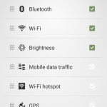
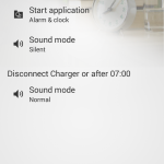
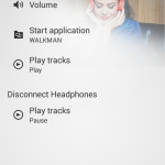
One of the really noteworthy and intelligent apps is the automation-based Smart connect. One can give specific workflows for the app to follow upon connection or disconnection of a peripheral, which can include a bluetooth accessory, a dock or just headphones. The events are triggered when the action happens, like for example, I had configured the phone to start playing music whenever I connect a headset, which is one of the many appropriate use cases. This app is something we found really useful and think more should know about it, although it’s already available on most Sony devices.
Battery Life
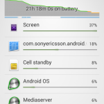
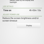
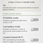
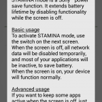
Coming to the battery life, this is one of those rare decisions when Sony had to cut down, due to the restrictions of physical dimensions. The phone packs a 2300 mAH lithium ion battery unit, which is sealed inside. It gave us an average of around 18 hours of regular usage, with constant connection to a pebble smartwatch, a couple of hours of 3G, Whatsapp and heavy twitter use, with notifications on. This is considered decent battery life for one day of use, but the phone does buckle under pressure, as constant use drains the battery. Not as fast as we had seen on other devices, but fast enough to need a charge in 8 or 10 hours. But this is all with no power saving modes turned on, like the Stamina mode, which Sony proudly advertises. We’ll give them that, because the Stamina mode works great, and is entirely customizable. It elongates the battery life well enough to last a day, and may be even more if you use the phone sparsely. Basically it cuts off all the internet-related background work when the phone’s screen is switched off, but you can have exceptions within the app. This makes a lot of sense and obviously works great for the battery life. Highly recommended that you use it after customization.
Price
Update: The Xperia Z1 Compact has been officially launched in India for a price of Rs. 36,990. While it may seem steep for a phone that has a small screen, also remember that the phone packs as many high end components as all the other flagships. With low specced devices like the HTC One mini launching at a similar price, we personally think the Z1 compact’s price tag is totally justifiable.
Conclusion
In the end, we think “the mini we deserve” matches our high expectations of a small flagship device, without a lot of compromises. If you are coming from an iPhone and really really want a similarly sized device with all the experiences that you’d expect out of a flagship, then the Sony Xperia Z1 compact is undoubtedly the best choice. However, you might have to put up with the slightly blocky design, quirky stability issues and a hit-or-miss camera, especially in low light. Small compromises aside, the Xperia Z1 Compact is the best “mini” version of a flagship device, and it is good to see that Sony has righted a lot of wrongs from the Xperia Z1 here. It has a better display, better performance, and we only wished it had the same battery. To summarize it better, here is a list of pros and cons of this device –
Pros
- Nicely designed, colour options
- Display is really better now, much better than the Z1
- Blazing fast performance throughout
- Packed with connectivity options
- Highly customizable default software
Cons
- Glass build susceptible to scratches, grease and dust
- Good, but sometimes a hit or miss camera
- Software stability needs to be improved

