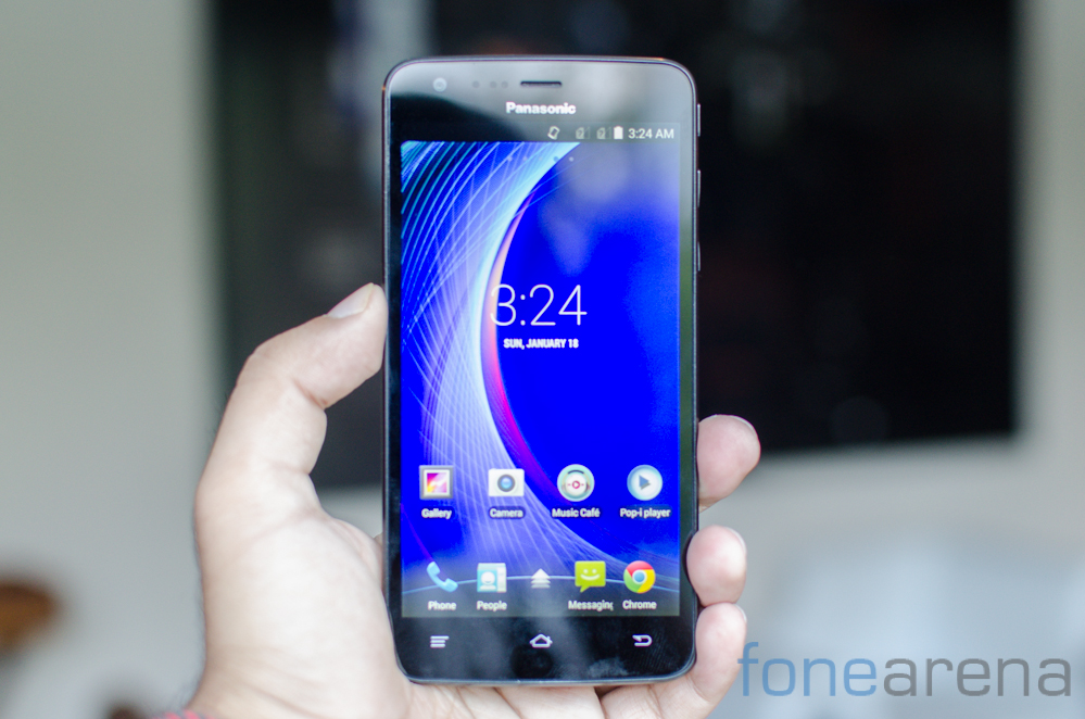
While there is no doubt that the US is the technology center of the world, it is also true that India is widely considered as the hotbed of smartphone competition. The country offers great opportunity to smartphone manufacturers both big and small to compete for a share of the untapped masses and get a share of the pie. With that in mind, Panasonic shifted its global headquarters for it’s smartphone business a while back. With the launch of the Eluga U, the company is bringing its flagship brand here. Is it worth the hype? Find out in our review.
Panasonic Eluga U specifications
- 5-inch (1280 x 720 pixels) HD IPS OGS display with Corning Gorilla Glass 3 protection
- 1.2 GHz quad-core Snapdragon 400 processor with Adreno 305 GPU
- Android 4.4 (KitKat)
- Dual SIM
- 13MP rear camera with LED Flash, 1080p video recording
- 2MP front-facing camera
- 7.95 mm thick and weighs 141 grams
- 3.5mm audio jack, FM Radio with RDS
- 2GB RAM, 16GB internal memory, 32GB expandable memory with MicroSD
- 3G HSPA+, WiFi 802.11 b/g/n, Bluetooth 4.0, GPS
- 2500 mAh battery
Hardware
Design is something that Panasonic has focussed on a lot with the Eluga U. While certainly a handsome device, it is far from original and takes liberal cues from several popular phones including the Nexus line.
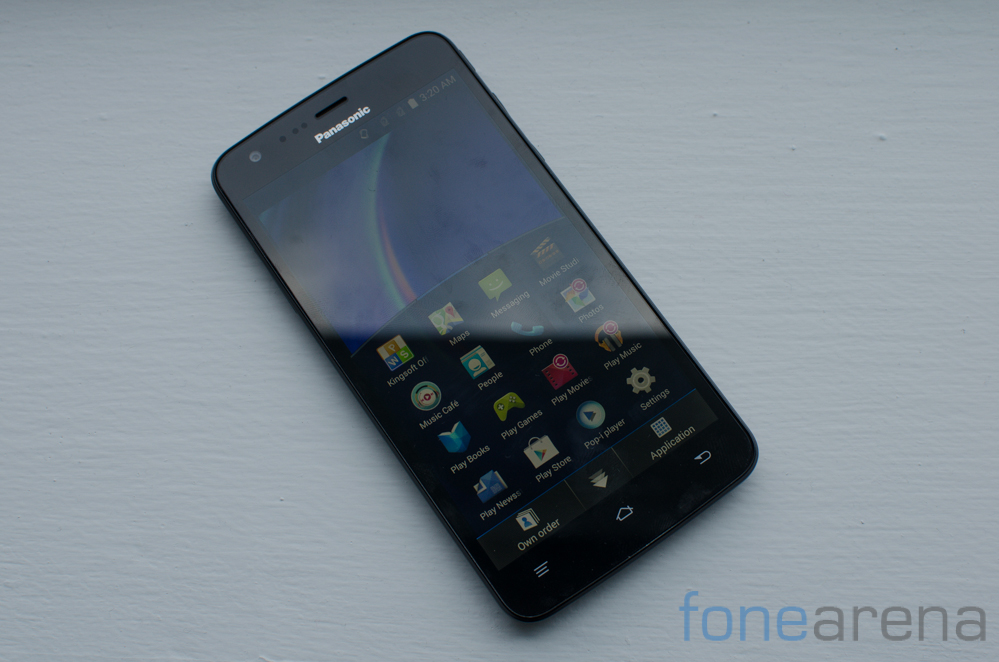
The front of the phone has a 5 inch screen as is commonplace amongst all mid range handsets. Below the 720p screen are three capacitive buttons while above the display is the front facing 2MP camera as well as the standard proximity sensors. A notification LED can also be found here.
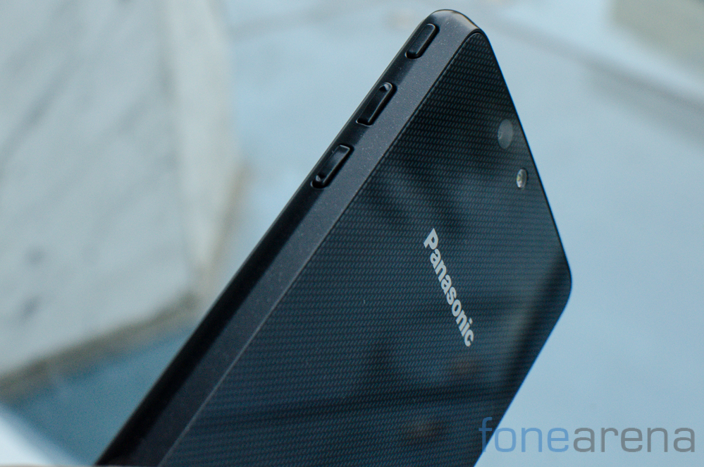
The right side of the phone sports the power and volume buttons. As we noted in our initial hands on, these buttons do not feel particularly reassuring and wobble a fair bit on pressing. Another gripe we had was with the button arrangement. The power button is placed too high along the edge of the device which makes it a stretch to reach. It is all too easy to mistakenly press the volume rocker instead of the power button.
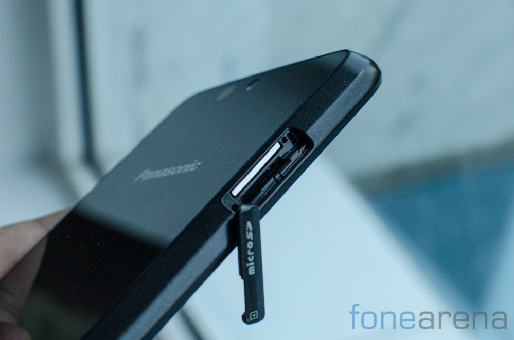
The left side of the phone is bereft of buttons and includes only a flap that hides the microSD and SIM card tray. There’s a 3.5mm audio jack on the top of the phone while the bottom of the device has a microUSB port and microphone. The port arrangement is bog standard and there’s nothing remarkable or particularly wrong here.
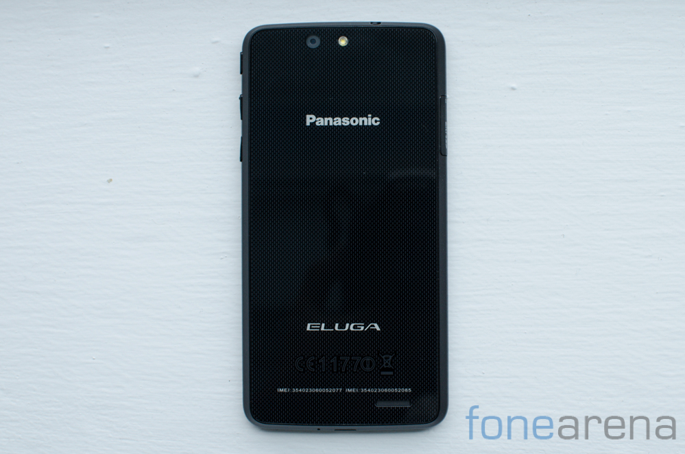
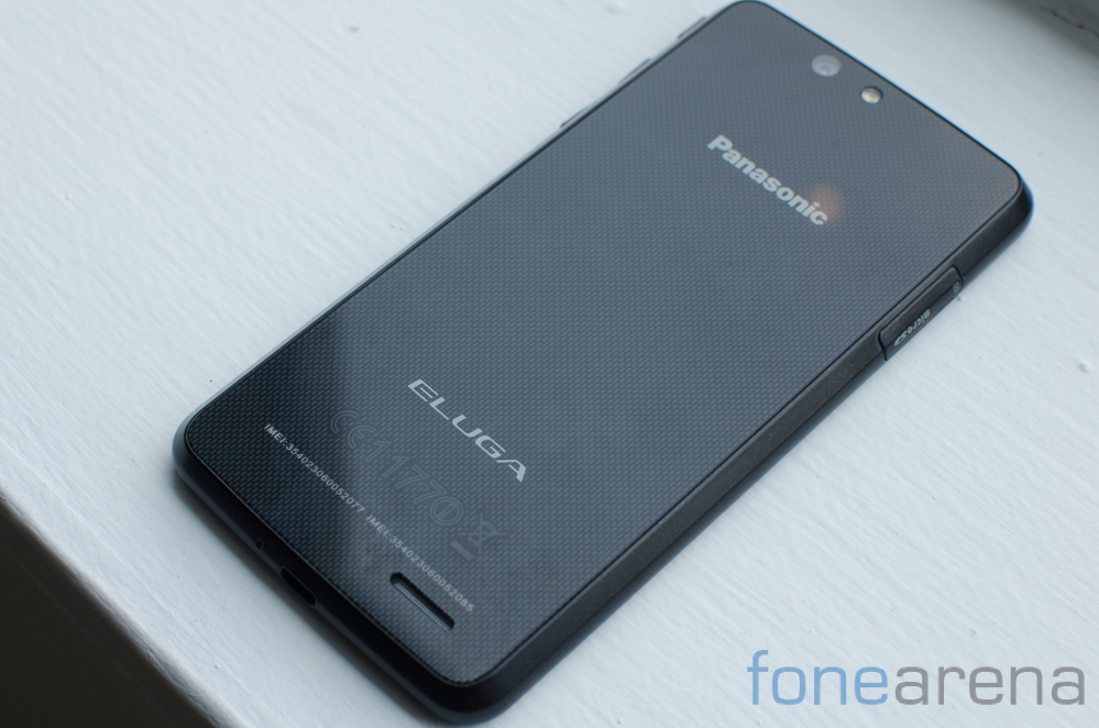
Moving to the back of the phone, you spot the textured rear glass panel. The panel reminds us quite a bit of the venerable Nexus 4. It is not removable and so the battery is not accessible either as you’d imagine. Like the power button, the 13MP camera and accompanying flash module are placed a bit too far up though it doesn’t really get in the way of taking images. Branding is minimal and includes the Panasonic and Eluga logo as well as necessary certification logos. The color and typography makes the branding material look fairly unobtrusive. Like the front, the back of the device too is a massive fingerprint magnet and scuffs are surprisingly hard to clean owing to the material used. Measuring 7.95 x 141.5 x 71.3 mm, the handset fits well in the hand and is slim enough to fit into most pockets. We take issue with the materials used but we found the phone to be ergonomically sound.
Software
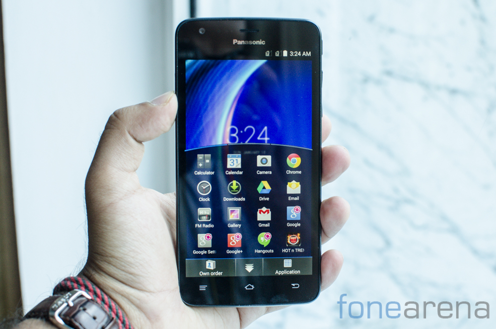
The phone runs Android 4.4.2 onboard with a custom skin called Fit Home UI on top of it. It is possible to drop back to a standard Android KitKat skin as well. That said, Fit Home is a surprisingly unique and usage focussed attempt at skinning. One that isn’t entirely an inconvenience and that we could see ourselves using on occasion given the amount of polish that has gone into it.
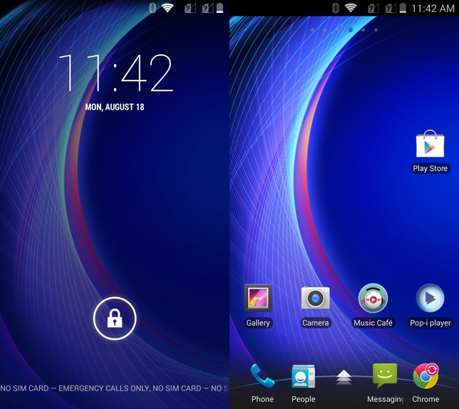
The Fit Home UI has been created to facilitate single handed usage and tackles a very specific problem. The entire app drawer has been reduced to a half height pane which can be conveniently scrolled from side to side. The backdrop fades away giving it a stylish look while remaining functional. The Fit Home UI allows you to switch application order between alphabetical, recently installed and your own order. You can also access widgets and wallpapers from this half height menu which means that for a large extent of interaction with the phone, you can most certainly navigate using just one hand.
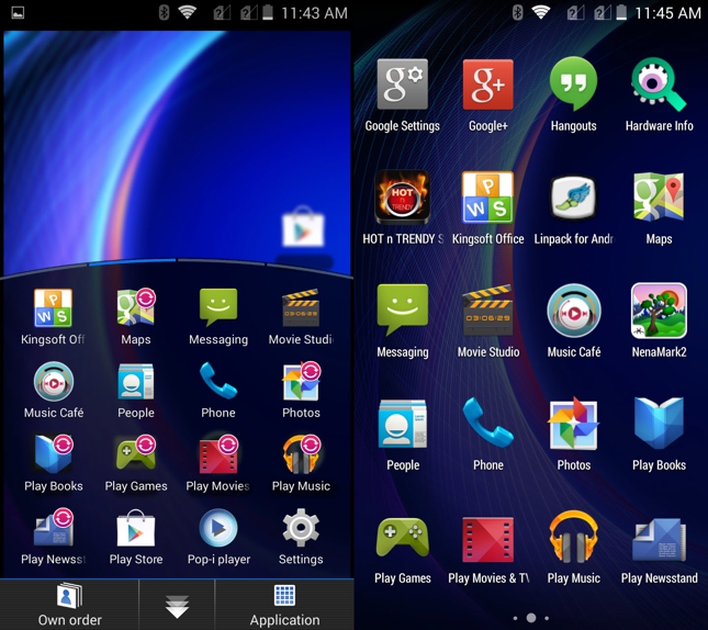
In addition to the Fit Home interface, the company hasn’t really messed around with the formula and much to our pleasure, bloatware is kept to a minimum. Three apps come pre loaded which includes Hot N Trendy Space, Panasonic TV Remote and Kingsoft Office and these invariably bring utility to the customer, more so if they vested in the Panasonic hardware ecosystem.
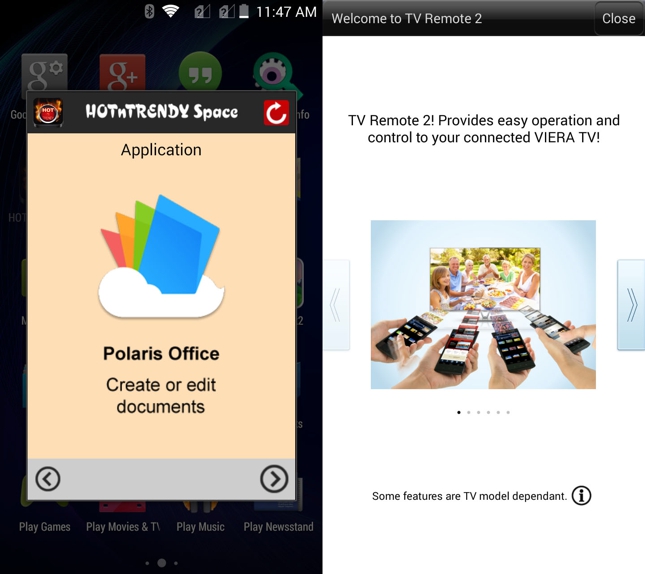
While Hot N Trendy is just a content recommendation engine for Android applications, Panasonic TV Remote shows a lot of promise. Due to lack of equipment, we couldn’t test out this application but it can be used to control Panasonic’s Viera range of televisions over your local WiFi network. The Panasonic TV application works in tandem with your WiFi connected Viera television and allows you to control most functions directly from your phone. Kingsoft Office as the name suggests is an office suite allowing you to view, create and edit documents on the go. Overall, the Eluga U is one of those few phones where the manufacturer provided skin wasn’t an eyesore and an impediment to usage.
Performance
The Panasonic Eluga U is far from a top of the line phone but it does carry enough power under the hood to be capable of effortlessly carrying out day to day duties. Powering the handset is a 1.2Ghz Qualcomm Snapdragon 400 quad core chipset that is paired with 2GB of RAM. There’s also an Adreno 305 GPU on offer that is good enough for light gaming.
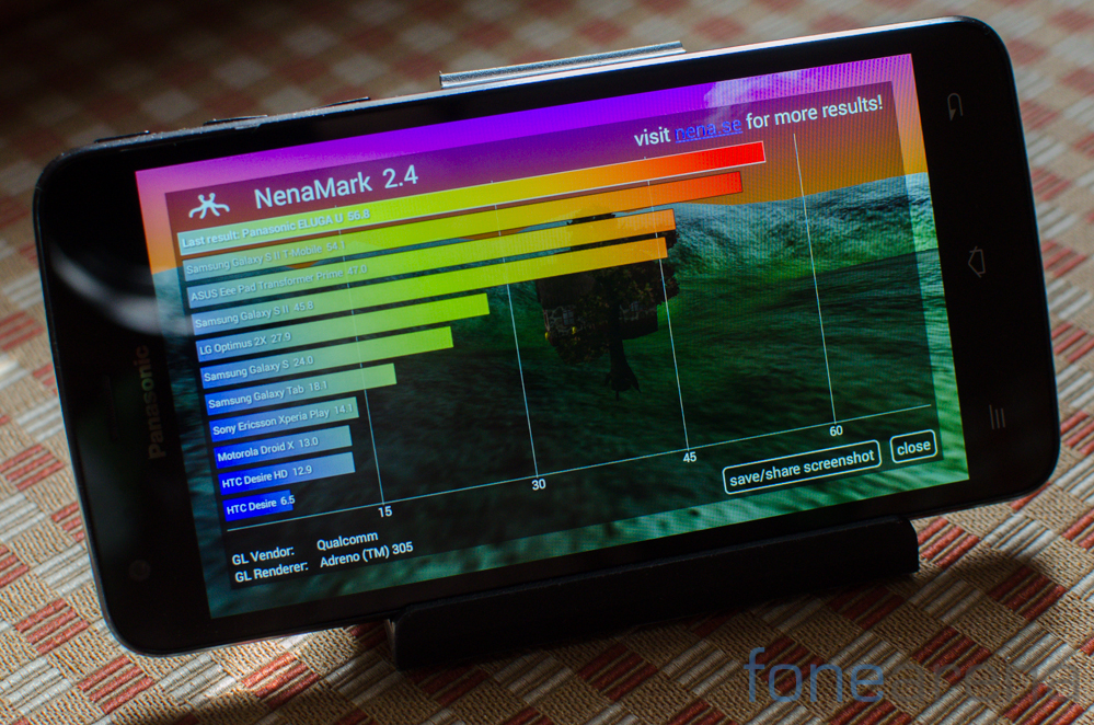
There’s about 1.4GB of RAM available on boot and performance tends to be decent with just an occasional frame drop when navigating the interface. Synthetic benchmarks show that the handset is decidedly mid range when it comes to performance and this backs up our experience too. We doubt most users would have anything to complain about here though as day to day navigation is perfectly fine. The phone occasionally drops frames while playing graphically intensive games and does heat up a fair bit too. Worth keeping in mind if you are an avid gamer. We’ve included a range of synthetic benchmarks below for you to take a look and gauge comparative performance of the handset.
AnTuTu
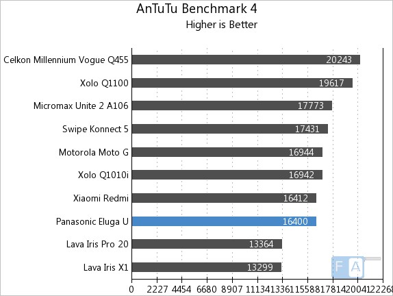
In the AnTuTu benchmark, the phone scored 16400 points which places it towards the lower end of our test bed but the difference between handsets is minimal.
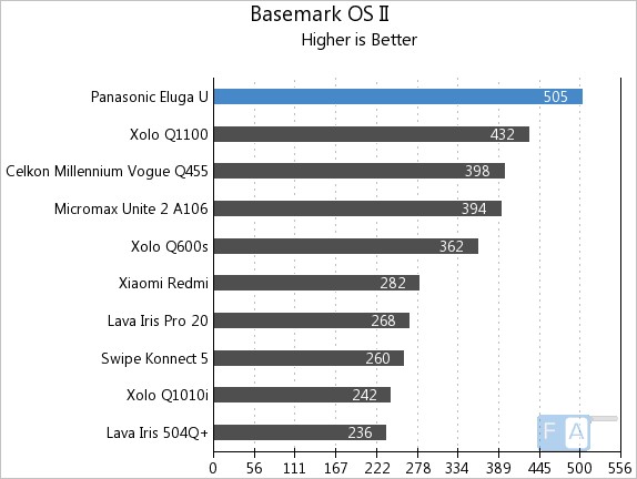
The Panasonic Eluga U excels in the Basemark OS II benchmark scoring 505 points and this places it ahead of most of the competition.
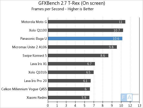
GFXBench is a GPU test which measures how well the phone will perform especially in gaming. Here the phone managed 10.6 frames per second which is in the upper range of our test bed.
Display
A five inch 720p panel can be found up front on the handset. The screen is well saturated and boasts of great brightness levels. We found the screen to be usable for the most part but it does tend to wash out in bright sunlight.
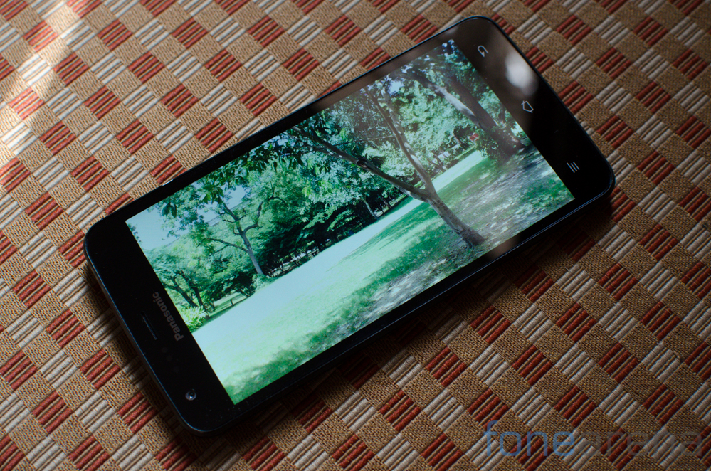
With a pixel density of 293.72 ppi, the display is good enough and ranks well with most of the Android competition. We found it to be crisp enough for every day use though there are obviously occasional jaggies around text and icons.
Camera
A 13 MP camera is what you find over at the back. The module is placed surprisingly high up on the handset and is accompanied by a single LED flash. Image quality from the phone is reasonable. We found that the hardware often over exposed the shot and dynamic range was an issue as is visible with the burnt out highlights. That said, the photographs are generally very sharp and noise levels are under control for the most part. Low light shots weren’t particularly good.

The Panasonic Eluga U does well with HDR shots and the contrast levels, saturation levels are much more appealing than the shots produced in standard mode. Additionally, the camera is able to recover a significant amount of details that it loses out in the standard mode. The camera is capable of capturing Full HD video with more than passable results. The camera does struggle with white balance but does a great job with managing exposure levels even when moving from light to dark areas.
Connectivity & Battery Life
If there’s one area where the Panasonic Eluga U excels, it has to be battery life. The phone could easy last us a work day without a hassle. The built in 2500 mAh battery pack is not replaceable but proves to be enough to last us a work day. With multiple email accounts, an hour or two of phone calls, music listening and occasional photographs, we had no issues in getting through a full work day.
In terms of connectivity options, you’ll find all the usual suspects including 3G HSPA+, WiFi 802.11 b/g/n, Bluetooth 4.0 and GPS. The phone has 16GB of built in storage of which about 13GB is available. Additionally, there’s a microSD card slot for expanding the built in storage on the phone.
Conclusion
The Panasonic Eluga U is a good phone without a doubt but the bigger question here is if it is worth the price. The competition has stepped up its game and the likes of Xiaomi are offering much higher specced devices for a much lower price point. We were satisfied with the performance and software build on the phone but remain skeptical about the upgrade path to future versions of Android.
The camera on the phone too was less than stellar. All in all, the Eluga U is a decent offering but we’d find it hard to recommend over the likes of the Xiaomi Mi3 or the myriad other Android phones that offer a Full HD screen, similar specs at a lower price point. The Eluga U is not a high end flagship, far from it, but it is a decent phone. We think that Panasonic needs to rethink its pricing strategy if they want to crack the Indian market. A good product just isn’t enough in a price conscious market like India.
Pros
- Display
- Performance
Cons
- Camera
- Price


