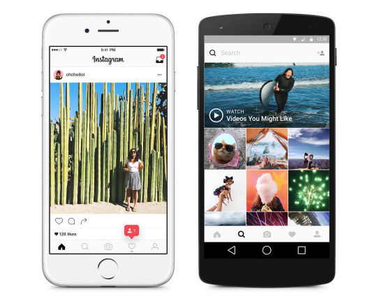
Instagram has finally rolled out its new black and white design for all the Android and iOS users, after beta testing it on Android couple of weeks back. The latest update brings monochromatic design instead of the usual blue and colorful theme, brings thinner and flatter icons on the bottom and doesn’t add any new features.
“Our updated look reflects how vibrant and diverse your storytelling has become. The simpler design puts more focus on your photos and videos,” said Instagram. The new look has been inspired by the community.
It has also updated the app icon with simpler camera and the rainbow lives on in gradient form. This has been inspired by the previous app icon. Instagram has also updated the icons for our other creative apps: Layout, Boomerang and Hyperlapse. Check out the video that highlights the new design.
httpv://vimeo.com/166112315
