The Android TV interface has mostly been unchanged over the last few years. That is finally changing as Google has begun rolling out a new update to Android TV that brings a fresh new redesign to the user interface and changing the organization to make content discovery easier.

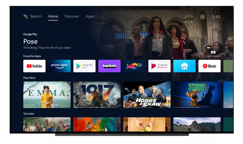
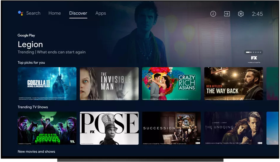
The Android TV update will make the UI look quite similar to the Google TV interface, which will continue to exist along-side it. In the older version, the Android TV Home screen had a vertical scrollable list of apps that were installed, and for each app, there was a carousel of content from that app on its right. Google has removed the vertically scrollable list in favour of simple tabs at the top the screen.
There are three tabs now – Home, Discover and Apps. The Home tab is largely similar to the older Home screen, showing quickly accessible content on apps and channels. The Discover tab will show TV show and movie recommendations that are personalized to the user. And the Apps tab is the place where you all installed apps can be accessed.
The new update is rolling out to Android TV devices in the US, Canada, Germany, France and Australia, and will be coming to more countries in the coming weeks.
