The company formerly known as RIM, now Blackberry, have had a rough few years to say the least. From their CEO’s public downplaying of the touchscreen in 2007-08, to the belief within the company that the iPhone wasn’t physically possible to finally grudging acceptance followed by a trainwreck as they attempted to provide a similar experience with the ill-fated BlackBerry Storm, BlackBerry 10 and the Z10 have been long in the making.
Unfortunately for RIM, they are releasing the Z10 into a market that has changed in every conceivable way since their initial forays into the touch game back in 2008. Two players, one with zero experience in mobile, and another that had been languishing in the shadow of a Finnish giant now account for almost 50% of smartphone marketshare and a staggering 90% of the profitswhile seemingly having much more room to grow. This of course doesn’t make for an impossible task, just an incredibly daunting one, especially when attempting to bring a new software platform along for the ride but let’s focus on the hardware first shall we?
Hardware:
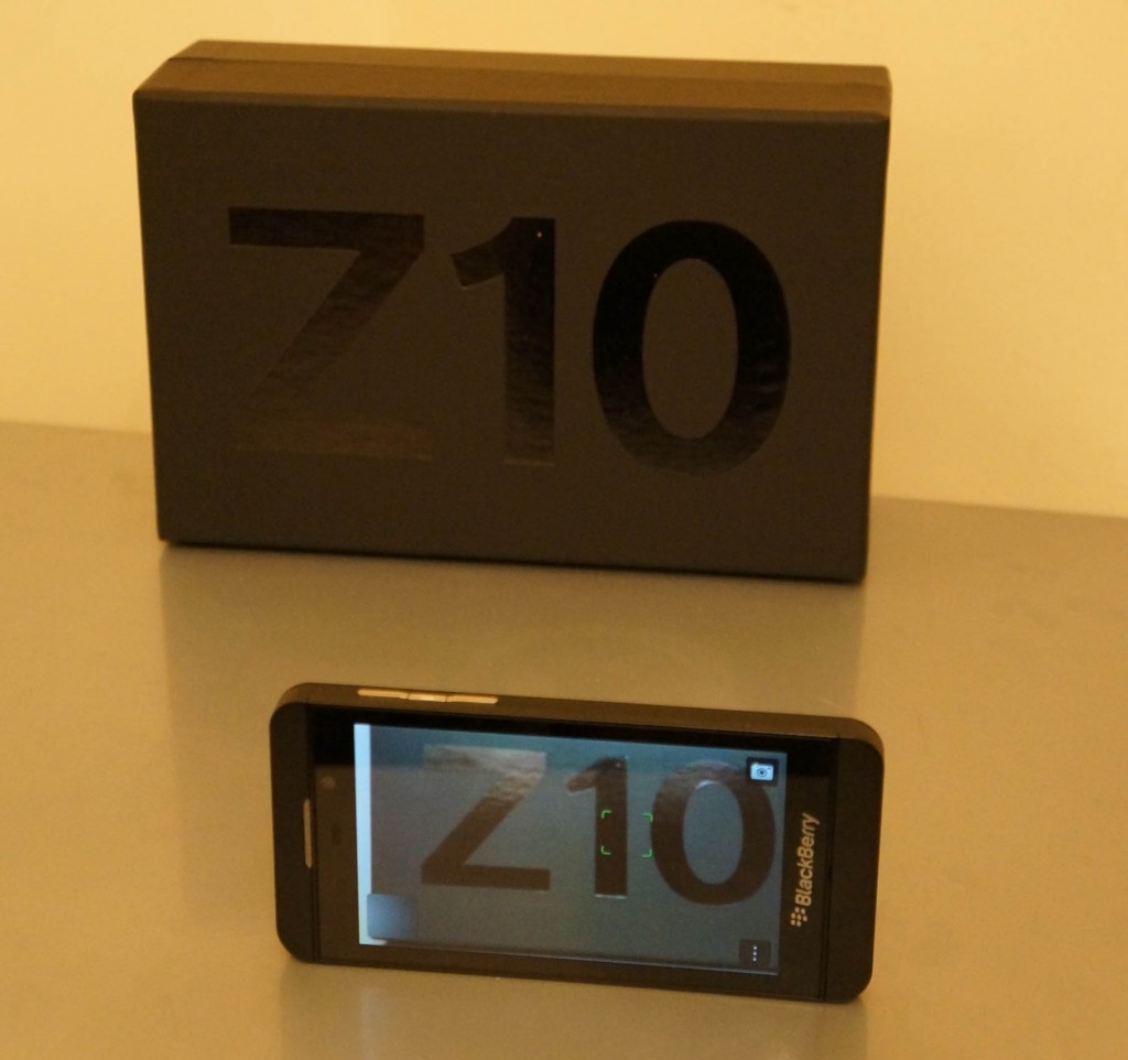
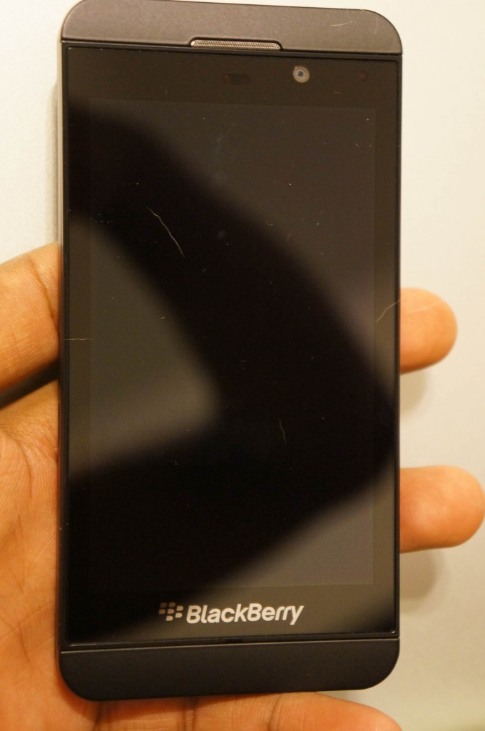
The hardware on the Z10 is pretty good, constructed for the most part out of soft-touch plastics and glass. The front of the device has a large Blackberry logo emblazoned on the bottom of the device, a 4.2 inch 1280×768 pixel display above. The usual suspects of a front-facing camera (2MP still and 720p video), ambient light sensor, proximity sensor, the customary Blackberry notification LED and speaker grille round out the features of the front of the device.

The top sports a microphone hole, 3.5mm headphone jack and the power button which does the usual double duty of putting the device to sleep and shutting it off completely. The left side is bereft of actual buttons and features the Micro-HDMI port for video out and the micro-USB port for charging and data-transfer.
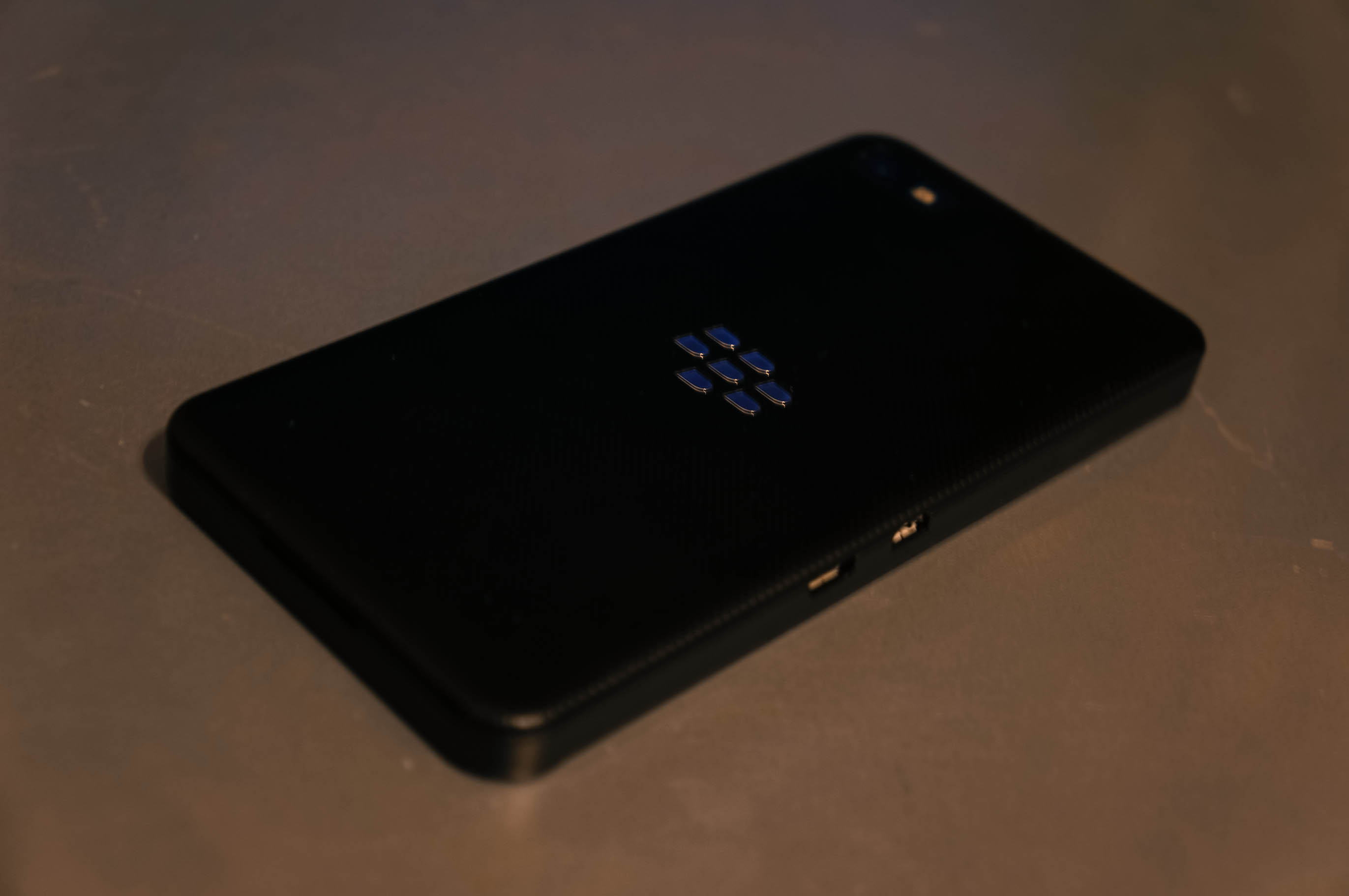
The right side features 3 buttons, the volume up and down buttons and a mute button that calls up voice controls when held down. The back-side features an 8 Megapixel camera and what appears to be a single LED flash and yet another Blackberry logo; like most Blackberries it’s ok-ish. That said, you won’t be winning any camera-phone shootouts with this one. More on that later though. The device measures in at a modest 130×65.6x 9 mm making it quite good for single handed usage without being unnecessarily skinny or too bulky. The weight of the device is similarly modest, tipping the scales at 138g giving a solid feel while not feeling like a workout in and of itself. This may be a personal preference but I like my devices (especially the more costly ones) to not feel fragile or likely to be moved by a passing wind, and Blackberry quite achieved that delicate balance.

As far as design of the entire of the exterior goes, it’s relatively tame, looking more like a mild, understated iPhone 5 than anything else. An unfortunate coincidence when one considers that the Z10’s basic hardware design was established as far back as mid-2012 with the “Dev Alpha” and “Dev Alpha B” devices from RIM. Taking nearly 12 months to bring the same hardware and software to market has its downsides.
Bluetooth 4.0, NFC, GPS, LTE support, Wi-Fi and 16GB of built-in memory (with MicroSD expansion) round out the miscellaneous specs. The Z10 is powered by a dual-core 1.5Ghz processor (at least by RIM) of unannounced origins paired with 2GB of RAM (rumour has itthat the US and Canada devices feature a Snapdragon MSM8960 processor while Europe, South America, Asia, Africa & Middle East devices run OMAP 4470). The device in my use so far has been pretty snappy though there are minor slow-downs when loading large web-pages as one might expect.
Display:

The 1280×768 pixel display (356ppi) is definitely one of the better aspects of the device, the 4.2 inch IPS possessing great viewing angles, sharpness and contrast and though the icons seem to almost float on the display, it’s still not as pronounced an effect as it is on the iPhone 5 for example. There are some minor colour aberrations as the viewing angles approach about 45° from perpendicular, but they’re just that, minor. Brightness is ok, but there seems to be no way to turn off the relatively aggressive screen dimming algorithm Blackberry have cooked up. No real negatives here, though some may complain about the lack of a 1080p display is a major hindrance.
Camera:

The 8 megapixel snapper is an improvement from the frankly horrid Blackberries of old but with slow focusing, noisy images in low or artificial light and so-so colours it’s not exactly a game changer. Even features like Time Shift which allows you to take a burst of photos in a single go then alter portions of the best in the captured set, have been implemented on other devices that have beaten the z10 to market by months. Conspicuous in their absence is burst mode, macro mode and panorama mode, all of which are regular features on other devices. The camera also captures 1080p video and much like with stills, it does a decent, though not stellar, job of it.
Battery Life:
This is probably the biggest downside of the device as far as hardware goes. It’s not terrible by any means but it’s barely going to get you through a full day, even if you’re using it lightly. This may be due to the LTE radio and the associated software stack being a little off, but other LTE devices in my collection don’t seem to go through nearly as much juice in similar use cases. The first day of use saw me get through ~75% of the available 1800mAh battery in an 8 hour span with sparse use of the display and radio. If the device used an OLED display or ran an ancient chipset like the Lumia 900, which features a similarly-sized 1830mAh battery, then the longevity of the device would be less of a surprise.
Unfortunately, the Z10 does worse than the Lumia 900 in terms of power consumption, even with less screen-on time and radio usage. It’s a baffling situation to say the least and one it would appear that RIM knew about beforehand when they artfully dodged questions and concerns about battery life during the Q&A session with Thorstein Heins last month.
Phone performance:
RIM have always had a pretty decent reputation as far as phone performance and network frugality and little has changed here. The Z10 doesn’t seem to have trouble finding networks, maintaining LTE connections or handing off between HSPA+ and LTE where necessary. Calls come through loudly without distortion and the microphones seem to do a good job of picking out my voice from the din and clamor of New York’s busy streets.
Software:

While the hardware of the Z10 is a big departure from prior Blackberries, current market trends show that the software is equally if not more important than the hardware it runs on. As the first device running Blackberry’s new BlackBerry 10 operating system, this is the first time many of us are seeing and getting hands-on time with what has been presented as the savior of the company.
You wouldn’t be wrong to look at Blackberry 10 and think that it’s a shameful rip-off of operating systems gone by, namely Harmattan and WebOS. However, with neither seemingly on the market anymore, it’s hard to fault Blackberry for taking some of their better features and running with them, namely gestures.
Blackberry 10 is one of the few major OS’s in recent years to eschew the use of hardware (or software representations of) keys for general interaction purposes. iOS uses the home key for multitasking, app switching, Siri and could be configured (with a few tweaks) to perform other tasks. Android still maintains the ‘menu’, ‘home’ and ‘multitasking’ buttons, in software form or otherwise, on stock versions of Android 4.0 and above. Windows Phone still maintains the same hardware buttons that it launched with, ‘start/home’, ‘search’ and ‘back’. So how does Blackberry 10 manage to implement or at least circumvent the paradigms that necessitate these “buttons”?
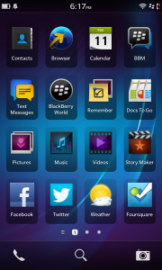
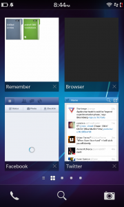
This is achieved mostly through the use of the edge-swipe gesture. Let’s start at the homescreen though. There are 3 main aspects of the homescreen experience, the typical application grid/list, replete with folder creation and organisation, the running applications section and the notification hub/center. Sound familiar? That’s because the idea has already been done once, to immense critical acclaim I might add. Blackberry may have implemented a few minor tweaks to the arrangement but the core ideas remain almost completely intact.
Much like with Harmattan, application continue to run in the background and will display the last and/or currently active content depending on the developer’s desires.

Navigating the UI is done almost exclusively through a combination of swiping and long pressing, though there is the back button that occasionally makes its way into play. Swiping from the top edge of the display downwards will bring up any application specific settings (so far these are pretty much non-existent), while swiping up from the bottom of the device will bring you back to the homepage.

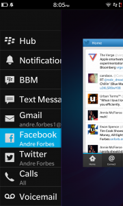
The swipe from the bottom gesture also has a neat little trick, swiping up and then moving your finger to the right will bring up what Blackberry are calling Peek. This allows you to glance at the notifications that you’ve yet to address in the Hub. Dragging your finger more to the right will bring up the hub proper. It’s a nice touch and allows you to stay within your application/workflow while staying on top of things in a way that has yet to be done quite as well by any other operating system.

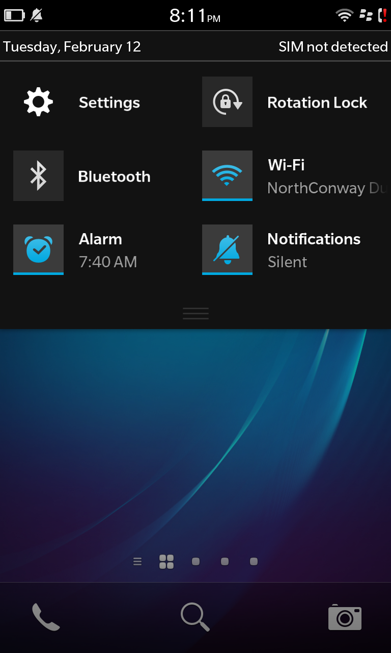
The main homescreen features a few nice touches as well such a permanently accessible set of soft-keys for “phone”, “search” (universal and web), and the camera. Swiping down from the top of the display provides access to a profile switcher (loud, silent etc), settings, Wi-Fi and Bluetooth toggles, rotation lock and alarms.
One thing that threw me off initially was the tedium of dealing with retweeting and/or replying to tweets and email without having to dive into each and every one given the lack of visible soft-keys. Luckily Blackberry thought ahead and made all the commonly used interactions only a long-press away. In the twitter app that might be “reply”, “retweet”, “favourite”, “copy” and “share” while in email, “mark as read”, “reply”, “reply-all”, “flag” etc tend to predominate. It’s useful, but require prior knowledge and thus can make for a frustrating first impression.

That said, after a relatively confusing first day or so, Blackberry 10 settles into a smooth, relatively easy to use and intuitive platform. Much like “double-tap to wake”, you’ll find yourself trying to swipe into multi-tasking or unlocking your other devices in short order which says a lot both for the intuitiveness and ease of muscle memory associated with the OS. Where design is concerned Blackberry 10 isn’t much of a departure from the company’s history. Yet, though the color schemes and icons don’t differ overly from Blackberries gone by, the entire operating system is easy, functional and quite a pleasure to use which is more than can be said for almost all prior devices by the company.
Default applications:
The Z10 comes with the expected helping off a Browser, Pictures, Music, Video and Maps (powered by Bing) apps along with a number of generic utility applications. Blackberry also saw fit to pre-install a video/slide-show mashup application known as Story-maker that allows you to create you’re own works of art on the fly, replete with music, Blackberry Remember that allows you to create notes and to-do’s (with due dates) that also syncs relatively well with Evernote and a weather app powered by Accuweather. Twitter and Facebook round out the noteworthy default applications which although initially strange makes perfect sense when you try to find good clients for the former especially. Quick hint, they don’t exist. A healthy helping of the popular apps imaginable for other platforms, Windows Phone included are just unavailable for Blackberry 10 and that’s a shame really, especially given how much they talked up their large launch catalogue of applications. It’s since been shown that the majority of those will be almost direct clones of Android applications. Of course some in the tech will gripe about this, extensively, it’s quite likely the end-user won’t care very much and for Blackberry that’s a godsend.
Conclusion:

There’s a lot to like with Blackberry 10, it takes a renewed take on what a smartphone should look and feel like and while some of the ideas’ execution leaves something to be desired, the general sentiment is positive. The Z10 combines decent, yet high-functioning hardware with much better software than they’ve released in ages. As many in the tech space have hinted, this isn’t your father’s Blackberry, it’s a complete, ground-up overhaul and Blackberry deserves plaudits for putting their best foot forward here. That said, I can’t help but feel the same way about Z10 and the accompanying software platform that I felt about the N9 and Harmattan; that while great, it’s come a little too late. Time will tell whether these two spiritual cousins go the same way but in placing their bets on supporting Android applications out of the gate, they have a much better chance than Harmattan ever did.
