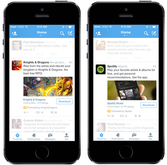
With an aim to pump up its revenues further, Twitter has introduced app-install ads on its mobile platform. Dubbed as “Mobile App Promotion Suite”, new mobile app promotion suite that will allow advertisers to promote mobile app installs both on and off-Twitter.
Tag: twitter
44% of registered Twitter users never Tweeted: Report
A recent report from Twopcharts has revealed that users on Twitter are not that engaged as it might look. The site that monitors Twitter account activity has stated that 44% of 974 million registered users have never sent one single tweet, according to The Wall Street Journal.
Continue reading “44% of registered Twitter users never Tweeted: Report”
Twitter adds real-time pop-up notifications for web
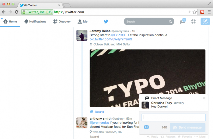
Soon after giving its profiles pages a Facebook like overhaul, Twitter has now added a new feature to its website. The popular microblogging site has announced that it is rolling out pop-up notifications for users of Twitter.com.
Continue reading “Twitter adds real-time pop-up notifications for web”
Twitter updates user profile pages, looks closer to Facebook than ever
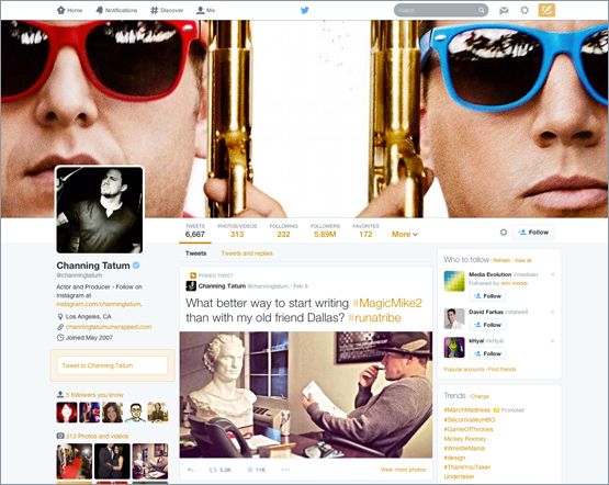
Sometime back, Twitter started rolling out a new lighter user interface for its web users and now, it has updated the profile pages of users. According to Twitter, the “new and improved web profile” page will help you tell about yourself in a better way.
 Continue reading “Twitter updates user profile pages, looks closer to Facebook than ever”
Twitter Music is officially dead, Twitter to pull the plug on April 18
Twitter #music used to be a service that would help you choose better music. Atleast, that is what the team had in mind, when Twitter acquired We Are Hunted team in 2012 and introduced Twitter Music. Twitter Music has never been famous and last year, around October, Twitter decided to put it to rest.

Continue reading “Twitter Music is officially dead, Twitter to pull the plug on April 18”
Twitter gets improved search filters on the web version
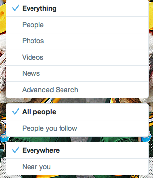
Twitter had recently updated its iOS app with improved photo editing capabilities and more; now the company has rolled out a few changes to the web version of their application. Twitter gets a new advanced and improved search that has new search filters letting you restrict your searches to photos, videos, news, people you follow, and nearby locations.
 Continue reading “Twitter gets improved search filters on the web version”
Carbon for Twitter gets a makeover
Carbon, one of the popular third party Twitter clients has recently received a massive overhaul. Carbon is considered one of the better Twitter clients because of its buttery smooth UI and minimal design. The Carbon team pushed the version 2 just in time for New Year and it brought along a major redesign.
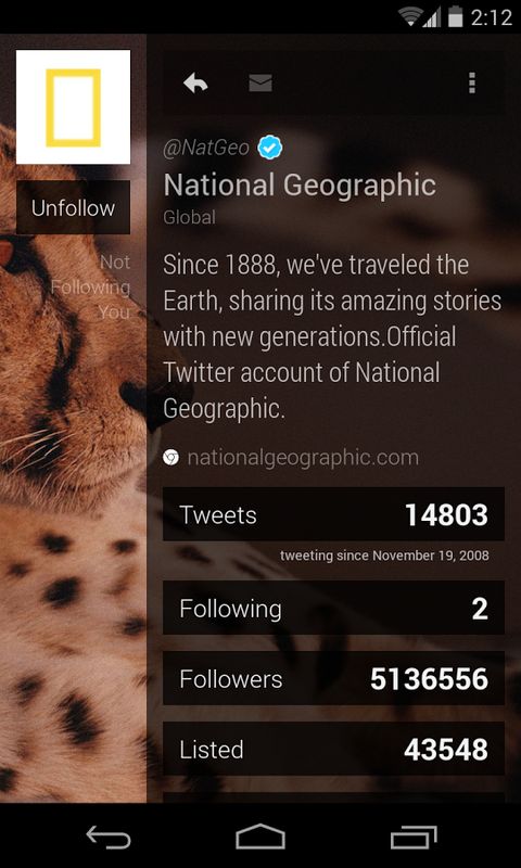
The starting screen that you see is your timeline. Swiping right takes you to the mentions and swiping right once more takes you to the direct messages. This is the basic structure of the application and it makes it quite easy and smooth to navigate between them. You can swipe up or down with two fingers to reach the top or bottom of the timeline respectively. This can be particularly useful if you want to go back to the top after checking out a lot of tweets.
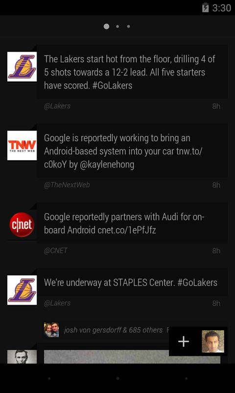
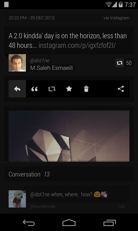
A single click on the tweet will make the links, hashtags and mentions clickable. It also displays a quick action menu that lets you retweet, favorite or share the tweet. When you double tap a tweet, it will let you edit and retweet it. Swiping right from edge brings the favorites menu that has your favorites, retweets and recent searches. You can compose a new tweet with the + sign along with your display picture on the bottom right corner. The latest redesign also changed the way a profile is display and the new look is just gorgeous. Clicking on the Profile picture at the bottom right reveals a small menu with the settings icon and links to your profile.
Do you use Carbon? If not, are you willing to try? Do let us know what you think in the comments below.
Twitter for iPhone updated to version 6, brings design changes in tow
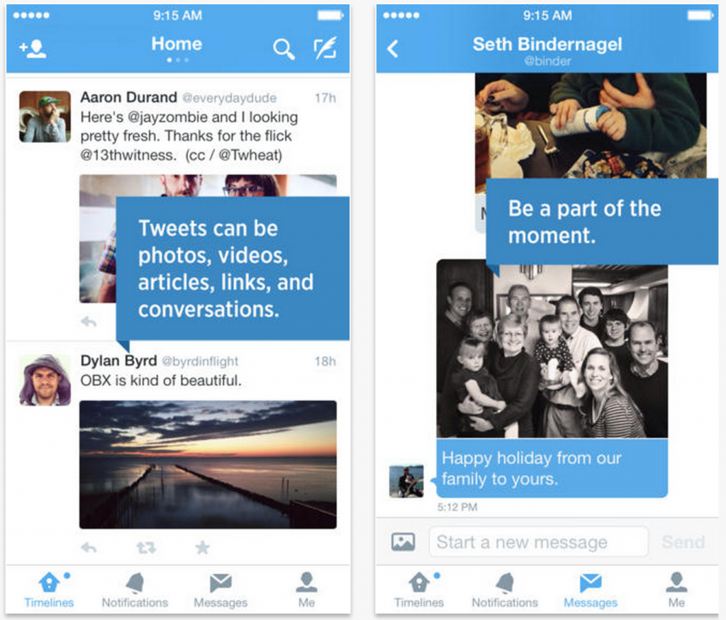
Twitter just pushed a major update to its iOS and Android application. The update brings with it a brand new and refreshed look. Activity and Discover tabs can now be accessed by swiping and there is a fresh focus on getting access to DMs. Continue reading “Twitter for iPhone updated to version 6, brings design changes in tow”
Twitter partners with Star Sports to offer in-stream videos on mobile
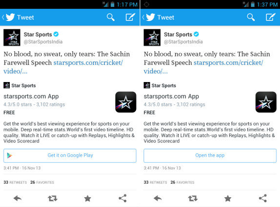
Starsports.com and Twitter have partnered to offer in-stream videos on starsports.com for Twitter users, without leaving Twitter. As part of the partnership, whenever a link to starsports.com is tweeted, Twitter users on mobile will have the option to download the starsports.com application. Once the mobile application is installed, they will be able to open the app directly by clicking the tweeted link, to watch the video. Continue reading “Twitter partners with Star Sports to offer in-stream videos on mobile”
Twitter for Windows Phone updated with Dark Theme option and Lock Screen highlights
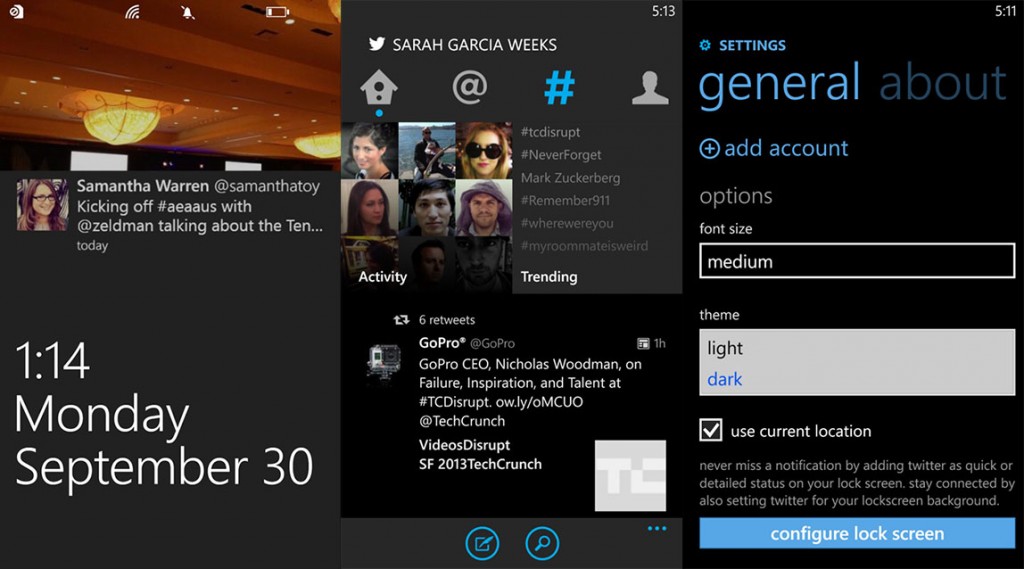
It’s been a while since the official Twitter for Windows Phone app got its updates. It had unsurprisingly missed the conversation thread update iOS and Android received. While that feature has still evaded the platform, we have news of an update for the app. The app now arguably brings more choices and interesting changes to the Twitter experience on your Windows Phone. Most notable of the new additions are the new dark theme option and lock screen highlights. Users can now choose between a light and dark theme and have Twitter set as the lock screen picture(using Windows Phone 8’s unique feature) to show recent highlights from your feed.
This is the Nokia Lumia 1520, leaked in a press image
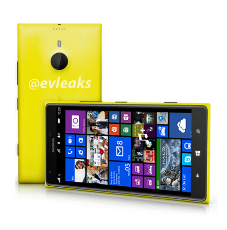
The Nokia Lumia 1520 has finally leaked in full glory. We saw the 1080p GDR3 screenshot, we saw the aluminium case and the bezels, and then we saw the phone’s rather huge front in another leaked image, but this time, thanks to the leakmeister EVleaks, we have a full press image. From the looks of it, it is definitely made in polycarbonate, with the design closely resembling the Lumia 925, and the device is… just massive. If you don’t think it’s huge, just take a look at the Windows shortcut capacitive keys. It is also nice to see that the phone has really thin bezels.
Continue reading “This is the Nokia Lumia 1520, leaked in a press image”
Twitter updates Android & iOS apps, adds login verification and photo galleries
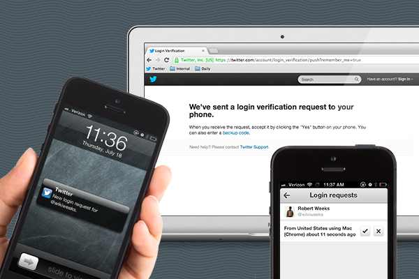
Twitter just pushed out an update for its iOS and Android applications which primarily adds new security related features. It is now possible to use login verification and approve such requests directly from the phone. Two factor authentication had been added to Twitter web a few months back but the updated version of the app will remove the need for SMS based verification. A push notification will show up on the application that will allow users to approve login attempts. Additionally, it is possible to get a backup code in case you don’t have an active data connection on the phone.
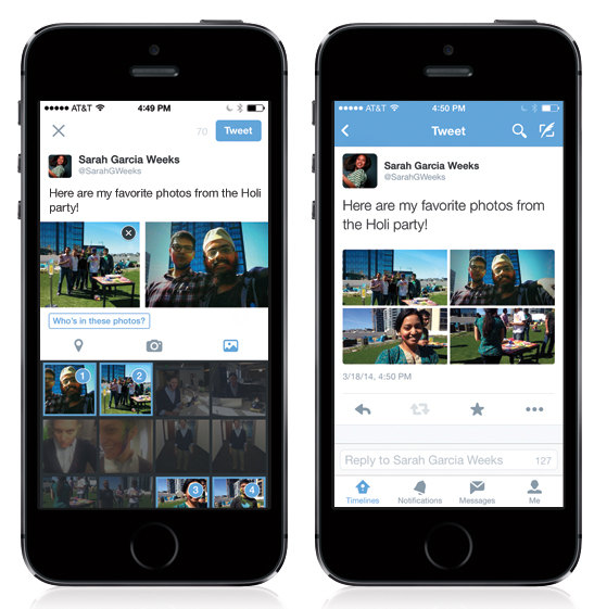
Additional features includes a new photo gallery that shows results in a mosaic like grid and lets you see more images in a go. The gallery will also show up under user profiles. An improved search experience is also part of the update which will provide more context and information on people who show up in Twitter searches. Continue reading “Twitter updates Android & iOS apps, adds login verification and photo galleries”
Twitter for BlackBerry 10 gets improved UX and new features with the latest update
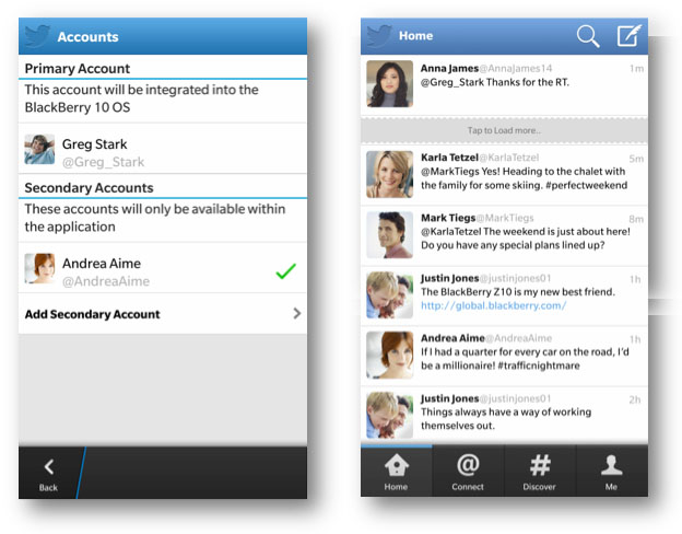
Twitter for BlackBerry 10 has been a mixed experience, with it mostly tending to be worse than on other platforms, but thanks to a new update, the real time social network is now better and more functional on BlackBerry 10. The new version 10.2 brings a refreshed user interface with minor tweaks and new features. You can get it from the BlackBerry World here, check past the break for the changelog.
Twitter updates its mobile apps, Android version goes HOLO
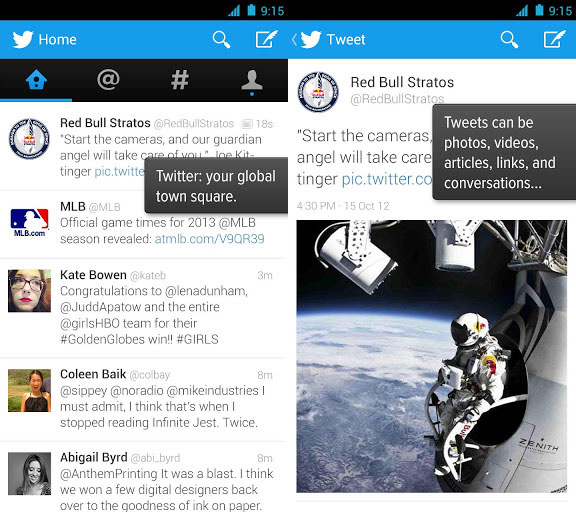
Twitter, the world’s only realtime social network has updated its mobile apps today. It includes a major update for Android and minor updates for Twitter for iPhone and the mobile web app. The main improvement of the Android app is that it has finally went HOLO, the design language that Google has been preaching to third party devs since 4.0 ICS, with blessings from lead designer Matias Duarte. Minor improvements to all the apps is that they get improved cards support with deep linked app links inside the details page.
Continue reading “Twitter updates its mobile apps, Android version goes HOLO”
Android 4.2.2 starts rolling out on Galaxy Nexus, Nexus 4, 7 and 10
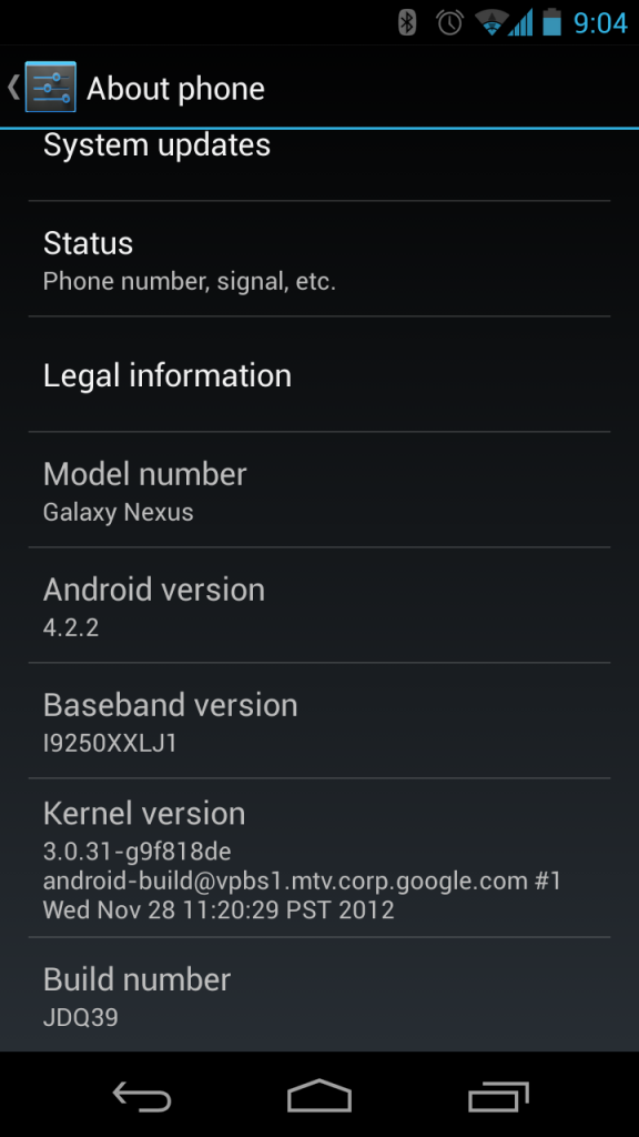
A lot of people on reddit, Twitter and other social platforms have been buzzing about the Nexus line of devices both smartphones and tablets from Galaxy nexus to the Nexus 10 have started to receive OTA update to Android 4.2.2, build JDQ39.
 Continue reading “Android 4.2.2 starts rolling out on Galaxy Nexus, Nexus 4, 7 and 10”
